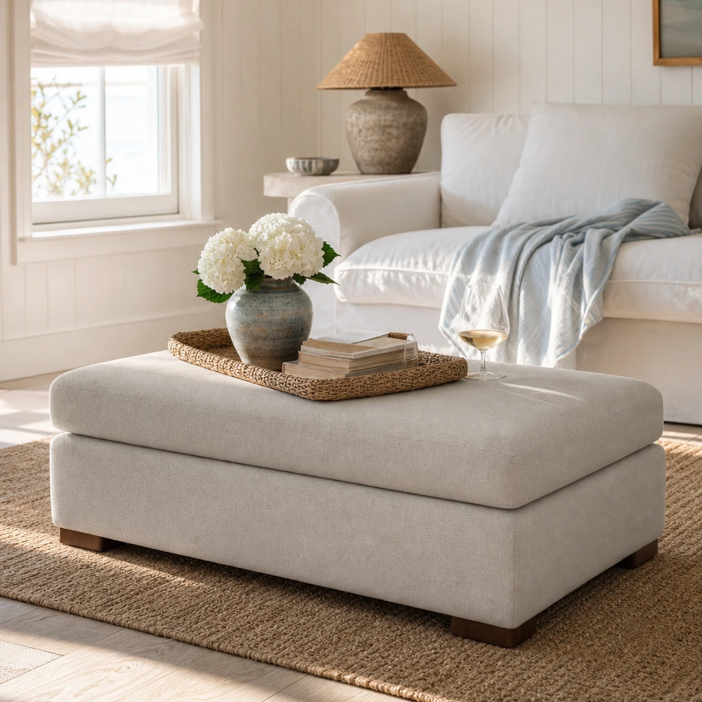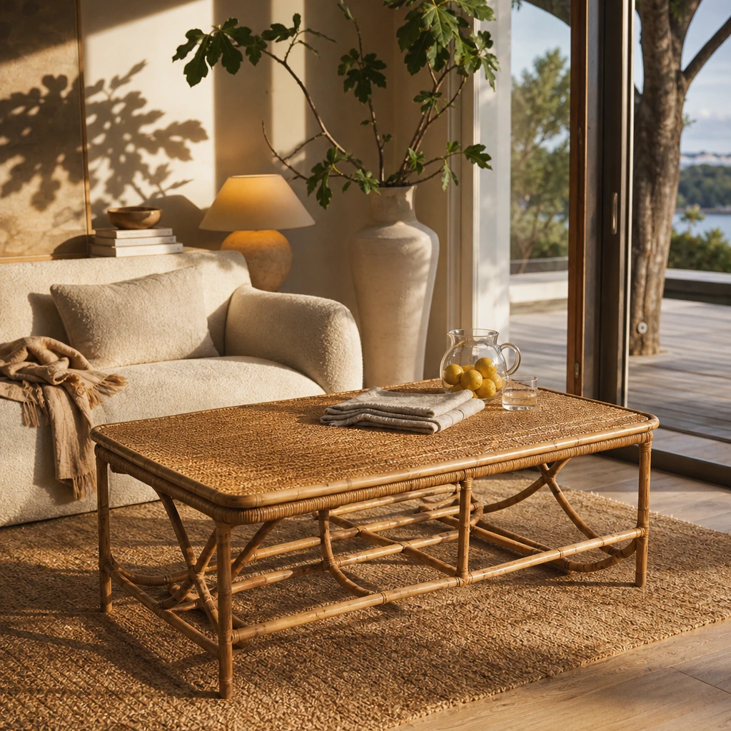
There is a specific kind of envy that hits around the forty-minute mark of almost any Downton Abbey episode. The camera settles on the Highclere Castle library: warm paneled walls, lamplight pooling across a Persian rug, velvet upholstery in deep jewel tones, portraits staring down from every wall. You are not thinking about the Crawley family's inheritance complications. You are thinking about your living room in Evanston, Illinois, or your terraced house in Edinburgh, and wondering why it feels so flat by comparison.
The gap between a Crawley drawing room and a real modern home is smaller than it looks. The Downton aesthetic is not primarily about square footage or aristocratic budgets. It is about architectural detail, layered texture, a considered color palette, and the kind of lighting that makes a room feel inhabited rather than staged. Most of those elements are achievable. Some of them are surprisingly affordable.
What the show's production design captures so precisely is a particular quality of accumulation: rooms that look as though they have been lived in, added to, and edited over generations rather than furnished in a single afternoon. That quality is reproducible. It requires a different approach to shopping and styling than most modern homeowners are used to, but it is not beyond reach for anyone with a clear sense of what they are after.
This guide breaks down the specific design moves that make Downton Abbey interiors feel the way they do, and translates each one into practical steps for a real home in 2026. You will learn which architectural details deliver the highest visual impact for the least structural commitment, how to build a period-appropriate color palette, where to source genuine and reproduction pieces at different price points, and which common mistakes turn a heritage-inspired room into something that reads as costume rather than considered.
Key Takeaways
- The Downton Abbey aesthetic draws from two distinct periods: Edwardian design (roughly 1901 to 1914) and early Art Deco (the 1920s). Understanding both gives you a wider, more flexible palette to work from.
- Architectural millwork, specifically dado rails, picture rails, deep skirting boards, and crown mouldings, delivers the highest visual impact for the least structural commitment. A 2023 AIA survey found 57% of residential architects reported increased client interest in custom millwork and trim compared with five years earlier.
- Lighting is the single most underrated element in period-style interiors. Warm, layered, indirect sources do more work than any piece of furniture.
- U.S. homeowners spent $481 billion on home improvements and repairs in 2023, with discretionary aesthetic projects representing a meaningful share of that spend. Heritage-inspired design sits squarely within that category.
- Pattern mixing works when it is anchored by a single cohesive color palette. Without that anchor, it reads as clutter rather than layered elegance.
- Genuine antique and vintage pieces from platforms like Chairish and 1stDibs can be mixed with reproduction pieces from Farrow and Ball, Sanderson, and Visual Comfort to achieve the look without a full antique-dealer budget.
- For homeowners in listed or historic properties, Historic England and the U.S. National Park Service both advise adding rather than removing original features, and keeping structural changes minimal.
- The collected quality of Downton interiors comes from density and variety of objects, not from expensive individual pieces. Fewer, more specific purchases outperform many generic ones every time.
What the Downton Abbey Aesthetic Actually Is
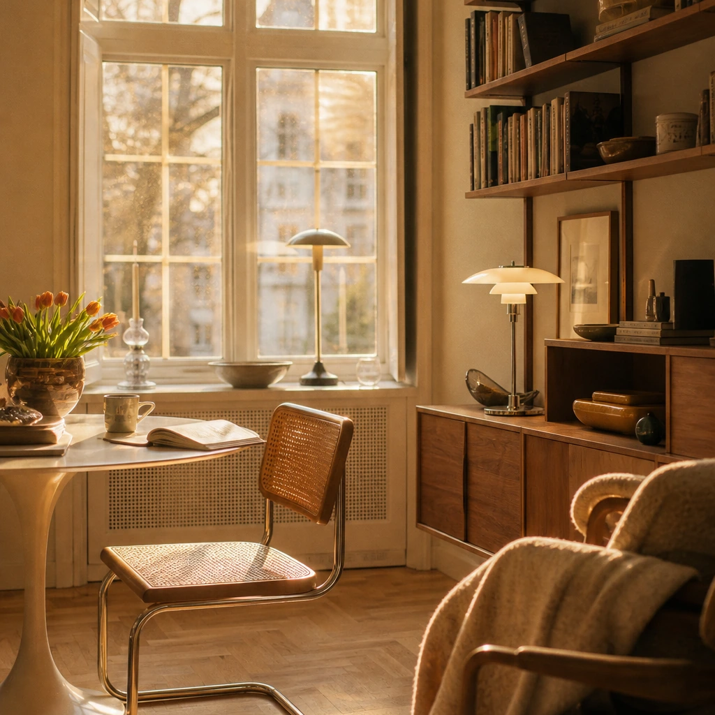
The Downton Abbey aesthetic is a layered visual language drawing from Edwardian interior design (1901 to 1914) and early Art Deco (the 1920s), characterized by architectural millwork, warm color palettes, textile layering, and directional lamplight rather than overhead illumination.
The show's production design is set primarily at Highclere Castle in Hampshire, a Victorian-era house with interiors that were updated and refined through the Edwardian period. The earlier seasons reflect the lighter, more elegant sensibility that replaced heavy Victorian decoration: softer colors, botanical motifs, furniture with less ornate carving, and a general sense of airiness. By the later seasons, the sets shift subtly toward Art Deco influences: geometric forms, lacquered surfaces, chrome and brass accents, and bolder color contrasts that signal the cultural shift of the 1920s.
That layering across two decades of British design history is actually an advantage for modern homeowners. You are not trying to recreate a single frozen moment. You are drawing from a range of compatible references that can be adapted to different room sizes, budgets, and existing architectural conditions.
The Three Structural Principles Behind the Look
Understanding why Downton interiors feel the way they do makes it easier to replicate the effect without copying the literal elements.
Architectural containment. Downton rooms feel grounded because the walls are articulated. Dado rails divide the wall into zones. Picture rails create a visual ceiling below the actual ceiling. Cornices and ceiling mouldings frame the room. Paneling adds depth and shadow. These details make a room feel considered rather than generic.
Textile layering. The rooms are never sparse. Curtains pool slightly on the floor. Rugs anchor seating groups. Cushions mix patterns at different scales. Throws are draped rather than folded. This is not maximalism for its own sake. It is the visual language of a room that has been lived in and accumulated over time.
Warm, directional light. Downton Abbey's set decorator Gina Wilson has noted that lampshade choice and light quality are central to the atmosphere of each room. The lighting is never overhead-dominant. It comes from table lamps, wall sconces, and candlelight, creating pools of warmth rather than uniform illumination.
Why Heritage Design Is Having a Mainstream Moment
This is not a niche aesthetic. The broader cultural and commercial context makes clear that heritage-inspired interiors are moving from specialist interest to mainstream demand.
Streaming-era period dramas have created a measurable commercial category. Etsy's 2024 Home and Living Trend Report documented a 24% year-on-year increase in searches for vintage wall art and a 30% increase in searches for ornate frames, attributing the growth partly to period drama fandom. Large retailers are merchandising directly around the Downton aesthetic, positioning Edwardian-style furniture, extravagant wallpaper, gold accents, and jewel-tone palettes as commercially significant style categories rather than niche references.
Consumer spending on premium decorative projects remains resilient. U.S. homeowners spent $481 billion on home improvements and repairs in 2023, according to Harvard University's Joint Center for Housing Studies, with roughly one in five dollars going to discretionary aesthetic projects like room remodels. A Houzz renovation survey found 61% of homeowners cited improving the look and feel of their home as their top motivation for renovating, ahead of increasing resale value. In the same survey, 31% described their preferred style as traditional or eclectic with traditional elements.
The identity dimension matters too. A 2023 McKinsey consumer survey found that 60% of respondents are willing to pay more for products that feel personalized to their identity and story. Heritage and estate-style décor sits precisely at that intersection: it is not trend-chasing. It is the expression of a particular kind of taste that values history, craft, and accumulated meaning over novelty.
The good homes and interiors media have named this moment variously as "Regencycore" or "heritagecore," a contemporary shorthand for modern interiors inspired by British aristocratic periods that mix rich fabrics, layered patterns, antique silhouettes, and decorative mouldings with current conveniences. The Downton aesthetic is the most specific and achievable version of that broader trend.
Edwardian and Art Deco Color Palettes for Modern Homes
Heritage color is one of the most accessible entry points into the Downton aesthetic. You do not need to change a single piece of furniture to shift the feeling of a room. The right wall color, paired with the right trim, does most of the work.
The Edwardian Palette: Soft, Layered, and Botanical
The Edwardian palette favored muted pastels and naturalistic tones: primrose yellows, wisteria mauves, sage greens, and soft blues, all paired with dark wood accents and cream or off-white trim. These are not the saturated pastels of a nursery. They are complex, slightly grayed tones that read as sophisticated rather than sweet.
Farrow and Ball's archive is the most referenced source for this palette. Colors like Mizzle, Mole's Breath, and Calke Green sit in exactly this register. Little Greene, which collaborates with the National Trust on historically referenced colors, offers similar depth with slightly more accessible pricing.
The key is contrast. An Edwardian room pairs a soft wall color with dark woodwork, not white. Painting skirting boards, dado rails, and window frames in a deep tone like Farrow and Ball's Railings or Down Pipe creates the visual weight that makes the pale walls feel intentional rather than timid.
The Art Deco Palette: Jewel Tones and Geometric Contrast
The later Downton seasons introduce deeper, more saturated tones: emerald greens, sapphire blues, deep burgundies, and warm golds. These are paired with geometric patterns, lacquered surfaces, and chrome or brass hardware.
For a modern home, the Art Deco palette works best as an accent layer over an Edwardian base. A deep emerald velvet sofa against sage walls. A geometric brass mirror above a dark wood console. A jewel-toned rug anchoring a neutral seating group. The contrast is what creates the period feeling, not the saturation alone.
Color Palette Reference by Room
The following table maps room type to Edwardian base color, Art Deco accent, and recommended trim or woodwork finish.
Recreating Downton Abbey's Architectural Details
This is where the most dramatic transformations happen, and also where the most common mistakes occur. The goal is not to make a modern home look like a film set. It is to give the walls and ceilings the kind of articulation that period rooms have naturally.
Millwork and Mouldings: The Highest-Impact Addition
Mouldings change how a room reads without changing its layout or furniture. The 57% of residential architects who reported increased client interest in custom millwork and trim in a 2023 American Institute of Architects survey were responding to a real shift in how homeowners think about the relationship between architectural detail and room quality.
The key elements to consider, in order of visual impact:
- Cornice or crown moulding at the ceiling-wall junction. This frames the room and creates a visual lid.
- Picture rail approximately 30 to 40 centimeters below the cornice. This allows art to be hung without wall damage and creates a horizontal band that makes ceilings feel higher.
- Dado rail at roughly chair height (90 to 100 centimeters from the floor). This divides the wall into upper and lower zones and is one of the most recognizable Edwardian details.
- Deep skirting boards at the floor. Standard modern skirtings are often too shallow to read as period. Replacing or adding to them with a deeper profile makes an immediate difference.
- Wall paneling below the dado rail (wainscoting). This is the most labor-intensive option but also the most transformative.
For non-listed homes, these additions are straightforward DIY or joinery projects. For homeowners in older or listed properties in the UK, Historic England notes that works affecting the character of a listed building, including replacement of paneling, staircases, and some internal fixtures, may require consent from the local authority. The U.S. National Park Service's Technical Preservation Services similarly advises repairing original features where possible and avoiding removal of historic trim or woodwork. The principle for both contexts is the same: add rather than remove, and keep structural changes minimal.
The Statement Staircase
Downton's grand staircase is frequently cited as the defining architectural moment of the show. For most homeowners, a structural rebuild is neither practical nor necessary. The elements that make the staircase read as grand are largely decorative and achievable.
The key staircase elements are a wool or patterned stair runner in a deep color, dark-stained or painted banisters, a gallery wall of portraits or botanical prints ascending with the stairs, and a statement light fixture (lantern or chandelier) visible from the entry. None of those require structural work. All of them shift the feeling of a staircase from functional to architectural.
Period-Appropriate Furniture: Selection and Sourcing
The furniture in Downton Abbey is not uniform. It is collected. Pieces from different periods and in different conditions sit alongside each other because they have been accumulated over generations. That is the quality you are trying to replicate, not a matched set from a single catalog.
Silhouettes That Read as Period
Edwardian furniture tends toward lighter, more elegant silhouettes than Victorian. The specific details to look for:
- Cabriole legs on chairs and occasional tables
- Rolled or scroll arms on sofas and armchairs
- Button-back upholstery in velvet, wool, or linen
- Inlaid or marquetry detailing on case pieces
- Claw-and-ball or pad feet on larger pieces
Art Deco pieces from the 1920s introduce more geometric forms: stepped profiles, lacquered surfaces, waterfall edges on case furniture, and upholstery in bold geometric patterns.
Where to Source Period and Reproduction Pieces
The most effective Downton-style rooms mix genuine antique or vintage pieces with well-chosen reproductions. The antiques provide authenticity and visual weight. The reproductions fill functional gaps without the fragility or cost of genuine period furniture.
For genuine antique and vintage pieces, 1stDibs and Chairish are the most reliable online sources. Both platforms have verified dealers and detailed condition reporting. Etsy's vintage décor market has grown significantly, making it a useful source for smaller decorative pieces, prints, and textiles at accessible price points.
For reproductions, Restoration Hardware's European estate lines and Interior Define's traditional upholstery options sit at the right aesthetic tier. For UK buyers, Oka and Neptune offer period-inspired furniture at a premium but accessible price point.
The rule for mixing: vary the finish and the age. A room where everything looks equally new, or equally old, loses the collected quality that makes period interiors feel authentic.
If you are working through multiple rooms at once and want to see how specific pieces work together before committing, First Chair pulls across retailers including CB2, Crate and Barrel, and Lulu and Georgia to help you build a cohesive room concept from real, in-stock pieces rather than fantasy renders. It is particularly useful when you are trying to balance a genuine antique anchor piece against reproduction fills without everything ending up looking mismatched.
Wallpaper, Paneling, and Wall Treatments from the 1920s Era
Wallpaper is one of the most powerful tools in the Downton aesthetic toolkit, and one of the most frequently misused. The instinct is to go bold immediately. The better approach is to understand which patterns work at which scale.
Pattern Categories That Work
Botanical and floral prints. These are the most Edwardian of all wallpaper categories. The key is scale: large-scale florals work in rooms with high ceilings and generous proportions. In a standard modern room, a smaller-scale botanical or a tonal floral reads more elegantly.
Damask and jacquard patterns. These are more formal and work well in dining rooms and libraries. Sanderson's archive includes several historically referenced damask patterns that sit in exactly the right register.
Geometric and Art Deco patterns. These belong to the later Downton period and work best as accents: a feature wall in a bedroom, a hallway, or a powder room. Paired with a plain color on the remaining walls, a geometric wallpaper creates period atmosphere without overwhelming the space.
Grasscloth and textured wallcoverings. These are not strictly period but read as compatible with the Edwardian palette. They add texture and warmth to walls without introducing pattern, which makes them useful in rooms that already have strong textile layering.
Downton's set decorator has noted that paper-backed silk wallcoverings were common historically and create a cocooning, period-appropriate ambience. For homeowners who want that quality without the cost of genuine silk, there are convincing fabric-effect wallpapers at more accessible price points from Cole and Son and Designers Guild.
The Paneling Decision
Full wall paneling below a dado rail is the most transformative wall treatment available, and also the most commitment-heavy. For homeowners who want the effect without the joinery cost, paint-effect paneling using applied timber battens or MDF strips achieves a similar result at a fraction of the price. The key is proportion: the panel dimensions should relate to the room's ceiling height. Panels that are too wide or too narrow read as decorative rather than architectural.
Lighting Fixtures and Hardware That Capture the Estate Aesthetic
If there is one area where Downton-inspired interiors most consistently fall short, it is lighting. The furniture is right. The wallpaper is right. But the overhead recessed lights are still doing all the work, and the room feels like a hotel corridor.
The Layered Lighting Principle
Period rooms were lit by multiple small sources rather than one dominant overhead fixture. The practical translation for a modern home:
- A central chandelier or pendant for ambient light, on a dimmer and rarely at full brightness
- Table lamps on side tables, consoles, and desks, with warm-toned bulbs (2700K or lower)
- Wall sconces flanking fireplaces, mirrors, or artwork
- Floor lamps in reading corners
- Candles on dining tables and mantels for evening use
The goal is that no single source dominates. The room should feel lit from within rather than from above.
Fixture Styles That Work
For chandeliers and pendants: crystal or glass with brass or aged bronze fittings. Visual Comfort and Co. offers a range of traditional chandeliers and lanterns at the right aesthetic tier. Pooky, a UK lighting company known for decorative lamps and pleated shades, is a strong source for table lamps and wall lights that read as period without being reproduction-heavy.
For hardware: aged brass is the most versatile finish for a Downton-adjacent aesthetic. It works with both Edwardian warmth and Art Deco geometry. Polished chrome reads as more specifically Art Deco and works best in rooms that lean toward the later period.
The mistake to avoid: black metal lighting in a room that already feels cool or sparse. It reads as contemporary rather than period, and it makes the room colder. If the room needs warmth, warm wood and aged brass get there faster than any other single change.
Textile Choices: Fabrics, Curtains, and Upholstery
Textiles are where the Downton aesthetic becomes tactile. The rooms feel the way they do partly because of what you imagine they would feel like to touch: the weight of the curtains, the pile of the rugs, the softness of the upholstery.
Fabric Categories by Room
Curtains. Full-length, lined, and heavy. In Edwardian rooms, curtains often pooled slightly on the floor. The fabric should have weight: velvet, wool, or a heavy linen-cotton blend. Patterns can be botanical, damask, or plain in a deep color. The elaborate swags seen in Downton's larger rooms do not translate well to average modern homes. Luxurious fabrics in simpler forms, full-length panels, Roman blinds in rich fabrics, or a simple pinch pleat rather than elaborate heading styles, tend to read better in standard room proportions.
Upholstery. Velvet is the most period-appropriate choice for sofas and armchairs. It reads as both Edwardian and Art Deco depending on the color and silhouette. Wool bouclé and linen-velvet blends are good alternatives for households where durability matters. Designers Guild and Liberty London Fabrics both offer upholstery-weight fabrics in patterns and colors that sit in the right register.
Rugs. Persian and Oriental rugs are the default for Downton-style rooms, and they work because they introduce pattern, color, and texture simultaneously. The key is scale: the rug should be large enough that all major furniture legs sit on it, or at least the front legs of seating pieces. A rug that is too small makes the room feel unanchored.
Cushions and throws. This is where pattern mixing happens most visibly. The rule from Good Homes is to mix pattern scales rather than pattern types: a large-scale floral with a small-scale geometric and a plain velvet. The cohesion comes from keeping all three within the same color family.
Accessorizing with Antiques, Art, and Decorative Objects
The collected quality of Downton interiors comes largely from the accessories. Not from expensive individual pieces, but from the density and variety of objects that suggest a room has been lived in and added to over time.
Art and Portraits
Large oil paintings and portraits were central to Edwardian rooms, often dictating the color scheme of the space around them. For modern homeowners, the practical approach is to source large-format prints or reproductions of period portraits and botanical illustrations, frame them in ornate gilt or dark wood frames, and hang them at a height that relates to the room's dado and picture rails rather than standard contemporary hanging height (which tends to be too low).
A gallery wall ascending a staircase, mixing portraits, landscapes, and botanical prints in varied frame sizes, is one of the most effective and budget-accessible ways to achieve the Downton atmosphere. The frames do not need to match. They need to share a finish family: all gilt, all dark wood, or a mix of the two.
Decorative Objects and Antiques
The objects in Downton rooms are specific: silver candlesticks, ceramic vases, leather-bound books, brass clocks, crystal decanters, botanical specimens under glass. They are not generic decorative objects. They have a category and a period.
The key is to buy fewer, more specific pieces rather than many generic ones. A single genuine Edwardian brass candlestick does more work than five unrelated decorative objects from a mass-market retailer. For sourcing, Chairish and 1stDibs are the most reliable online platforms for genuine period pieces. Etsy's vintage sellers offer a wide range of period-adjacent objects at accessible prices for smaller decorative pieces.
The Fireplace as Focal Point
Every significant room in Downton Abbey is organized around a fireplace. In modern homes where the fireplace is decorative rather than functional, the mantel still serves as the room's primary focal point. Treat it accordingly: a large mirror or painting above, flanked by symmetrical objects (candlesticks, vases, or small sculptures), with a layered arrangement of objects at varying heights on the mantel shelf itself.
Tools and Solutions for Recreating the Downton Aesthetic
The following categories cover the practical sourcing landscape for homeowners working toward a heritage-inspired interior at different budget levels.
Heritage Paint and Wallpaper
The paint and wallpaper decision is where the palette gets established. Getting this right before buying any furniture saves significant money and regret.
- Farrow and Ball offers historically referenced colors used extensively in period properties and on period drama sets. Their archive is the most cited source for Edwardian and Art Deco palettes.
- Little Greene collaborates with the National Trust on paints and wallpapers using archived historic colors and patterns. Slightly more accessible pricing than Farrow and Ball with comparable depth.
- Sanderson offers classic florals and damasks suitable for Edwardian and Regency-inspired schemes. Their archive includes patterns that have been in continuous production for over a century.
Millwork, Moulding, and Paneling
- Metrie (North America) manufactures traditional baseboards, chair rails, panel systems, and crown mouldings suitable for classic interiors.
- B&Q (UK) and Home Depot (U.S.) both carry off-the-shelf mouldings, dado rails, and panel kits accessible to mainstream homeowners at DIY price points.
- Regional custom joiners and millwork shops are the best option for bespoke staircases, paneling, and sash windows in period home renovations. Local sourcing also tends to produce better results when matching existing profiles.
Lighting and Hardware
- Pooky (UK) is known for decorative lamps, pleated shades, and classic silhouettes that align with manor-house aesthetics. Strong for table lamps and wall lights.
- Restoration Hardware (RH) offers chandeliers, brass hardware, and European estate lines at a premium tier.
- Visual Comfort and Co. produces traditional chandeliers, sconces, and lanterns suitable for Downton-style interiors across a range of price points.
Antique, Vintage, and Reproduction Furniture
- 1stDibs is a marketplace for high-end antiques and vintage pieces, including Edwardian armchairs, gilt mirrors, and chandeliers, with verified dealers and detailed condition reporting.
- Chairish is a curated resale platform focusing on vintage and antique furniture and decor at a slightly more accessible price point than 1stDibs.
- Etsy offers small sellers providing Downton-style textiles, ornate frames, and reproduction prints at accessible price points, particularly useful for decorative accessories.
Design Visualization and Room Planning
Committing to a heritage-inspired room without seeing how the pieces work together is one of the most common sources of expensive mistakes. Several tools help bridge that gap.
- First Chair helps design-conscious homeowners build cohesive room concepts from real, in-stock pieces across multiple retailers, including CB2, Crate and Barrel, Pottery Barn, and Lulu and Georgia. Unlike tools that generate fantasy renders with furniture that does not exist, every recommendation is grounded in pieces you can actually purchase. The platform is particularly useful for homeowners trying to balance period-inspired pieces from multiple sources without ending up with a room that looks assembled rather than collected. Member pricing is available on selected pieces.
- Havenly and similar virtual interior design platforms offer remote design services with 3D visualizations, allowing homeowners to experiment with traditional wallpapers, mouldings, and period-style layouts before purchasing.
Fabric, Upholstery, and Soft Furnishings
- Designers Guild offers velvets, damasks, and florals consistent with Downton-style layering. Strong for both upholstery and curtain fabrics.
- Liberty London Fabrics is known for intricate florals and heritage prints used in traditional English interiors. Particularly useful for cushions, throws, and smaller upholstery projects.
- Plumbs (UK) is an upholstery brand whose style experts have recommended William Morris-inspired prints, tweeds, and checks for a country-house aesthetic.
Best Practices for Achieving the Downton Abbey Look
1. Layer, But Edit
Use a cohesive color palette and mix pattern scales (bold florals with fine stripes) to create depth without overwhelming the space. The controlling palette is what separates layered elegance from visual noise. Identify two or three colors that will appear throughout the room and let every pattern choice sit within that family.
2. Blend Old and New to Avoid Pastiche
Pairing classic details like claw feet or bobbin legs with contemporary finishes (pale woods, unexpected upholstery colors, matte black accents) makes Downton-style furniture feel fresh in a modern home. The goal is inspired by, not literal replication. Direct copying tends to clash with modern architecture and lifestyle in ways that are difficult to fix after the fact.
3. Prioritize Reversible or Additive Architectural Details
Deep skirtings, dado rails, picture rails, ceiling friezes, and plasterwork are powerful but achievable ways to emulate Downton style. They can often be added without major structural changes, making them suitable for non-listed homes and for homeowners who may not own their property long-term.
4. Use Lighting as Set Design
Think of the home as a film set, as Downton's set decorator has suggested. Plan chandeliers, wall lights, and lamps as mood tools rather than functional necessities. Warm, indirect sources and candlelight for evening use do more atmospheric work than any piece of furniture. Put every overhead fixture on a dimmer.
5. Let Art and Portraits Anchor Rooms
Large oil paintings and portraits were central to Edwardian rooms, often dictating the color scheme of the space around them. This is a low-technical-barrier way to achieve a manor feel. Source large-format reproductions, frame them properly, and hang them at period-appropriate heights (higher than contemporary convention suggests).
6. Respect Historic Fabric in Older Homes
For homeowners in listed buildings or historic properties, the guidance from Historic England and the National Park Service is consistent: repair original features where possible, match materials and profiles, and avoid removal of historic staircases, trim, or windows unless necessary. Alterations to listed buildings require consent and should preserve character.
7. Design Entry Spaces and Circulation as Tone-Setters
Heritage practitioners consistently emphasize the foyer and staircase as crucial for conveying the overall register of a home. Glossy wood or parquet flooring, a wool rug, a statement console, and an ornate mirror are cited as key elements. The entry is the first impression. Getting it right sets expectations for every room that follows.
8. Conceal Modern Technology Discreetly
Modern conveniences should be present but not visible. Armoires and screens to hide televisions and technology, cable management built into millwork, and period-appropriate storage pieces that contain modern clutter all contribute to the sense that the room belongs to a different era without sacrificing function.
Common Mistakes That Undermine the Downton Aesthetic
1. Overloading Small Rooms with Heavy Drapery
The layered swags seen in Downton's larger rooms do not translate to average modern homes. The consequence is a room that feels oppressive rather than grand. The fix: use luxurious fabrics in simpler forms. Full-length panels in velvet or heavy linen read as period without requiring elaborate heading styles or swag arrangements.
2. Attempting Literal Replication Rather Than Interpretation
Trying to copy Downton exactly tends to clash with modern architecture and lifestyle. The result reads as costume rather than considered design. The fix: draw inspiration from the era rather than attempting a complete replication. A nod to the style, executed with confidence, reads better than an anxious facsimile.
3. Ignoring Proportion When Adding Millwork
Ill-proportioned new mouldings or paneling can visually conflict with existing architecture and, in historic homes, devalue historic character. Oversized or overly ornate mouldings in rooms with modest ceiling heights read as parody. The fix: research the correct proportional relationships between ceiling height and moulding depth before ordering. Many millwork suppliers provide proportion guides.
4. Pattern Mixing Without a Unifying Palette
Adding florals, damasks, stripes, and checks simultaneously without a plan results in visual noise rather than layered elegance. The consequence is a room that feels busy rather than rich. The fix: establish the color palette first, then select patterns that all sit within it, varying scale rather than color family.
5. Buying a Matched Furniture Set
A matched five-piece living room set is the fastest way to make a room look staged rather than collected. The consequence is exactly the opposite of the Downton quality you are after. The fix: source pieces individually, vary the period and finish, and let the upholstery and color palette provide the cohesion rather than matching frames.
6. Neglecting the Rug Scale
A rug that is too small makes the room feel unanchored and visually shrinks the seating group. This is one of the most common and most fixable mistakes in period-inspired rooms. The fix: the rug should be large enough that all major furniture legs sit on it, or at minimum the front legs of all seating pieces.
7. Using Too Much Black Metal Hardware and Lighting
Black metal reads as contemporary, not period. In a room that is trying to establish an Edwardian or Art Deco register, it creates a jarring anachronism. The fix: default to aged brass for Edwardian-leaning rooms and polished chrome for rooms that lean toward Art Deco. Reserve black metal for rooms where the brief is explicitly modern.
8. Over-Accessorizing Without Editing
The density of objects in Downton rooms is real, but it is not random. Each object has a category and a period. The consequence of buying many generic decorative objects is a room that looks cluttered rather than collected. The fix: buy fewer, more specific pieces. One genuine Edwardian object does more work than ten unrelated decorative items from a mass-market home store.
Frequently Asked Questions
What is the difference between Edwardian and Art Deco design, and which does Downton Abbey use?
Edwardian design (roughly 1901 to 1914) is characterized by lighter color palettes, floral and botanical motifs, and elegant furniture with less ornate carving than Victorian. Art Deco (the 1920s and 1930s) introduces geometric forms, lacquered surfaces, chrome and brass accents, and bolder color contrasts. Downton Abbey uses both: the earlier seasons reflect Edwardian sensibility, while the later seasons shift toward Art Deco influences as the storyline moves into the 1920s.
Can I achieve the Downton Abbey look in a small apartment or modern home?
Yes, with the right approach. The most impactful elements, architectural millwork, a considered color palette, layered lighting, and textile layering, all work at smaller scales. The key is to avoid the elements that require large proportions, such as elaborate swag drapery or oversized chandeliers, and focus on the details that translate regardless of room size: dado rails, picture rails, deep skirting boards, warm lamplight, and a cohesive color palette with dark woodwork.
What paint colors are most authentic for a Downton Abbey-style interior?
Farrow and Ball and Little Greene are the most referenced sources for period-appropriate palettes. For Edwardian rooms, look for muted pastels and naturalistic tones: sage greens, wisteria mauves, primrose yellows, and soft blues, all paired with dark woodwork rather than white. For Art Deco-leaning rooms, deeper jewel tones (emerald, sapphire, burgundy) work well as accent colors against a more neutral base.
Do I need to buy genuine antiques to achieve the Downton aesthetic?
No. The most effective Downton-style rooms mix genuine antique or vintage pieces with well-chosen reproductions. Genuine antiques from platforms like Chairish and 1stDibs provide authenticity and visual weight. Reproductions from Restoration Hardware, Interior Define, Oka, or Neptune fill functional gaps without the fragility or cost of genuine period furniture. The key is to vary the finish and apparent age so the room looks collected rather than uniformly new or uniformly old.
Are there any regulatory considerations for adding period details to my home?
For homeowners in listed or historic properties in the UK, Historic England notes that works affecting the character of a listed building, including replacement of paneling, staircases, and some internal fixtures, may require consent from the local authority. In the U.S. the National Park Service's Technical Preservation Services advises repairing original features where possible and avoiding removal of historic trim or woodwork. For non-listed homes, additive millwork like dado rails, picture rails, and crown mouldings is generally straightforward and does not require planning permission.
What is the single most impactful change I can make to move a room toward the Downton aesthetic?
Lighting. Replacing overhead-dominant lighting with a layered scheme of table lamps, wall sconces, and a central fixture on a dimmer transforms the atmosphere of a room more dramatically than any furniture change. Warm-toned bulbs (2700K or lower) and the elimination of recessed downlights as the primary light source are the two most immediate moves. The furniture and wallpaper can come later. The lighting changes how everything else reads.
Conclusion: From Inspiration to a Room You Can Actually Live In
The Downton Abbey aesthetic is not about recreating a film set or approximating aristocratic wealth. It is about understanding the design principles that make those rooms feel the way they do, and applying them with intelligence and restraint to a real home in 2026.
The principles are consistent: articulate the walls with millwork, build a palette anchored by dark woodwork and muted naturalistic tones, layer textiles at different scales within a cohesive color family, source pieces that look collected rather than matched, and light the room from multiple warm sources rather than a single overhead fixture. None of those require a listed building or a period property. They require clarity about what you are after and the confidence to commit.
The most common reason Downton-inspired rooms fall short is not budget. It is the attempt to do too much at once without a clear hierarchy of decisions. Start with the color palette and the lighting. Add the millwork. Then source the anchor furniture pieces. Then layer the textiles and accessories. Each layer builds on the one before it, and the room accumulates the quality you are after gradually rather than all at once.
If you are working through multiple rooms and want to see how specific pieces work together before committing to purchases, First Chair helps you build cohesive room concepts from real, in-stock pieces across multiple retailers. The platform is designed for exactly the kind of considered, intentional furnishing that the Downton aesthetic requires: fewer pieces doing more work, sourced from the right places, working together rather than competing. It is the difference between a room that looks assembled and a room that looks lived in.