You finally have the kitchen you've been planning for three years. The cabinets are painted. The island is in. And somehow, standing in your newly renovated Chicago kitchen, it still doesn't feel like the one from It's Complicated. It feels like a kitchen. A nice kitchen, sure, but not that kitchen. Not the one where you could imagine Meryl Streep making croissants at midnight while the whole room glows like a Vermeer painting.
This is the most common outcome of a Meyers-inspired renovation, and it almost always comes down to the same handful of misunderstood decisions. People get the cabinet color approximately right and the countertop approximately right, then stop. What they miss is that the Meyers kitchen is not a collection of finishes. It is a system: a specific relationship between light, material, scale, and the deliberate presence of beautiful everyday objects. Get the system wrong and the finishes don't matter. Get the system right and even a modest kitchen starts to feel like it belongs in a film.
This guide breaks down that system in full. It covers the actual design logic behind the aesthetic, what the 2026 residential kitchen market confirms about where design is heading, and how to make confident decisions about color, lighting, materials, layout, and styling without a Hollywood budget or a set decorator on call. Whether you are planning a full renovation, a partial refresh, or just trying to understand why your current kitchen feels slightly off, the answers are here.
What you will learn:
- The specific color palette that defines the Meyers aesthetic and how to apply it to cabinetry, walls, and surfaces
- Why layered lighting is the single most important and most neglected element of this look
- How to style open shelving without it reading as clutter or as a staged showroom
- Which material choices deliver the "functional luxury" quality of Meyers kitchens in real life
- How layout and circulation decisions shape the gathering quality of the space
- The hardware and fixture details that separate a designed kitchen from a beige one
- The most common mistakes that prevent homeowners from landing the aesthetic, and how to fix them
Key Takeaways
- The all-white kitchen is fading fast among professionals: 86% of design pros say it is on its way out, replaced by warm neutrals and earth tones, which is exactly the palette Meyers has used for decades.
- Personalization and self-expression are the top kitchen design trend for 2026, cited by 47% of experts, making this the right moment to commit to a more identity-driven kitchen.
- Layered lighting (ambient, task, and accent combined) is the single most underused tool in recreating this aesthetic. Recessed cans alone will kill the warmth of any palette.
- The National Association of Realtors recommends Greenguard Gold-certified cabinetry for low formaldehyde emissions, a standard that aligns naturally with the quality-focused cabinetry choices in a Meyers-style kitchen.
- Furniture-like islands, panel-ready appliances, and mixed material surfaces are confirmed 2026 priorities at the Kitchen and Bath Industry Show, all of which mirror the Meyers aesthetic directly.
- The "lived-in" quality of these kitchens is intentional. Displaying copper pots, cookbooks, ceramic bowls, and fresh flowers is a design decision, not a lack of editing.
- You do not need a full renovation to shift the feel of a kitchen. Color, lighting, hardware, and open shelving can move the room significantly without touching the layout.
What the Nancy Meyers Kitchen Actually Is

The Nancy Meyers kitchen aesthetic is a cinematic interior design style defined by soft neutral color palettes, generous natural light, large central islands, farmhouse sinks, mixed natural materials, and deliberately displayed everyday objects that communicate both elegance and real habitation.
It appears across her films in different forms: the Hamptons beach house in Something's Gotta Give, the Santa Barbara estate in It's Complicated, the Paris apartment in The Holiday. The specific rooms differ. The underlying design logic does not. Every one of these kitchens is warm, generous in scale, layered in texture, and populated with objects that suggest someone with excellent taste actually cooks there.
What separates the Meyers kitchen from a generic "classic neutral kitchen" is the warmth. These spaces feel inhabited in a specific way. The cabinetry is cream or pale grey, not stark white. The stone has movement and warmth, not the cool grey veining that dominated the last decade. The lighting is soft and varied, not clinical. And the counters have things on them: a wooden cutting board, a bowl of lemons, a stack of cookbooks, a copper pot. None of it is accidental.
The residential design market is catching up to what Meyers understood intuitively. The 2026 Kitchen and Bath Industry Show highlighted islands that function like furniture, appliances that disappear into the cabinetry, and material mixing that creates a curated, layered feel rather than a catalog-stamped one. Meyers was doing this twenty years ago. The industry is now calling it a trend.
For homeowners considering a renovation or refresh, this convergence matters. The design choices that create a Meyers-style kitchen are not nostalgic or niche. They are exactly where the broader market is heading. Investing in this aesthetic now means investing in a direction that will hold.
Why the Meyers Aesthetic Matters in 2026
The Market Is Moving Toward Warmth
The all-white kitchen had a long run. It is ending. Fixr's 2026 Kitchen Design Trends Report, which surveyed U.S. design professionals, found that 86% of pros describe the all-white kitchen as officially on its way out, with 67% identifying warm neutrals and earth tones as the leading replacement palette. This is not a stylistic preference. It is a documented professional consensus.
The Meyers palette, which has always lived in creamy whites, pale blues, warm greys, and soft sage tones, is precisely what the market is moving toward. Homeowners who renovated toward stark white in 2018 are now the ones planning refreshes. Homeowners renovating in 2026 have a clear directional signal: go warmer.
Personalization Has Replaced Minimalism as the Design Priority
The same Fixr report identifies personalization and self-expression as the top kitchen design trend for 2026, cited by 47% of experts. This is a meaningful shift away from the "clean, neutral, universally appealing" kitchen that dominated the staging-influenced renovation market of the past decade.
The Meyers kitchen is, at its core, a deeply personal space. It reflects the taste, the cooking life, and the gathering habits of the person who lives there. The objects on the counter are chosen. The books on the shelf are read. The flowers are fresh. This is what personalization actually looks like in practice, and it is exactly what the market is now asking for.
Functionality and Aesthetics Are Converging
Veranda's 2026 coverage from KBIS notes strong consumer preference for appliances that blend into the interior design, islands designed to look like furniture, and material mixing that creates a curated, luxurious feel. These are not competing priorities. They are the same priority: a kitchen that functions beautifully and looks considered.
The Meyers kitchen has always operated on this principle. The farmhouse sink is beautiful and practical. The large island serves prep, seating, and display simultaneously. The open shelving stores and decorates at the same time. Functional luxury is not a new concept in her work. It is the organizing principle.
Sustainability Standards Align With the Aesthetic
The National Association of Realtors cites the U.S. Green Building Council's residential guidelines as the starting point for energy-efficient kitchen design, with specific recommendations for Greenguard Gold-certified cabinetry to ensure low formaldehyde emissions. Separately, guidance from sustainable kitchen design sources highlights reclaimed wood, low-VOC paints, and recycled glass countertops as materials that reduce environmental impact without sacrificing aesthetic quality.
These choices map directly onto the Meyers palette. Reclaimed wood reads warm and considered. Low-VOC creamy paints are the right color anyway. Durable stone or quartz countertops last longer and perform better than lower-quality alternatives. The sustainable kitchen and the Meyers kitchen are not in tension. They are largely the same kitchen.
Nancy Meyers Signature Color Palettes and How to Apply Them
The Core Palette: Warm Neutrals, Not Stark White
The Meyers palette occupies a specific range: creamy whites, pale blues, warm greys, soft sage, and muted putty tones. These are not the bright, cool whites that dominated residential kitchens for the past decade. They read warmer, softer, and more complex in natural light. The difference between a Meyers kitchen and a generic neutral kitchen often comes down to a single degree of warmth in the cabinet color.
For cabinetry, the most reliable Meyers-adjacent colors include Benjamin Moore White Dove (OC-17) and Pale Oak (OC-20) for a warm, creamy base; Sherwin-Williams Accessible Beige (SW 7036) or Agreeable Gray (SW 7029) for a slightly warmer grey; and Farrow and Ball Mizzle or Mole's Breath for a more editorial, muted tone. The walls should be lighter than the cabinetry or match it closely. Contrast comes from materials and texture, not from color blocking.
Southern Home Magazine's coverage of the Meyers aesthetic specifically recommends light-colored walls and cabinetry in soft creams, pale blues, and warm greys, paired with maximized natural light through large windows and minimal heavy drapery. The palette is the foundation. Get this wrong and nothing else will save the room.
Applying Color Beyond the Cabinets
The palette extends to every surface. Stone countertops should have warmth: a creamy Calacatta marble, a warm-veined quartzite, or a quartz in the Dreamy Marfil range from Caesarstone that reads marble-adjacent without the maintenance anxiety. Flooring should be warm wood or large-format stone in a soft, natural tone.
Avoid cool greys, blue-toned whites, or anything that reads "modern farmhouse" in the shiplap-and-black-hardware sense. The Meyers palette is more European, more restrained, and more quietly expensive-feeling. The test is simple: does the room feel warm at dusk without the lights on? If it does not, the palette is too cool.
The backsplash is often where homeowners introduce an accent color. Pale blue subway tile, soft sage zellige, or a warm white handmade tile all work within the palette. Avoid stark white glossy subway tile; it reads too clinical and fights the warmth of everything else.
Lighting Design: Creating Warmth and Ambiance in Your Kitchen
Why Single-Source Lighting Fails This Aesthetic
Layered lighting is the deliberate combination of ambient lighting (ceiling fixtures and recessed lights), task lighting (under-cabinet strips and pendants over the island), and accent lighting (table lamps, sconces, and decorative fixtures) to create both functional illumination and warm ambiance. It is the single most important and most neglected element of the Meyers kitchen.
Most residential kitchens are lit by a grid of recessed LED cans. This produces even, functional illumination and absolutely no warmth. It is the lighting equivalent of a beige wall: inoffensive, forgettable, and completely at odds with the Meyers aesthetic. The cans stay (they are useful for task lighting), but they cannot be the only source.
Veranda's 2026 kitchen trends coverage identifies layered lighting as a standard design expectation in higher-end residential kitchens, not a luxury add-on. If your renovation budget has to prioritize, lighting delivers the highest return per dollar spent on the overall feel of the space.
Building the Lighting System
A functional Meyers-style lighting system works in three layers:
- Ambient layer: Recessed cans on a dimmer, set to 2700K color temperature. This is the base layer, not the feature.
- Task layer: Pendant lights over the island (aged brass, warm bronze, or rattan shades) and under-cabinet LED strips for prep work. Pendants should hang at 30 to 36 inches above the island surface.
- Accent layer: A small lamp on a counter or shelf, a sconce near a window, or a decorative fixture over a breakfast nook. This is what creates the evening glow that makes a Meyers kitchen feel like a Meyers kitchen.
Dimmers on every circuit are non-negotiable. The room should be able to shift from bright and functional at noon to warm and ambient at 8pm without changing a single fixture.
Fixture Choices That Fit the Palette
For pendants over an island, look for fixtures in aged brass, unlacquered brass, or warm bronze. Rattan or woven shades add texture and warmth. Avoid matte black if the room already feels cool; it will make it colder. Rejuvenation and Anthropologie Home both carry pendant styles that fit this aesthetic without veering into farmhouse territory. The fixture should feel collected, not matched.
Open Shelving and Display: Styling Kitchens Like a Film Set
What Open Shelving Is Actually Doing
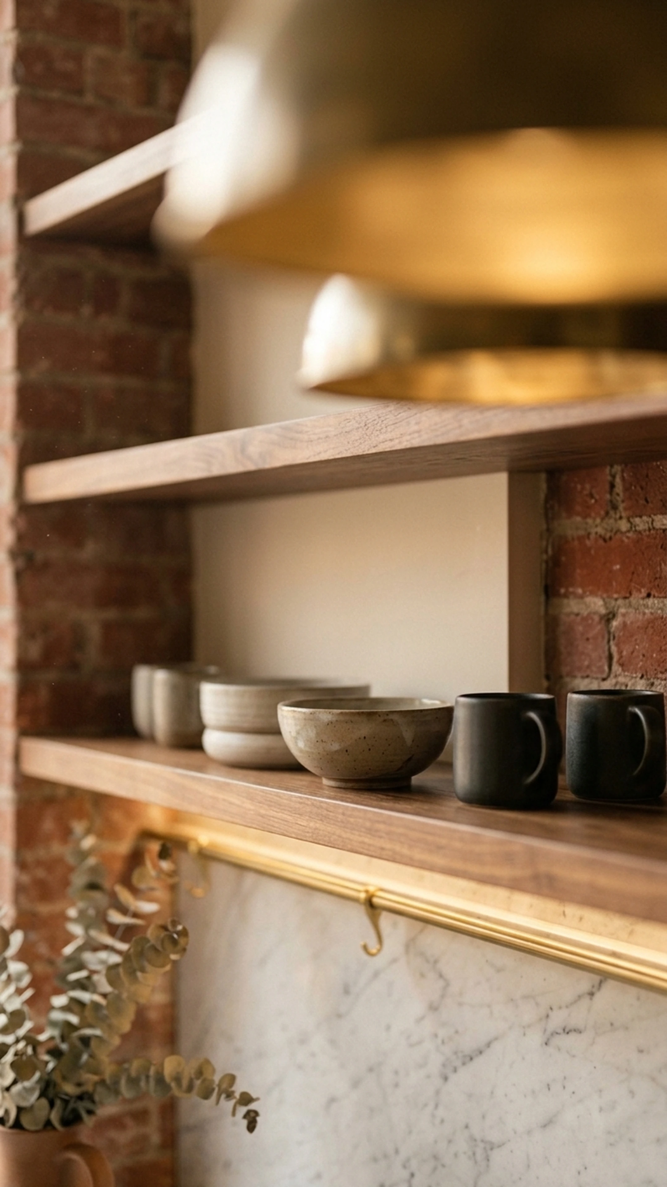
Open shelving in a Meyers kitchen is not primarily a storage solution. It is a communication device. It tells anyone who walks into the room that real people live here, they cook, they have good taste, and they are not trying too hard. The shelves display white dishware, glassware, cookbooks, ceramic canisters, copper pots, and small plants. Everything on the shelf is either beautiful, useful, or both.
Room's guide to the Meyers aesthetic notes that these kitchens feel lived in by real people, with pretty but functional decor displayed rather than hidden. This is a deliberate design choice. The mistake most homeowners make is treating open shelving as a storage decision rather than a styling decision.
The right density sits between a well-edited bookshelf and a still life painting. Too much and it reads as clutter. Too little and it reads as staged. The goal is a shelf that looks like someone with excellent taste put things there because they use them.
A Reliable Styling Formula
For one shelf, a workable formula is:
- One stack of white or neutral plates, bowls, or pitchers
- One or two glasses or small vessels in clear or warm-toned glass
- One cookbook or small stack of books with attractive spines
- One small plant or dried botanical
- One object with texture: a woven basket, a ceramic pitcher, a wooden board
Repeat with variation across shelves. Keep the color palette consistent with the rest of the kitchen. The objects should feel like they belong to the same person, not like they were sourced from three different aesthetic directions.
For homeowners who want help translating a specific Meyers film kitchen into a shoppable list of real objects and pieces, First Chair allows you to upload a reference image and receive curated recommendations across multiple retailers, so the room feels layered rather than sourced from a single catalog.
Functional Luxury: High-End Materials That Work for Real Life
Countertops: Resolving the Marble Question
Marble is the aspirational choice and it appears throughout Meyers' film kitchens. In real life, it etches, stains, and requires sealing. For most homeowners, the better answer is a high-quality quartz that reads like marble. Caesarstone, Silestone, and Cambria all offer options in the warm white and soft grey range that hold up to daily cooking without the anxiety.
If you want real stone, quartzite is a more durable alternative to marble with similar visual warmth. Honed finishes read more Meyers than polished; they feel less precious and more lived-in. For islands specifically, a butcher block section alongside stone countertops adds the material contrast that makes the space feel layered rather than showroom-matched.
Cabinetry: Why Certification Matters
The health case for quality cabinetry is straightforward. Greenguard Gold-certified cabinetry guarantees low formaldehyde emissions, which matters particularly in a room where you spend significant time cooking and gathering. Beyond health, manufacturers who meet this standard tend to have tighter quality controls, which shows in finish consistency and longevity.
For the Meyers look, inset cabinetry with simple shaker or beaded inset doors reads more tailored than overlay construction. The hardware should be in aged brass or unlacquered brass. Brushed nickel and chrome both read too contemporary and too cool for this palette.
Appliances: The Case for Integration
Panel-ready and integrated appliances are a confirmed 2026 priority among design professionals, and this aligns directly with the Meyers aesthetic. In her film kitchens, appliances recede. The refrigerator is often paneled to match the cabinetry. The dishwasher disappears. The range is the one appliance that earns visual attention, typically a professional-style range in white, cream, or stainless with a substantial hood above it.
Brands like La Cornue and Lacanche occupy the high end of this category. At a more accessible price point, Bertazzoni and Smeg offer ranges that fit the aesthetic. Pair with ENERGY STAR-rated appliances elsewhere to reduce energy consumption without compromising the look.
The table below summarizes the key material decisions and their practical trade-offs:
| Element | Aspirational Choice | Practical Alternative | What to Avoid |
|---|---|---|---|
| Countertops | Calacatta marble | Warm-toned quartz (Caesarstone, Cambria) | Cool grey or stark white quartz |
| Cabinetry | Custom inset, Greenguard Gold certified | Semi-custom shaker, certified low-VOC | Flat-front, high-gloss, or thermofoil |
| Island surface | Honed marble or quartzite | Butcher block section plus quartz | Laminate or overly veined dramatic stone |
| Flooring | Wide-plank white oak | Engineered hardwood in warm tone | Dark espresso stain, cool grey tile |
| Hardware | Unlacquered or aged brass | Brushed brass, warm bronze | Matte black in warm-palette kitchens; chrome |
| Appliances | Panel-ready integrated | Smeg or Bertazzoni in cream or stainless | Stainless-heavy, commercial-looking setups |
Kitchen Layout and Flow: Designing for Both Beauty and Practicality
The Island as the Organizing Principle
In nearly every Meyers kitchen, the island is the heart of the space. It is large enough to seat three or four people on one side, with prep space on the other. It often has a different material or finish than the perimeter cabinetry, functioning more like a piece of furniture than a built-in. This distinction matters: a furniture-like island with turned legs or paneled sides reads as collected and considered. A standard built-in island reads as a kitchen.
For homeowners with sufficient square footage, a furniture-like island with a butcher block or marble top and seating on one end is the single highest-impact change toward this aesthetic. If the kitchen is smaller, a rolling butcher block island from CB2 or Crate and Barrel can approximate the effect without a full renovation. The First Chair guide to small apartment furniture covers the proportional logic that applies equally to kitchen island planning in tighter spaces.
Circulation and Gathering Zones
Meyers kitchens feel generous because they are designed with circulation in mind. There is room to move around the island while someone is seated at it. There is a clear path from the range to the sink. The work triangle (sink, stove, refrigerator) is respected, but the space around it is not compressed.
The 2026 report notes that secondary prep spaces, sculleries, and butler's pantries are among the most in-demand features in higher-end homes right now, tied with induction cooktops at 47% of expert citations each. A scullery keeps the main kitchen visually calm during entertaining, which is very much in the Meyers spirit: the primary kitchen should look like it is always ready for company.
Seating as a Layout Decision
Every Meyers kitchen has seating, and its placement is a layout decision, not an afterthought. Counter stools at the island, a banquette in a breakfast nook, or a small table near a window all serve the same purpose: they invite people to stay. The kitchen should have a place where someone can sit with a glass of wine while you cook without being in the way.
Counter stools in natural linen, leather, or rattan fit the palette. A banquette with a cushion in a warm stripe or solid linen is even more Meyers. The seating should feel comfortable enough to sit in for an hour, not just for the duration of a quick breakfast.
Hardware, Fixtures, and Finishing Touches That Define the Aesthetic
Hardware: The Case for Brass
Unlacquered brass hardware ages beautifully and reads warm and considered without being trendy. It is the most consistent hardware choice across Meyers-inspired kitchens, and it works with cream, pale grey, and warm white cabinetry equally well. The patina it develops over time is part of the point: it looks more collected and less showroom with each passing year.
If unlacquered brass feels like too much maintenance, brushed brass or antique brass from Rejuvenation or Anthropologie Home are reliable alternatives. Avoid mixing metal finishes extensively. One primary metal with a secondary accent is the cleaner approach. The hardware should feel like it belongs to the room, not like it was selected from a different mood board.
Plumbing Fixtures: The Farmhouse Sink
The farmhouse or apron-front sink is one of the most recognizable elements of the Meyers kitchen. A large, single-basin fireclay sink in white or off-white, paired with a gooseneck faucet in unlacquered brass or polished nickel, is the combination that appears most consistently across her film kitchens and their real-world interpretations.
Brands like Rohl, Kohler, and Shaws Original offer farmhouse sinks at various price points. The faucet matters as much as the sink. A thin, contemporary faucet on a farmhouse sink creates a visual mismatch that undermines the whole effect. The faucet should have weight and presence.
The Objects on the Counter
This is where most kitchens either land the aesthetic or lose it entirely. The Meyers counter is not empty, but it is not cluttered. It contains objects that are both beautiful and functional: a wooden cutting board leaning against the backsplash, a ceramic bowl of lemons or apples, a small potted herb, a canister or two, a cookbook open or stacked.
Home's Meyers style guide identifies copper pots, white porcelain dishware, woven baskets, linen textiles, and framed art as the key styling tools for this aesthetic. The goal is a kitchen that looks like someone with excellent taste actually cooks in it. Everything earns its place, and nothing is there purely for decoration.
Creating a Welcoming Gathering Space: The Heart of the Home
Why the Kitchen Needs to Feel Like a Room
The Nancy Meyers kitchen is not just a place to cook. It is the room where the movie happens. Characters gather there, have difficult conversations, make breakfast at midnight, and fall in love over a glass of wine. That quality is not accidental. It is the result of treating the kitchen like a living space rather than a utility space.
This means a small lamp on a counter or shelf for evening ambiance. A piece of art or a framed print on an available wall. Fresh flowers or a potted plant, always. Textiles: a linen dish towel, a runner, a cushion on a stool. Books that are actually read, not just styled. These are not expensive changes. They are intentional ones. And intention is exactly what the Meyers aesthetic communicates.
For homeowners working through a kitchen refresh or a larger renovation, First Chair is built for exactly this kind of moment. You can describe your aesthetic direction, upload your reference images, and receive a curated room concept built from real pieces across West Elm, CB2, Crate and Barrel, Pottery Barn, and Lulu and Georgia, so the room feels layered rather than sourced from a single catalog.
Making the Transition From Functional to Welcoming
The shift from a functional kitchen to a welcoming one requires a few specific decisions:
- Add a lamp. A small lamp on a counter or shelf changes the entire feel of the room after 6pm. It is the single cheapest change with the highest aesthetic return.
- Put art on the walls. A kitchen with art on the walls reads as a room. A kitchen without art reads as a kitchen.
- Keep fresh flowers or a plant. This is not optional in a Meyers kitchen. A bowl of lemons or a small potted herb on the counter costs almost nothing and communicates everything.
- Use textiles. A linen dish towel hanging from an oven handle, a runner on the island, a cushion on a stool. Textiles add warmth and softness that no hard material can replicate.
For more on the principles of intentional layering that apply across a home, the First Chair guide to decorating a new apartment covers the same logic in a broader room context.
Tools and Solutions for the Meyers-Inspired Kitchen
The following categories cover the primary product decisions in a Meyers-style kitchen, with representative brands at each tier.
Countertop and Surface Materials
The surface category divides into engineered stone (durable, low-maintenance, marble-adjacent) and natural stone (authentic, requires care). Both can work within the Meyers palette if chosen in warm tones.
- Caesarstone: Offers durable quartz surfaces with guidance on sustainable kitchen materials, including options in warm white and soft grey ranges that read marble-adjacent.
- Cambria and Silestone: Both offer warm-toned quartz options suitable for the Meyers palette, with strong durability profiles for daily cooking use.
- Specialty surfaces: Recycled glass, concrete, and paper composite countertops (highlighted by Sunnyfields Cabinetry) deliver eco-friendly options that fit the Meyers look when chosen in soft, classic tones.
Cabinetry and Storage Systems
Cabinetry is the largest visual element in the kitchen and the one that most directly establishes the palette.
- Custom and semi-custom manufacturers with Greenguard Gold certification: The NAR-recommended standard for low formaldehyde emissions; look for this certification when evaluating any cabinetry manufacturer.
- Sunnyfields Cabinetry: Emphasizes reclaimed wood and low-VOC finishes for eco-friendly kitchens, aligning with both the Meyers aesthetic and sustainability standards.
- Kitchen Distributors: Publishes guidance on sustainable material selection and low-VOC finishes, useful for homeowners evaluating semi-custom options.
Appliances
The appliance category in a Meyers kitchen is governed by one principle: the range earns attention, everything else disappears.
- La Cornue and Lacanche: High-end professional ranges in cream, white, and custom colors that function as the visual centerpiece of the kitchen.
- Bertazzoni and Smeg: More accessible price points with similar aesthetic sensibility; both offer ranges in cream and stainless that fit the Meyers palette without the La Cornue investment.
- Panel-ready integrated appliances: Sub-Zero, Miele, and Bosch all offer panel-ready refrigerators and dishwashers that disappear into cabinetry, consistent with the 2026 KBIS trend toward appliances that blend into the interior design.
Lighting Fixtures
Lighting is where the aesthetic either succeeds or fails at the fixture level.
- Rejuvenation: Carries pendant and sconce styles in aged brass and warm bronze that fit the Meyers aesthetic without veering into farmhouse territory.
- Anthropologie Home: Offers decorative fixtures in rattan, woven materials, and warm metals suitable for island pendants and accent lighting.
- Visual Comfort and Circa Lighting: Both carry higher-end decorative fixtures in the warm metal finishes and classic forms that suit this aesthetic.
Hardware and Plumbing Fixtures
- Rejuvenation and Anthropologie Home: Both carry cabinet hardware in unlacquered brass, brushed brass, and antique brass at accessible price points.
- Rohl and Shaws Original: Farmhouse sinks in fireclay at various price points, with the weight and presence the aesthetic requires.
- Waterworks: Higher-end plumbing fixtures in unlacquered brass and polished nickel, including gooseneck faucets suited to farmhouse sinks.
Design and Shopping Guidance
For homeowners who want help translating inspiration into a specific, shoppable room plan, the tools in this category bridge the gap between reference images and actual purchase decisions.
- First Chair: An AI-assisted interior design and shopping platform that allows users to upload photos of spaces they love, including Meyers film kitchens or real-world references, and receive curated room concepts built from real pieces across multiple retailers. Unlike tools that generate fantasy renders, every recommendation is grounded in furniture and decor that can actually be purchased. First Chair pulls across West Elm, CB2, Crate and Barrel, Pottery Barn, and Lulu and Georgia, which matters when the right room rarely comes from a single catalog. Member pricing is available on most pieces.
Best Practices for the Meyers-Inspired Kitchen
1. Start with the color palette and commit to warmth. The palette is the foundation. Soft creams, warm greys, and muted pale blues are the base. Cool whites, grey-blues, and stark whites will fight everything else you do. Test paint colors in natural light at different times of day before committing.
2. Design the island as a furniture piece, not a built-in. A furniture-like island with paneled sides, turned legs, or a contrasting material top reads as collected and considered. A standard built-in island, however well-made, reads as a kitchen. The distinction is visible immediately.
3. Layer the lighting before the renovation is finished. Lighting decisions are easiest and cheapest to make during construction. Plan for pendants over the island, under-cabinet strips, and at least one accent light source before the walls close. Dimmers on every circuit.
4. Mix natural materials for depth, but keep the palette calm. Marble or quartz countertops, butcher block on the island, warm wood flooring, woven baskets, copper accents. The materials should vary; the color palette should not. Everything should read as belonging to the same warm, considered world.
5. Display beautiful everyday objects instead of hiding everything. The lived-in quality of a Meyers kitchen is intentional. Copper pots, ceramic bowls, cookbooks, fresh flowers, wooden boards: these are design elements, not clutter. Edit carefully, but do not clear the counters.
6. Choose hardware in aged or unlacquered brass and do not mix metals extensively. One primary metal with a secondary accent is the cleaner approach. Unlacquered brass ages beautifully and reads more collected over time, not less.
7. Plan seating into the layout from the beginning. Counter stools at the island, a banquette, or a small table near a window: the kitchen needs a place where people can stay. Seating is a layout decision, not an afterthought.
8. Use low-VOC paints and Greenguard Gold-certified cabinetry. The health and quality case for these choices is well-documented. They also tend to come from manufacturers with tighter quality controls, which shows in finish consistency over time.
Common Mistakes That Undermine the Aesthetic
Using stark white instead of warm white. The difference between Benjamin Moore Chantilly Lace and White Dove is subtle on a paint chip and significant on a cabinet door. Cool whites read clinical. The fix is simple: test warm whites and creamy whites before committing, and compare them against your stone and flooring samples in natural light.
Relying on recessed cans as the only light source. A grid of overhead cans produces even, functional illumination and no warmth. The consequence is a room that looks like a kitchen, not a gathering space. The fix: add pendants over the island, under-cabinet strips, and at least one lamp somewhere in the room.
Over-editing the counters. Empty counters look staged. A Meyers kitchen has objects on it. The consequence of over-editing is a room that feels cold and impersonal, the opposite of the aesthetic. The fix: add a wooden cutting board, a bowl of fruit, a small plant, and a cookbook. Start there.
Matching everything too precisely. A kitchen where every element is from the same collection, in the same finish, at the same price point, reads as a showroom. The consequence is a room that looks assembled rather than collected. The fix: mix sources, mix materials, mix price points. The island should feel slightly different from the perimeter cabinetry.
Choosing the wrong stone. Cool grey veining, dramatic black-and-white marble, or overly busy patterns all fight the Meyers palette. The consequence is a countertop that draws attention to itself rather than contributing to the warmth of the room. The fix: choose stone with warm undertones, soft veining, and a honed finish.
Installing the wrong faucet on a farmhouse sink. A thin, contemporary faucet on a farmhouse sink creates a visual mismatch that undermines both elements. The consequence is a sink that looks like a mistake rather than a focal point. The fix: pair the farmhouse sink with a gooseneck faucet in unlacquered brass or polished nickel that has weight and presence.
Skipping the accent lighting layer entirely. Many homeowners add pendants over the island and stop there. The consequence is a room that looks better than a standard kitchen but still lacks the evening warmth of a Meyers kitchen. The fix: add a small lamp somewhere in the kitchen, even if it is just on a shelf or a counter corner.
Treating the kitchen as a utility space rather than a room. No art on the walls, no textiles, no plants, no books. The consequence is a kitchen that functions well and feels like nothing in particular. The fix: add one piece of art, one textile, and one plant. These three additions cost almost nothing and communicate everything.
Frequently Asked Questions
What makes a Nancy Meyers kitchen different from a standard neutral kitchen?
The Meyers kitchen is defined by a specific system: warm neutral color palettes (creamy whites, pale blues, warm greys), layered lighting from multiple sources, furniture-like islands, mixed natural materials, and deliberately displayed everyday objects. A standard neutral kitchen may share the color palette but typically lacks the layered lighting, the material mixing, and the lived-in styling that give Meyers kitchens their warmth and character.
How much does it cost to recreate a Nancy Meyers-inspired kitchen?
The range is wide. A full renovation with custom cabinetry, natural stone countertops, a professional range, and panel-ready appliances can run well into six figures. A partial refresh, covering paint, hardware, lighting, and open shelving styling, can shift the feel of a kitchen significantly for a few thousand dollars. The highest-impact changes per dollar spent are paint color, lighting (adding pendants and a lamp), hardware replacement, and counter styling.
Do you need a large kitchen to achieve this aesthetic?
No. The Meyers aesthetic is about warmth, layering, and intentionality, not square footage. A smaller kitchen can achieve the same feel through warm paint colors, layered lighting, a rolling butcher block island, open shelving, and careful counter styling. The proportions of the furniture and fixtures need to be appropriate for the space, but the aesthetic itself is not dependent on size.
Is marble necessary for a Meyers-style kitchen?
No. Marble is the aspirational choice and it appears in her film kitchens, but high-quality quartz in warm white and soft grey tones from brands like Caesarstone and Cambria delivers a very similar visual result with significantly better durability for daily cooking. Quartzite is a natural stone alternative with more durability than marble and similar warmth. The key is choosing stone with warm undertones and a honed finish, not the stone type itself.
What is the single most important change for a Meyers-inspired kitchen?
If forced to choose one: lighting. Specifically, adding pendants over the island and at least one lamp somewhere in the kitchen. The palette and the materials matter, but a warm, layered lighting system is what separates a kitchen that looks designed from one that merely has nice finishes. Most kitchens are over-lit from above and under-lit everywhere else. Fixing this changes the feel of the room more than any other single change.
How do I style open shelving without it looking cluttered or staged?
The key is density and consistency. Each shelf should contain a mix of functional objects (stacked plates, glasses, a pitcher) and textural objects (a woven basket, a wooden board, a small plant), all within the same warm, neutral color palette as the rest of the kitchen. Avoid too many small objects; group things in threes or stack them vertically. The goal is a shelf that looks like someone with good taste put things there because they use them, not because they were arranging a photo.
Conclusion: From Reference Image to Real Kitchen
The Nancy Meyers kitchen is achievable. Not because it is simple, but because its logic is consistent and learnable. Warm neutrals over stark white. Layered lighting over single-source overhead cans. Furniture-like islands over standard built-ins. Mixed natural materials over matched surfaces. Displayed everyday objects over cleared counters. Brass hardware over brushed nickel. Seating that invites people to stay.
These are not expensive principles. They are intentional ones. And the gap between a kitchen that looks almost right and one that actually feels like a Meyers kitchen is almost always a gap in intention, not in budget.
The 2026 kitchen design market is moving firmly in this direction: warmer, more personal, more considered. Homeowners renovating now are not chasing a trend. They are investing in a direction that the broader design industry has already confirmed.
If you are ready to move from inspiration to a specific, shoppable room plan built around your actual kitchen, First Chair is the place to start. Upload your reference images, describe your aesthetic direction, and receive curated recommendations from real pieces across multiple retailers. No fantasy renders. No endless tabs. Just the room you have been trying to make, built from furniture and objects that actually exist.