
You signed a lease in Los Angeles six months ago. The apartment has good bones, decent light, and a layout you can work with. But every time you walk in, it feels like someone else's place. You've been saving the same kind of rooms on Pinterest for two years: dark walls, warm lighting, minimal furniture, a sense of atmosphere that feels personal rather than staged. You know exactly what you want. You just can't figure out how to build it.
Billie Eilish's aesthetic has become one of the most referenced design directions among younger homeowners, and not because it's expensive or difficult to source. It resonates because it feels intentional. Dark palettes, layered lighting, edited surfaces, and a room that communicates something about the person living in it. The principles behind it are genuinely accessible. You don't need a Highland Park budget to pull them off. You need a clear framework and the discipline to stop buying things that almost work.
This guide breaks down the core design elements of Billie Eilish's home aesthetic and shows you how to recreate them in a real apartment or house, with real paint colors, real furniture, and a realistic approach to budget. The goal is not inspiration. You already have that. The goal is execution.
What you'll learn:
- How to define and apply dark minimalism as a design system, not just a mood
- Which paint colors, finishes, and wall treatments work best in this aesthetic
- How to build a layered lighting plan that makes a dark room feel warm instead of oppressive
- Which furniture shapes, materials, and price tiers work together in this style
- The sustainable material choices that also happen to be better design choices
- The most common mistakes that undermine the aesthetic and how to avoid them
- How to find real, shoppable pieces that work together across multiple retailers
Key Takeaways
- Searches for "moody room aesthetic" doubled year-over-year on Pinterest's 2024 trends data, confirming this is a mainstream design direction, not a niche subculture.
- Dark minimalism works best when it starts with one feature wall in charcoal, deep navy, or forest green before committing to a full room.
- Warm white LEDs in the 2700 to 3000K range are non-negotiable in dark spaces. Cool lighting at 4000K and above kills the atmospheric quality entirely.
- Texture does more work than color in a moody room. Velvet, matte wood, linen, and concrete create depth without visual noise.
- LEDs now account for over 50% of installed residential lighting in the U.S. making color-changing smart lighting more affordable and accessible than it has ever been.
- The biggest single mistake is painting walls dark without a lighting plan. The room ends up feeling like a basement, not a considered space.
- 61% of millennials say they seek products with reduced environmental impact for their homes. Sustainable material choices in this aesthetic are also better design choices.
- First Chair helps you find real, shoppable pieces across West Elm, CB2, Crate and Barrel, and other retailers so your dark minimalist room feels collected rather than assembled from a single catalog.
What Dark Minimalism Actually Is
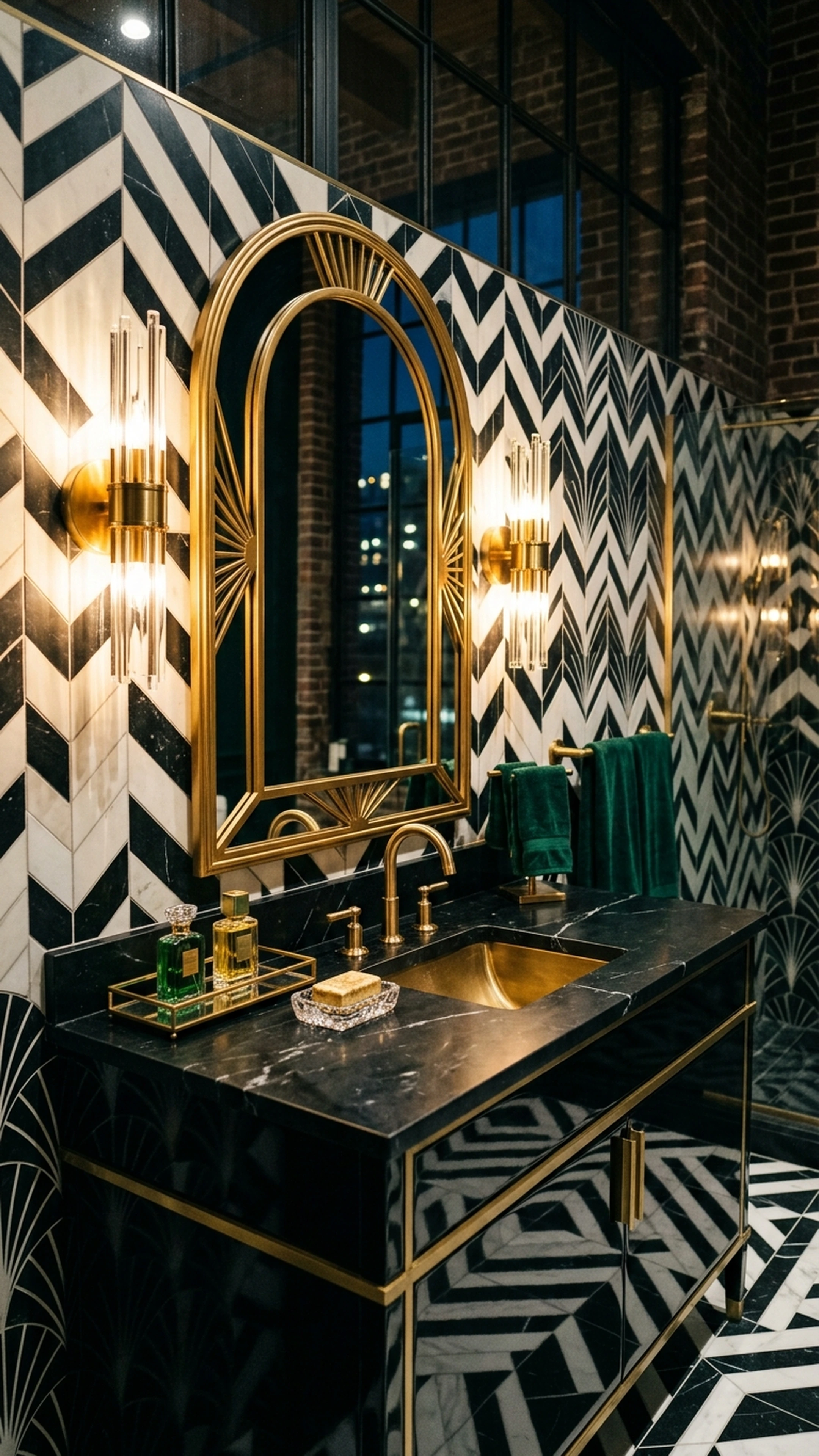
Dark minimalism is a design style that combines minimalist layouts (few, functional pieces with decluttered surfaces) with dark, saturated palettes such as black, charcoal, deep forest green, and navy, layered with rich textures and dramatic lighting to create intimacy and atmosphere without visual clutter.
It is not gothic maximalism. It is not a room full of black furniture, neon signs, and band posters competing for attention. It is restraint with depth. The distinction matters because most attempts to recreate this aesthetic fail by adding too much rather than editing enough.
Billie Eilish's Highland Park home, documented across multiple architectural profiles, reflects this balance clearly. The spaces are quiet. The furniture is considered. The lighting does most of the emotional heavy lifting. Personal objects are present, but they're edited. Nothing is there by accident.
WGSN's 2025/26 interiors forecast identifies this direction under the labels "Neo Noir" and "Dark Opulence": layered black and deep color, sculptural furniture, and dramatic lighting within calm, minimal layouts. The trend has moved well past early adopters. Over 50% of U.S. homeowners aged 25 to 34 cite social media as their primary design inspiration source, with celebrity homes among the most-saved references.
The key insight is this: the aesthetic is replicable because it is built on principles, not price tags.
Why This Aesthetic Is Having a Moment Right Now
Several converging forces have made dark minimalism the dominant design direction for younger homeowners in 2026.
The first is a direct reaction to the all-white minimalism that dominated the previous decade. That aesthetic aged into something that felt cold, impersonal, and difficult to maintain. Dark palettes feel warmer, more forgiving, and more expressive of individual identity. Pinterest's 2024 Home Trends data shows searches for "moody room aesthetic" doubled year-over-year, and searches for "dark gothic bedroom" tripled. That is not a niche signal.
The second force is the maturation of smart lighting technology. The U.S. Department of Energy estimates that LEDs now account for over 50% of installed residential lighting, up from 19% in 2018. Color-changing LED strips, smart bulbs, and modular light panels are now affordable enough that layered, programmable lighting is accessible to renters and first-time homeowners, not just people doing full renovations.
The third force is the broader shift toward personalized, identity-driven spaces among millennials and Gen Z. Millennials contributed roughly 45% of growth in U.S. home-related spending between 2019 and 2023, with decor and DIY being key categories. This cohort is not buying rooms. They are building environments that reflect who they are.
The fourth force is sustainability. A 2023 Deloitte study found that 61% of millennials seek products with reduced environmental impact for their homes. The materials that work best in dark minimalism (matte wood, organic textiles, durable stone and concrete) tend to be the same materials with lower lifecycle environmental impact. The aesthetic and the values align.
Dark and Moody Color Palettes: Where to Start
Choosing the Right Dark Paint Colors
The single most consistent recommendation across every dark minimalism resource is to start with one feature wall, not a full room repaint. A single wall in charcoal, deep navy, or forest green adds drama without making the space feel smaller or oppressive. Live with it for a few weeks before committing to more.
For paint selection, the brands worth knowing at different price tiers:
Price TierBrandRecommended LinesNotable ColorsBudgetBehr (Home Depot)Marquee, DynastyDeep navy, charcoal, forest greenMid-rangeBenjamin MooreAura, RegalBlacks, charcoals, deep neutralsMid-rangeSherwin-WilliamsEmerald, DurationIron Ore, PeppercornPremiumFarrow and BallStandard rangeRailings, Studio Green
Sherwin-Williams "Iron Ore" and "Peppercorn" appear in more dark minimalist interiors than almost any other colors. Farrow and Ball "Railings" shows up constantly in higher-end references. The depth of color in Farrow and Ball is genuinely different from mass-market options, but it comes at a significant price premium. For a feature wall, it may be worth it. For a full room, the mid-range options perform well.
A practical health consideration: the U.S. Environmental Protection Agency notes that indoor VOC concentrations are often 2 to 5 times higher than outdoor levels. Low-VOC formulas are not just a sustainability preference. In smaller apartments with limited ventilation, they matter.
Texture Over Pattern
Once the wall color is decided, texture becomes the primary design tool. Dark minimalism practitioners consistently recommend mixing velvet, leather, matte wood, stone, concrete, and linen to create depth while keeping the visual field calm. Busy patterns compete with a dark palette. Texture works with it.
A velvet sofa in charcoal or deep olive. A linen throw in warm cream. A matte wood coffee table with visible grain. These combinations create the layered, collected feeling that makes a dark room feel warm rather than cold.
Avoid high-gloss black surfaces. They show every fingerprint, reflect light in ways that feel clinical, and undermine the matte, atmospheric quality that makes dark minimalism work. Matte and textured finishes are the right call at every price point.
Wall Treatments Beyond Paint
For a more textured wall finish, Portola Paints offers limewash and Roman clay finishes that create depth and movement on a wall without pattern. These finishes have become common in moody minimalism projects because they add visual complexity while keeping the palette controlled. They are also more forgiving than flat paint in terms of application and touch-ups.
Lighting Design: The Element That Makes or Breaks the Room
Layered Lighting as a System
Lighting is not an afterthought in a dark room. It is the room. The difference between a moody, atmospheric space and a depressing one is almost entirely lighting, and this is the section most people skip when they start planning.
The framework used by interior designers is straightforward:
- Ambient lighting: general, overall light in a room (ceiling fixtures, recessed lights)
- Task lighting: focused light for specific activities (reading lamps, desk lights)
- Accent lighting: highlights specific features (LED strips on shelves, art lights, floor uplights)
A Billie-style room uses all three, with accent lighting doing the most expressive work. The goal is to eliminate the single overhead light as the primary source and replace it with a layered system where you control the mood by controlling which layers are active.
Warm White Is Non-Negotiable
Cool LEDs at 4000K and above make dark rooms feel clinical rather than atmospheric. The American Academy of Sleep Medicine also notes that blue-rich light before bed suppresses melatonin and delays sleep onset. For bedrooms especially, warm white (2700 to 3000K) or amber lighting is the right call on both design and health grounds.
For smart and color-changing options, the landscape breaks down by budget:
- Philips Hue: the most reliable ecosystem for smart bulbs and LED strips, controllable via app or voice, with warm white and saturated color options. The starter kits are a reasonable investment for a primary living space.
- Govee: budget-friendly RGBIC LED strips and neon rope lights that have become a staple in Gen Z room setups. Quality has improved significantly. A solid option for accent lighting in secondary spaces.
- Nanoleaf: modular light panels used as graphic wall features, particularly effective in music-oriented rooms where the lighting itself is part of the visual composition.
Switching to LED with dimming controls can reduce lighting energy use by 30 to 40% in residential settings. Smart lighting is not just an aesthetic upgrade. It is a practical one.
One safety note: the U.S. Consumer Product Safety Commission warns that many imported decorative LED products lack proper safety certification. When buying neon-style or LED strip lighting, look for UL or ETL marks. This is especially relevant when purchasing from marketplace sellers where product sourcing is unclear.
Statement Fixtures as Sculpture
Beyond strips and smart bulbs, the fixture itself matters. West Elm and CB2 both carry sculptural floor lamps, sconces, and pendants in matte black, aged brass, and smoked glass that work well in dark minimalist rooms. A single strong floor lamp in the corner of a living room does more for the atmosphere than three mediocre ceiling fixtures. In a minimal room, the lamp is also a piece of furniture.
Minimalist Bedroom Design: The Billie Eilish Approach
Editing the Room Down
A Princeton University Neuroscience Institute study found that visual clutter competes for attention and increases stress. This is the cognitive science case for minimalism, and it is also the reason Billie Eilish's bedroom aesthetic resonates: it feels calm because it is calm. There is nothing extra.
The practical application is ruthless editing. Keep surfaces clear. Use closed storage in dark finishes. A platform bed with integrated storage eliminates the need for a separate dresser. A single piece of wall art, chosen carefully, does more than a gallery wall of smaller prints.
For furniture, the pieces worth considering at different price points:
Price TierSourceWhat Works WellBudgetIKEADark-tone shelving, platform beds, minimal sofasMid-rangeArticleClean lines, darker upholstery, solid constructionDesign-forwardCB2, West ElmSculptural shapes, matte finishes, considered proportionsStatement piecesDesign Within Reach, HAYHero sofas, lounge chairs, long-term investments
Skip the matched five-piece bedroom set. It makes the room look staged rather than lived in, and it is the fastest way to undermine the collected quality that makes dark minimalist spaces feel personal.
Music-Centric Spaces
IKEA's 2023 Life at Home Report found that 29% of people aged 18 to 34 say their home needs to be a place where they can immerse themselves in music and media. This is central to the Billie Eilish aesthetic: the room is designed around listening.
A dedicated listening corner with a quality speaker, warm accent lighting, and a comfortable chair is one of the most achievable and highest-impact moves in this style. Sonos works well for design-conscious setups where the speaker is part of the visual composition. JBL offers solid quality at a lower price point. The speaker does not need to be hidden. In a minimal room, a well-chosen speaker becomes part of the furniture arrangement.
For more on furniture proportions in small spaces, understanding clearances and scale before you buy anything will save you from the most expensive mistakes.
Furniture Selection: Statement Pieces Over Sets
Why Matching Sets Work Against You
The approach that works in dark minimalism: choose one or two strong anchor pieces and build around them. A chunky, low-profile sofa in deep charcoal or olive. A sculptural floor lamp. A coffee table in matte wood or concrete. These pieces do the heavy lifting. Everything else supports them.
Low-profile, clean-lined silhouettes work better than ornate or heavily detailed pieces. Track-arm sofas, platform beds, and simple rectangular coffee tables in matte wood or concrete are consistent choices across dark minimalist references. The room should feel collected over time, not purchased as a package.
For wall art and music-centric decor, Society6 and Etsy both carry dark, surreal, and music-inspired prints that fit the aesthetic without requiring a gallery budget. Displate offers metal posters with moody graphic designs that work particularly well in this style.
Balancing Statement Pieces with Functionality
The practical constraint most people face is that a dark minimalist room still needs to function. Storage, seating capacity, surface space. The solution is furniture that does double duty: storage ottomans, platform beds with drawers, shelving that holds both objects and books.
The clearance rules still apply regardless of aesthetic. Maintain 15 to 18 inches between a sofa and coffee table. Do not push furniture against every wall in a small room. Dark minimalism requires breathing room to work. A crowded dark room just feels heavy.
For guidance on avoiding costly furniture mistakes, the data on what goes wrong most often is worth reviewing before you start buying.
Sustainable and Eco-Friendly Materials
Why Material Choice Matters Here
The materials that work best in dark minimalism tend to be the same materials with lower lifecycle environmental impact. FSC-certified wood, organic textiles, and recycled content materials tend to have the matte, natural quality that works well in this aesthetic. The values and the design direction align.
Specific options worth knowing:
- Coyuchi: organic cotton and wool bedding and throws in neutral tones that layer well over dark furniture.
- Parachute Home: OEKO-TEX certified textiles, particularly their linen and cotton bedding in warm neutrals.
- West Elm's FSC program: certain collections use certified wood, which matters when you are buying a piece you intend to keep for a decade.
ThredUp's 2023 Resale Report found that 36% of U.S. consumers bought second-hand furniture or home goods in 2022, with Gen Z and millennials leading the category. Chairish and 1stDibs are the right platforms for finding vintage and pre-owned pieces with the sculptural quality that works in dark minimalist rooms. A vintage lounge chair in worn leather does more for this aesthetic than a new one at the same price point.
The Global Alliance for Buildings and Construction reports that buildings and construction account for roughly 37% of global energy-related CO2 emissions. Dark interiors that rely heavily on artificial lighting should be planned with LED and smart controls to avoid unnecessary energy load. The aesthetic and the efficiency case point in the same direction.
Tools and Solutions for Building This Room
The tools and vendors below cover the full stack of what you need to execute a dark minimalist room at a realistic budget.
Paints and Wall Treatments
- Benjamin Moore (Aura and Regal lines): low-VOC formulas with excellent coverage on dark tones. Widely available through independent paint retailers.
- Sherwin-Williams (Emerald and Duration lines): "Iron Ore" and "Peppercorn" are among the most-used colors in this aesthetic. Available at Sherwin-Williams locations and select home improvement stores.
- Farrow and Ball: "Railings" and "Studio Green" appear constantly in high-end dark interior references. The depth of color is genuinely different. Worth the premium for a feature wall.
- Portola Paints: limewash and Roman clay finishes for textured wall treatments that add depth without pattern.
Smart and Accent Lighting
- Philips Hue: the most reliable smart lighting ecosystem for bulbs and LED strips. Warm white and saturated color options, controllable via app or voice.
- Govee: budget-friendly RGBIC LED strips and neon rope lights. Solid quality for accent lighting in secondary spaces.
- Nanoleaf: modular light panels used as graphic wall features. Particularly effective in music-oriented rooms.
Furniture and Decor
- IKEA: affordable minimalist furniture in dark tones. A solid foundation for a first apartment or budget-constrained build.
- Article: mid-price modern furniture with clean lines and darker upholstery options. Good construction at a reasonable price point.
- CB2 and West Elm: sculptural shapes, matte finishes, and considered proportions. The right tier for anchor pieces you intend to keep.
- Design Within Reach and HAY: higher-end modern designs for hero pieces. Long-term investments in sofas and lounge chairs.
Wall Art and Music-Centric Decor
- Society6: prints, tapestries, and art featuring dark, surreal, and music-inspired motifs. Accessible price points.
- Etsy: independent makers selling dark decor, moody prints, and music-inspired pieces. Good source for pieces that feel personal rather than mass-produced.
- Displate: metal posters with moody graphic designs. Works particularly well in this aesthetic.
Sound and Immersive Tech
- Sonos: networked speakers for whole-home audio. Frequently used in design-conscious setups where the speaker is part of the visual composition.
- JBL: budget-friendly speakers with solid quality. A practical option for a dedicated listening corner.
Sustainable Textiles and Materials
- Coyuchi: organic cotton and wool bedding and throws. Warm neutrals that layer well over dark furniture.
- Parachute Home: OEKO-TEX certified textiles. Linen and cotton bedding in warm neutrals.
- Chairish and 1stDibs: vintage and pre-owned furniture with sculptural quality. Often the best source for pieces that feel collected rather than purchased.
Inspiration-to-Room Execution
Finding individual pieces is one problem. Finding pieces that work together across different retailers, at different price points, is a harder one. First Chair pulls across West Elm, CB2, Crate and Barrel, Pottery Barn, and Lulu and Georgia, which matters when the right room rarely comes from a single catalog. The platform interprets layered aesthetic directions like "dark but warm, not gothic" or "minimal but not cold" and narrows the field to pieces that actually work together in the room you are building. Every recommendation is grounded in real, in-stock furniture you can actually buy, not renders of pieces that do not exist.
Best Practices for Dark Minimalism
1. Start with one feature wall, not a full room repaint. A single wall in charcoal, navy, or forest green adds drama without making the space feel oppressive. Live with it before committing to more.
2. Map your lighting before you paint. Decide where your ambient, task, and accent sources will be before the walls go dark. A lighting plan is not optional in this aesthetic. It is the foundation.
3. Use warm white LEDs exclusively in dark spaces. 2700 to 3000K is the range. Anything cooler makes the room feel clinical. This applies to smart bulbs, LED strips, and all fixture choices.
4. Mix textures, not patterns. Velvet, matte wood, linen, stone, and concrete create depth while keeping the visual field calm. Busy patterns compete with a dark palette rather than working with it.
5. Invest in one or two strong anchor pieces rather than many smaller items. A chunky low-profile sofa, a sculptural floor lamp, or a large piece of wall art does more for the room than a collection of smaller decorative objects.
6. Use hidden and integrated storage to keep surfaces clear. Platform beds with drawers, closed shelving in dark finishes, and storage ottomans maintain the minimalist quality without sacrificing function.
7. Balance dark elements with at least one lighter neutral. A cream throw, a warm-toned rug, or a light-colored ceiling prevents the room from feeling heavy. The contrast is what makes the dark elements read as intentional rather than oppressive.
8. Verify safety certification on decorative LED products. Look for UL or ETL marks when purchasing neon-style or LED strip lighting, particularly from marketplace sellers. The CPSC has flagged uncertified imported products as a genuine safety concern.
Common Mistakes That Undermine the Aesthetic
1. Painting everything dark without a lighting plan. This is the most common and most damaging mistake. A dark room with a single overhead fixture feels like a basement. The fix: map your layered lighting sources before the paint goes on.
2. Using cool, blue-white LEDs in dark spaces. Cool lighting at 4000K and above makes dark rooms feel clinical and kills the atmospheric quality entirely. The fix: warm white only, 2700 to 3000K, across every light source in the room.
3. Over-decorating and ignoring the edit principle. Too many posters, trinkets, neon items, and plants competing for attention in a small room is the opposite of minimalism. The fix: remove anything that does not earn its place. Regular editing is part of maintaining this aesthetic.
4. Blocking natural light during the day. Heavy blackout drapes make a dark space feel lifeless in daylight hours. The fix: sheer curtains in a warm neutral let light in while maintaining privacy. The dark palette should work in both natural and artificial light.
5. Choosing high-gloss black surfaces throughout. Gloss black shows every fingerprint, reflects light in ways that feel cold, and undermines the matte, atmospheric quality that makes dark minimalism work. The fix: matte and textured finishes at every price point.
6. Ignoring furniture clearances and proportions. A crowded dark room just feels heavy. The fix: maintain 15 to 18 inches between sofa and coffee table, pull furniture slightly away from walls, and choose pieces proportionate to the room's actual dimensions.
7. Buying matching furniture sets. A matched five-piece set makes the room look staged rather than collected. The fix: choose anchor pieces individually and build around them. The room should feel like it came together over time.
8. Skipping safety certification on LED products. Uncertified imported decorative LED products are a documented safety concern. The fix: look for UL or ETL marks before purchasing any neon-style or LED strip lighting.
Frequently Asked Questions
What paint colors best recreate Billie Eilish's home aesthetic?
Sherwin-Williams "Iron Ore" and "Peppercorn" are among the most-used colors in dark minimalist interiors. Farrow and Ball "Railings" and "Studio Green" appear frequently in higher-end references. For budget options, Behr Marquee at Home Depot offers a solid dark palette. Start with a single feature wall before committing to a full room repaint.
How do you make a dark room feel warm instead of oppressive?
Warm white LEDs in the 2700 to 3000K range are the most important factor. Layer ambient, task, and accent lighting rather than relying on a single overhead source. Add texture through velvet, linen, and matte wood. Include at least one lighter neutral element, such as a cream throw or warm-toned rug, to prevent the room from feeling heavy.
Can you recreate a dark minimalist aesthetic on a budget?
Yes. IKEA's dark-tone shelving, platform beds, and minimal sofas provide a solid foundation. Govee LED strips are affordable and effective for accent lighting. Society6 and Etsy carry dark, moody art prints at accessible price points. The key is editing ruthlessly and investing in one or two stronger anchor pieces rather than filling the room with many smaller items.
What furniture shapes work best in a dark minimalist room?
Low-profile, clean-lined silhouettes work better than ornate or heavily detailed pieces. Track-arm sofas, platform beds, and simple rectangular coffee tables in matte wood or concrete are consistent choices in this style. Avoid matching sets. The room should feel collected over time, not purchased as a package.
Is dark minimalism a good choice for small apartments?
It works well in small spaces when the lighting is handled correctly. A well-lit dark room with minimal furniture and clear surfaces can feel more intimate and considered than a bright room with too much in it. The clearances still matter: 15 to 18 inches between sofa and coffee table, furniture pulled slightly away from walls, and pieces proportionate to the room's actual dimensions.
How do you incorporate music and sound into a dark minimalist room?
A dedicated listening corner with a quality speaker, warm accent lighting, and a comfortable chair is the most effective approach. Sonos works well for design-conscious setups. The speaker itself can be part of the visual composition in a minimal room rather than something to conceal. Integrate smart lighting that complements the listening experience for a more immersive setup.
Conclusion: From Saved Inspiration to a Room You Can Actually Live In
The principles behind Billie Eilish's aesthetic are not complicated. Dark palette, warm layered lighting, minimal furniture with strong silhouettes, edited surfaces, and a sense that everything in the room is there because it belongs. The challenge is not understanding the principles. The challenge is executing them without ending up with a room that feels like a mood board rather than a home.
Start with one feature wall. Map your lighting before you paint. Choose one or two anchor pieces and build around them. Edit ruthlessly. The room does not need more. It needs the right things.
If you are ready to move from saved inspiration to a room you can actually build, First Chair helps you find real, in-stock pieces across multiple retailers that work together in the specific room you are trying to create. Upload a photo of a space you love, describe the direction you want, and get a curated room concept built from furniture that actually exists.
For more on how design apps approach the inspiration-to-execution gap, that comparison is worth reading before you commit to a workflow.
