
You have watched The Holiday at least twice for the interiors. You paused on Iris's Surrey cottage not to track the plot but to study the window trim, the slipcovered sofa, the way the lamp light pooled across the kitchen island. You saved a screenshot of the Hamptons house from Something's Gotta Give and filed it somewhere between your CB2 wishlist and your Pottery Barn cart. The rooms felt like something you had been designing in your head for years, warm and layered and completely livable, without a single piece that looked like it came from a showroom floor.
The good news is that the Nancy Meyers aesthetic is not a fantasy. It is a design system, and it is more reproducible than most people assume. The look is built on proportion, warmth, natural materials, and a specific philosophy about how rooms should feel to live in, not just to look at. None of that requires a film budget or a Bel Air zip code. It requires a clear understanding of what the system actually is and a disciplined approach to building it piece by piece.
This guide breaks down the core principles behind Meyers' most iconic interiors and translates them into decisions you can actually make: paint colors, furniture silhouettes, kitchen priorities, lighting strategy, and the small choices that separate a room that feels collected from one that just feels assembled. Whether you are furnishing a new home, refreshing a room that has never quite clicked, or finally replacing the starter furniture you moved in with years ago, the principles here apply directly.
Here is what you will learn:
- What the Nancy Meyers aesthetic actually is and why it has lasted across decades
- How to choose and apply the signature warm neutral palette
- Kitchen design priorities that define the look
- Furniture selection and layout principles for the collected, lived-in quality
- How to build layered lighting that transforms a room at every hour
- Budget-conscious sequencing strategies for achieving the look without a renovation
- The most common mistakes that undermine the aesthetic and how to avoid them
Key Takeaways
- The Nancy Meyers aesthetic is a design system built on warm neutrals, natural textures, generous scale, and layered lighting, not a single furniture line or paint color.
- Kitchens are the anchor of the look. Open storage, visible cookware, strong natural light, and a social island matter more than cabinet hardware or countertop material.
- The collected, lived-in quality depends on mixing vintage and contemporary pieces across multiple sources, not ordering everything from one catalog.
- Slipcovered sofas in linen or cotton, warm wood tones, and natural fiber rugs are the three furniture decisions with the highest visual impact per dollar spent.
- The most common mistake is making the room too matchy. The look depends on contrast, mixed tones, and a sense that the room was assembled over time.
- Layered lamps and warm bulbs do more for the evening quality of a Meyers-inspired room than any furniture purchase. Recessed-only lighting is the single fastest way to undermine the aesthetic.
- Stark cool whites destroy the palette immediately. The walls should read creamy and warm, not clinical.
- First Chair sources across West Elm, Pottery Barn, Crate and Barrel, and Lulu and Georgia, which matters when the right room rarely comes from a single catalog.
What the Nancy Meyers Aesthetic Actually Is
The Nancy Meyers aesthetic is a residential design philosophy centered on warm neutrals, natural materials, generous furniture scale, and rooms that feel actively lived in rather than staged for display. It is not a style label like mid-century modern or Scandinavian minimalism. It is closer to a set of values about how a home should feel: welcoming, personal, comfortable, and visually rich without being busy.
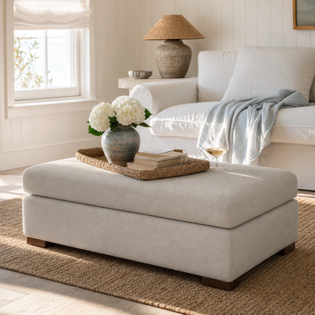
The rooms in her films share a consistent logic. Walls are creamy rather than stark white. Furniture is comfortable and slightly oversized. Kitchens are designed for real cooking and real conversation. Every surface has texture, and every room contains something that looks like it was found rather than ordered. The aesthetic is built by layering fabrics, wood tones, rugs, and antiques over a creamy neutral backdrop, which means it is achievable through furnishing decisions, not necessarily through renovation.
What makes the look feel cohesive is not any single element but the way those elements reinforce each other across a room. Warm walls read warmer because of the warm wood tones. Natural fiber rugs feel more grounded because the upholstery is linen. The lamp light feels softer because the palette absorbs rather than reflects it. The system works because every decision supports the same underlying goal: a room that feels like someone actually lives there.
The Philosophy Behind the Rooms
Meyers has described her approach as designing spaces that feel like the characters actually live there. That means visible books, fresh flowers, cookware on open shelves, and the kind of comfortable furniture that invites people to sit down and stay. The rooms are not minimalist. They are edited.
The practical implication for homeowners is significant. You are not trying to recreate a specific sofa or a specific kitchen island. You are trying to recreate a feeling, and that feeling comes from a set of decisions about proportion, warmth, and what you choose to display. The rooms intentionally include visible everyday objects, books, cookware, bowls, flowers, baskets, and family photographs, to create an authentic lived-in effect. That means the aesthetic is less about perfect staging and more about editing and display strategy.
Why the Look Has Lasted
The aesthetic has remained influential across decades because it sits outside trend cycles. It does not depend on a particular decade's furniture silhouette or a particular year's paint color. It depends on timeless materials, classic proportions, and a hospitality-minded approach to how rooms function. That durability is part of why homeowners return to it as a reference point regardless of what else is happening in design. The look spans over four decades of consistent influence precisely because it is built on principles rather than trends.
Nancy Meyers' Signature Color Palettes and How to Apply Them
The color palette in Meyers' films is one of the most immediately recognizable elements of the style, and also one of the most misunderstood. The rooms are not white. They are warm. That distinction is the single most important color decision in the entire aesthetic, and getting it wrong undermines everything else.
Decorator insights confirm that the approach involves creamy neutral backdrops layered with fabrics, wood tones, rugs, and antiques to build depth. The difference between a warm cream and a cool white is subtle on a paint chip and significant on a wall, especially as the light changes through the day.
Choosing the Right Neutral Base
Cool whites with blue or gray undertones read clinical in natural light. Warm whites and creams with yellow, pink, or beige undertones read soft and inviting. For walls, look at colors in the warm white and soft cream range. Benjamin Moore's White Dove, Sherwin-Williams' Alabaster, and Farrow and Ball's All White (which reads warmer than its name suggests in certain light conditions) are frequently cited as close approximations of the Meyers palette.
Test paint colors in your specific light conditions before committing. A north-facing room will read differently than a south-facing one, and the same cream that looks perfect in a sun-filled kitchen can read flat and gray in a darker hallway.
Building Color Through Layers
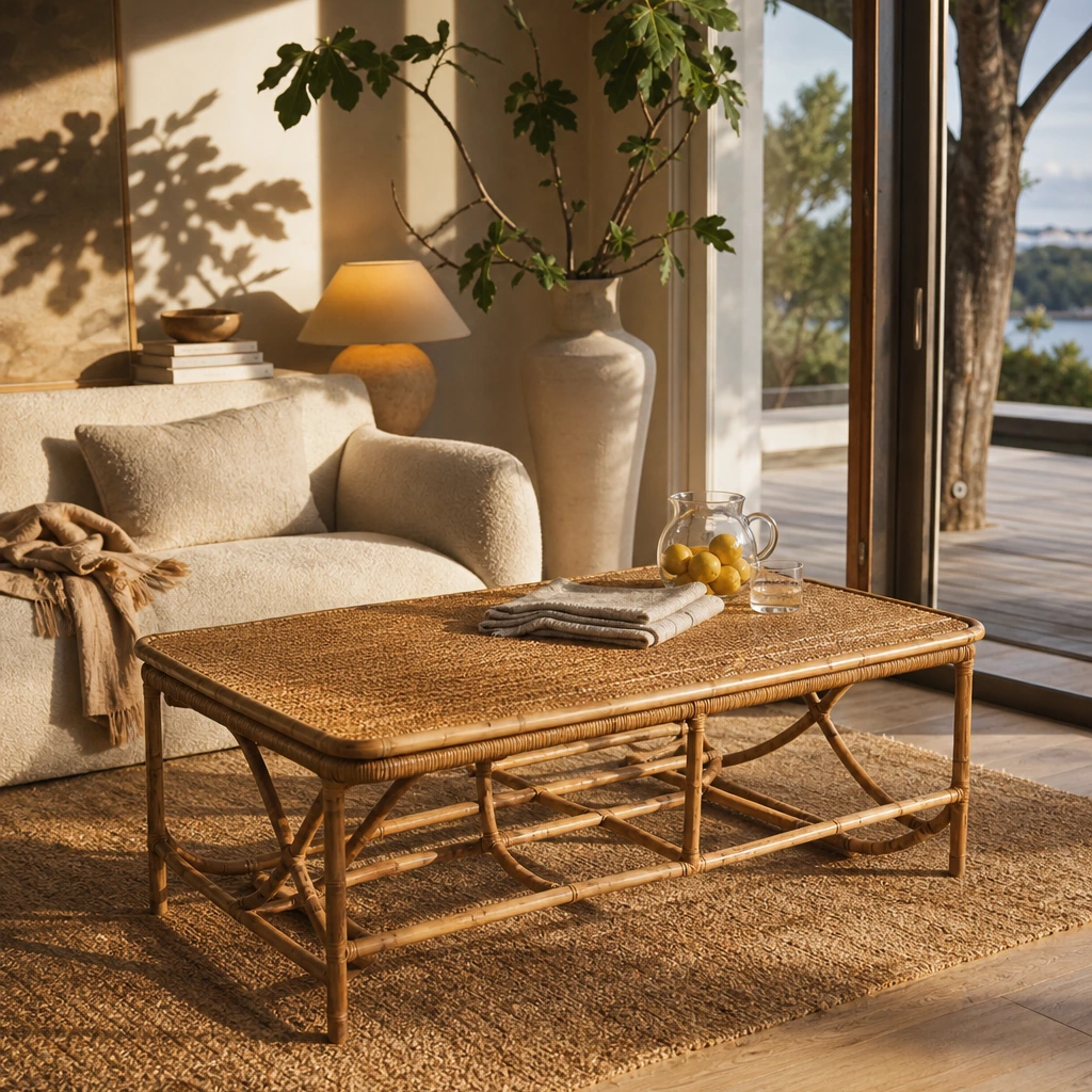
The palette does not stop at the walls. The layering happens through upholstery in linen, cotton, and wool in oatmeal, flax, and warm ivory tones; rugs in natural fibers like sisal, jute, or wool in warm neutrals and soft patterns; wood tones in warm mahogany, walnut, or honey oak rather than cool gray-washed finishes; and accent pieces in aged brass, terracotta, soft sage, and dusty blue.
The result is a room that reads neutral from a distance but reveals texture and warmth up close. That layered quality is what separates a Meyers-inspired room from a room that is simply beige.
What to Avoid
Stark cool whites make the look fall apart immediately. So do saturated accent colors used in large quantities. The palette is restrained by design. If you want to introduce color, do it through a single textile, a piece of art, or a ceramic object, not through a feature wall. The aesthetic relies on a warm, layered approach rather than bold color statements.
Kitchen Design Inspiration from Nancy Meyers Films
The kitchen is the heart of the Nancy Meyers aesthetic. It appears in nearly every film as a social anchor: a large, light-filled space designed for real cooking, real conversation, and the kind of casual entertaining that happens when people drift in from the living room. The kitchen in Something's Gotta Give and the one in It's Complicated are both aspirational and completely functional, which is exactly the point.
Multiple design sources identify the signature elements as large islands, open storage, copper cookware on display, strong natural light, and visible everyday objects that signal the kitchen is actually used. The practical implication is that layout, lighting, and storage visibility matter more than cabinet hardware or countertop material.
The Island as Social Infrastructure
The island in a Meyers kitchen is not just a prep surface. It is where people sit, where conversations happen, and where the boundary between cooking and entertaining dissolves. If you are planning a kitchen renovation, prioritize island size and seating capacity over decorative details. A generous island with comfortable stools does more for the aesthetic than any cabinet finish.
If your kitchen cannot accommodate a permanent island, a large butcher block cart on casters achieves a similar effect at a fraction of the cost and without any structural work.
Open Storage and Display Strategy
Open shelving is one of the most discussed elements of the Meyers kitchen. It works because it treats functional objects as part of the room's visual composition. Stacked white dishes, copper pots, glass jars, and ceramic bowls become decor when they are displayed with intention.
The key is editing. Open shelving only works when the objects on it are worth looking at. That means investing in cookware and dishware you actually want to display, and being disciplined about what stays visible and what goes behind closed doors.
Light and Surface Priorities
Natural light is non-negotiable in the Meyers kitchen. Large windows, skylights, or glass doors that connect to an outdoor space are consistent across the films. If your kitchen is structurally limited, prioritize warm artificial lighting: under-cabinet task lighting, pendant lights over the island in aged brass or unlacquered brass finishes, and ambient lighting that avoids the harsh overhead fluorescent effect.
For countertops, marble and honed stone surfaces appear frequently. They are not precious or untouchable in these kitchens. They are used, and the patina that comes with use is part of the look.
Furniture Selection and Layout Principles
The furniture in Meyers' films is comfortable, generously scaled, and deliberately mixed. There are no matching five-piece living room sets. There are sofas that look like they have been sat on for years, chairs that came from different places at different times, and tables that feel like they were found rather than ordered from a catalog.
Analysis consistently identifies slipcovered sofas, warm woods, linen upholstery, and a mix of vintage and contemporary pieces as the furniture signatures of the style. The collected quality is the goal, and it cannot be achieved by ordering everything from one retailer in one afternoon.
Sofas and Seating
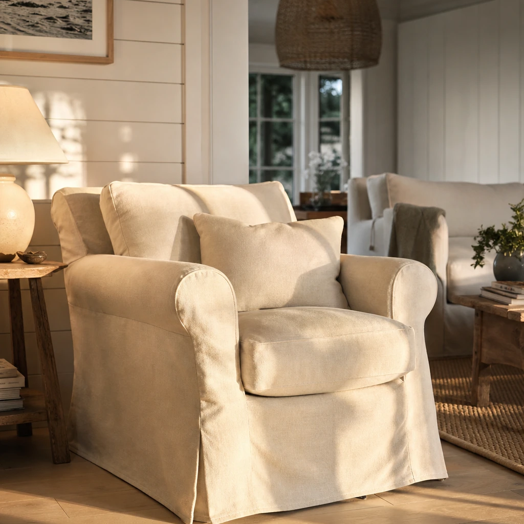
Slipcovered sofas are the most recognizable furniture signature of the aesthetic. The slipcover signals comfort and ease. It says the sofa is for sitting on, not looking at. Look for generous proportions, track arms or slightly rolled arms, and upholstery in linen, cotton, or a linen-cotton blend in warm neutral tones.
Avoid tight, tailored upholstery in dark or saturated colors. Avoid ultra-modern silhouettes with thin legs and sharp angles. The furniture should feel like it belongs to someone who has lived in the room for a long time.
Mixing Old and New
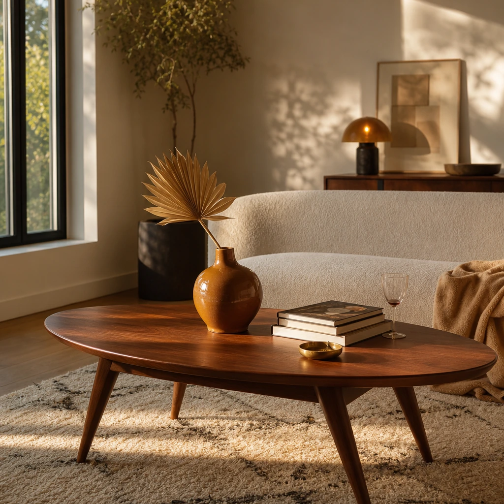
The collected look requires contrast. Pair a contemporary slipcovered sofa with a vintage side table. Put a modern floor lamp next to an antique chest. Mix wood tones rather than matching them. The room should look like it was assembled over time, because that is exactly what the most livable rooms are.
Chairish and 1stDibs are useful sources for the vintage and antique pieces that give the look its depth. Pair those finds with cleaner contemporary pieces from Pottery Barn, Crate and Barrel, or Restoration Hardware for balance.
Scale and Proportion
One of the most common mistakes in recreating this aesthetic is choosing furniture that is too small for the room. Meyers' interiors use generously scaled pieces that make rooms feel full and inviting rather than sparse. A sofa that is slightly too large for a room reads more comfortably than one that floats in the middle of it. Rugs should be large enough to anchor the seating area, with all front legs of the furniture sitting on the rug.
The table below summarizes the key furniture decisions and their Meyers-inspired equivalents:
Creating Warm, Inviting Living Spaces with Meyers-Inspired Decor
The living room in a Meyers film is not a formal sitting room. It is a room where people actually live: reading, talking, watching films, and spending time together. The furniture is arranged for conversation. The lighting is warm. There are books, flowers, and objects that suggest a real person lives there.
Analysis identifies the key elements as layered textiles, natural materials, visible everyday objects, and a balance of ambient and task lighting. The room feels rich because of what is in it, not because of what it cost.
Layering Textiles and Texture
Texture is what makes a neutral room feel warm rather than flat. Layer it deliberately:
- Linen or cotton slipcovers on the sofa
- A wool or cotton throw draped over one arm
- A sisal or jute rug under the seating area
- Linen or cotton curtains that pool slightly on the floor
- Wicker or rattan accent pieces for additional texture contrast
- Ceramic, terracotta, or stone objects on surfaces
The goal is a room that rewards close inspection. From across the room it reads calm and neutral. Up close, every surface has something interesting happening.
Displaying Objects with Intention
Meyers-inspired interiors intentionally include visible everyday objects: books stacked on coffee tables, fresh flowers in simple vases, ceramic bowls, family photographs in simple frames, and baskets used for functional storage. These objects are not clutter. They are evidence of a life being lived.
The editing principle is important here. Every object should earn its place. If it does not add warmth, texture, or personal meaning, it probably does not belong on the surface.
Greenery and Biophilic Elements
Fresh flowers and plants appear consistently across Meyers' interiors. They soften hard surfaces, add color without committing to a color scheme, and make rooms feel alive rather than static. A simple bunch of white peonies in a ceramic vase does more for a room than most decorative accessories.
If you cannot maintain fresh flowers regularly, a well-placed potted plant in a terracotta or ceramic pot achieves a similar effect with less maintenance. The goal is the same in both cases: a room that feels like it is being tended, not just decorated.
If you are struggling to pull these elements into a cohesive room, First Chair sources across West Elm, CB2, Crate and Barrel, Pottery Barn, and Lulu and Georgia, which matters when the right room rarely comes from a single catalog. You can describe the aesthetic direction you want, upload inspiration images from Meyers' films, and receive curated recommendations for real, in-stock pieces that work together.
Lighting and Window Treatments in Nancy Meyers Interiors
Lighting is where most Meyers-inspired rooms succeed or fail. The aesthetic depends on a specific quality of light: warm, layered, and abundant. Rooms that are over-lit with recessed ceiling fixtures or under-lit with a single overhead pendant miss the mark entirely.
Design sources consistently identify layered lamps, soft window treatments, and abundant natural light as essential to the look. The evening quality of a Meyers room, that warm lamp-lit glow, is one of its most distinctive and most reproducible qualities.
Building a Layered Lighting Plan
A Meyers-inspired room uses at least three types of lighting working together:
- Natural light: Maximized through large windows, French doors, or skylights with minimal obstruction from heavy window treatments.
- Ambient lighting: Soft overhead light from a chandelier or pendant in a warm finish, used at low intensity rather than as the primary light source.
- Task and accent lighting: Table lamps, floor lamps, and reading lights placed throughout the room to create pools of warm light at human scale.
The result is a room that feels different at different times of day and never harsh. Warm bulbs at 2700K or lower are non-negotiable. Cool daylight bulbs destroy the effect immediately.
Window Treatments
The window treatments in Meyers' films are consistently soft and light-permitting. Linen or cotton curtains in warm white or natural tones, hung high and wide to maximize the sense of light and height, are the default. Heavy drapes in dark colors work against the aesthetic.
Roman shades in natural linen are a practical alternative for rooms where curtains are not appropriate. Serena and Lily carries options that align closely with the aesthetic, and The Shade Store offers custom linen and cotton options at a range of price points.
Aged Brass and Warm Metal Finishes
Hardware and fixture finishes matter more than most people expect. Aged brass, unlacquered brass, and warm bronze finishes appear consistently in Meyers' interiors. They add warmth and a sense of patina that polished chrome or matte black cannot replicate in this context. If your room already feels cold, switching to warm metal finishes on lamps, cabinet hardware, and plumbing fixtures is one of the highest-impact, lowest-cost changes you can make.
Budget-Friendly Ways to Achieve the Nancy Meyers Aesthetic
The look does not require a renovation budget or a designer's trade account. The most important elements of the aesthetic, warm neutrals, layered textiles, natural materials, and a collected mix of old and new, are achievable at a range of price points. The key is sequencing. Start with the decisions that have the most visual impact and work outward from there.
Where to Spend and Where to Save
The table below outlines where investment pays off and where budget options perform just as well:
The Sequencing Strategy
Start with paint. A warm neutral wall color is the single highest-impact change you can make for the lowest cost. Then address lighting: add two or three table lamps with warm bulbs before buying any new furniture. Then address the rug, which anchors the room and makes everything else look more intentional. Furniture and accessories come after the foundation is right.
This sequencing matters because it prevents the most common mistake: buying individual pieces that look good in isolation but do not work together in the room. For anyone dealing with furniture decision fatigue, the platform's approach of narrowing the field rather than expanding it is particularly well-suited to this aesthetic.
Using Multi-Retailer Sourcing
One of the practical challenges of the Meyers aesthetic is that it requires pieces from multiple sources. The right slipcovered sofa might come from Pottery Barn. The right vintage side table might come from Chairish. The right rug might come from Lulu and Georgia. Pulling those pieces together into a cohesive room without endless tabs and second-guessing is exactly the problem First Chair is built to solve. The platform's multi-retailer sourcing means you can build a collected look without the years it normally takes to collect it.
Outdoor Spaces and Entertaining Areas in Meyers Films
The outdoor spaces in Meyers' films are extensions of the interior aesthetic rather than separate design statements. The Hamptons terrace in Something's Gotta Give, the garden in It's Complicated, and the Bel Air pool area in The Holiday all share the same warmth, natural materials, and hospitality-minded arrangement as the interiors.
The collected, layered quality of the interior extends outdoors through natural materials, comfortable seating, and the kind of casual arrangement that invites people to linger. The outdoor space is never an afterthought. It is treated as another room.
Connecting Interior and Exterior
French doors are one of the most consistent architectural elements in Meyers' films. They increase light transfer, visually connect interior and exterior spaces, and create the sense that the outdoor area is a natural extension of the home rather than a separate zone. If your home has French doors or large sliding glass doors, treat the outdoor space visible through them as part of the interior composition.
Outdoor Furniture Principles
The same principles that apply indoors apply outdoors. Natural materials, teak, rattan, wicker, and stone, read warmer and more timeless than powder-coated aluminum or synthetic wicker. Comfortable scale matters as much outside as inside. Cushions in outdoor linen or canvas in warm neutral tones carry the palette through from the interior.
Avoid matching outdoor furniture sets that look like they came from a single catalog page. Mix a teak dining table with rattan chairs. Add a stone or concrete side table next to a wicker lounge chair. The collected quality should extend all the way to the garden.
Tools and Resources for Building the Look
Achieving a Meyers-inspired interior requires sourcing across multiple categories and multiple retailers. The tools below organize the process by function.
Design Planning and Visualization
Spatial planning tools help you understand scale and proportion before you buy anything. SketchUp and Chief Architect are professional-grade options for homeowners working with designers. For a more accessible approach, Planner 5D and HomeByMe offer browser-based room planning at no cost.
Furniture and Decor Sourcing
The aesthetic requires pieces from multiple retailers. The most relevant sources by category:
- Sofas and upholstered pieces: Pottery Barn, Crate and Barrel, Interior Define, Article
- Vintage and antique finds: Chairish, 1stDibs, local estate sales
- Rugs: Lulu and Georgia, Serena and Lily, West Elm
- Lighting: Rejuvenation, Anthropologie Home, CB2
- Kitchen and entertaining: Williams Sonoma Home, Pottery Barn, Restoration Hardware
Multi-Retailer Curation
Pulling pieces from multiple sources into a cohesive room is where most homeowners get stuck. First Chair sources across West Elm, CB2, Crate and Barrel, Pottery Barn, and Lulu and Georgia in a single platform. You can upload inspiration images from Meyers' films, describe the aesthetic direction you want (something like "warm, layered, collected, not matchy"), and receive curated recommendations for real, in-stock pieces that work together. The platform includes insider pricing on most pieces, without the promo-code hunt. For anyone trying to furnish a new apartment or home with a cohesive aesthetic rather than a random collection of individual purchases, that kind of guided curation is a meaningful shortcut.
Window Treatments and Textiles
The Shade Store and Hunter Douglas both offer custom linen and cotton window treatments. Serena and Lily carries ready-made options that align closely with the Meyers palette. For textiles, Pottery Barn and Crate and Barrel both carry linen and cotton upholstery fabrics and slipcover options.
Kitchen and Surface Materials
For countertops, Caesarstone and Cambria both offer honed finishes that approximate the marble look with more durability. Kohler's farmhouse sink styles appear frequently in Meyers-inspired kitchen renovations.
Best Practices for the Nancy Meyers Aesthetic
- Start with a warm neutral base. Choose paint in the warm white and cream range before making any other decisions. The wall color sets the temperature for everything that follows.
- Prioritize natural light. Large windows, French doors, and light window coverings that keep rooms bright are more important than any furniture purchase. If your space is structurally limited, maximize what you have before adding artificial light.
- Use comfortable, generously scaled furniture. Rooms should feel full and inviting, not sparse. A sofa that is slightly too large reads more comfortably than one that floats in the middle of the room.
- Mix old and new deliberately. Pair vintage pieces, antiques, or heirlooms with simpler contemporary furnishings. The contrast is what creates the collected quality. Matching sets undermine it.
- Layer texture aggressively. Linen, cotton, wool, sisal, wicker, rattan, and wood all contribute tactile richness. The room should feel rich even when the palette is restrained.
- Design the kitchen as the heart of the home. Use open storage, display-worthy cookware, a practical island, and visible everyday objects. The kitchen should look like it is actually used.
- Add greenery and flowers. Fresh flowers and plants soften hard surfaces and keep rooms from feeling static. A bunch of white peonies in a ceramic vase does more for a room than most decorative accessories.
- Use lamps and layered lighting. Create evening warmth with table lamps, floor lamps, and warm bulbs. Avoid relying on recessed ceiling fixtures as the primary light source.
Common Mistakes That Undermine the Aesthetic
Making the room too matchy. Ordering a matching sofa, loveseat, and accent chairs from the same collection produces a showroom floor, not a lived-in home. The fix: source seating from at least two different places and mix wood tones intentionally.
Using stark cool whites. Cool whites with blue or gray undertones read clinical rather than warm and creamy. The fix: test paint colors in your specific light conditions and choose warm whites with yellow or beige undertones.
Over-minimalizing the space. The Meyers look is edited, not empty. Removing too many objects strips the room of the layered, lived-in quality that defines the aesthetic. The fix: add back texture, books, plants, and objects that have personal meaning.
Choosing trendy statement pieces. Pieces that depend on a current trend date quickly and fight the timeless character of the style. The fix: invest in classic silhouettes and natural materials that will look as good in ten years as they do today.
Hiding all functional objects. Meyers-inspired interiors often display useful items as part of the decor. Hiding everything behind closed doors produces a sterile, impersonal effect. The fix: edit what is visible rather than concealing everything.
Under-lighting the room. The aesthetic relies on a balance of daylight, task lighting, and lamps. A room lit only by recessed ceiling fixtures will never achieve the warm, layered quality of a Meyers interior. The fix: add at least two table lamps with warm bulbs before making any other changes.
Using synthetic-feeling materials. Synthetic upholstery, plastic accessories, and faux-wood finishes undermine the warmth and authenticity of the look. The fix: prioritize natural fibers and finishes even at lower price points. Sisal and jute are affordable and authentic. Linen is widely available at accessible prices.
Treating the kitchen like a showroom. A kitchen that looks too perfect, with nothing on the counters and nothing on the shelves, misses the point entirely. The fix: display the cookware, the cutting boards, the ceramic bowls. Let the kitchen look like someone cooks in it.
Frequently Asked Questions
What makes the Nancy Meyers aesthetic different from other warm neutral styles?
The Nancy Meyers aesthetic is distinguished by its hospitality-minded approach to how rooms function, not just how they look. Where other warm neutral styles might prioritize restraint or minimalism, the Meyers look actively includes visible everyday objects, generous furniture scale, and rooms designed for real use and real entertaining. The kitchen as social anchor, the slipcovered sofa, the layered lamps, and the mix of vintage and contemporary pieces are all specific to this aesthetic rather than shared with broader neutral-palette design.
Do I need to renovate to achieve the Nancy Meyers look?
No. Set decorator insights confirm that the look is built by layering fabrics, wood tones, rugs, and antiques over a creamy neutral backdrop, which means it is achievable through furnishing and decorating decisions rather than structural renovation. The most impactful changes, paint color, lighting, a slipcovered sofa, a large natural fiber rug, and a few vintage pieces, require no construction at all.
What paint colors are closest to the Nancy Meyers palette?
The palette centers on warm whites and creams with yellow, pink, or beige undertones rather than cool whites with blue or gray undertones. Benjamin Moore's White Dove, Sherwin-Williams' Alabaster, and Farrow and Ball's All White are frequently cited as close approximations. Always test in your specific light conditions before committing, as the same color reads differently in north-facing and south-facing rooms.
How do I get the collected, lived-in quality without it looking cluttered?
The key is editing. Every object on a surface should earn its place by adding warmth, texture, or personal meaning. The goal is not to fill every surface but to make every visible object intentional. Open shelving works when the objects on it are worth looking at. Books, fresh flowers, ceramic bowls, and family photographs in simple frames all contribute to the lived-in quality without creating visual noise.
What is the most important furniture piece to get right?
The sofa. A slipcovered sofa in linen or cotton in a warm neutral tone is the single most recognizable furniture signature of the aesthetic and the piece that sets the tone for everything else in the room. Get the sofa right and the rest of the room becomes easier to build around it. Get it wrong, with tight tailored upholstery in a dark or saturated color, and the aesthetic is difficult to recover regardless of what else you add.
How do I find vintage and antique pieces that work with the look?
Chairish and 1stDibs are the most accessible online sources for vintage and antique pieces that align with the Meyers aesthetic. Local estate sales and antique markets are often more cost-effective and allow you to assess scale and condition in person. The goal is contrast: one or two genuine vintage finds paired with cleaner contemporary pieces create the collected quality that matching sets cannot replicate.
Conclusion: From Inspiration to a Room You Can Actually Live In
The Nancy Meyers aesthetic is not a fantasy. It is a design system built on warm neutrals, natural materials, generous scale, layered lighting, and a philosophy about how rooms should feel to live in. Every element of the look, from the creamy wall color to the slipcovered sofa to the copper cookware on open shelves, serves that underlying philosophy. Once you understand the system, the decisions become clearer and the room starts to come together.
The most important shift is from inspiration to execution. You probably already have the saves, the screenshots, and the general sense of what you want the room to feel like. The gap is not taste. The gap is knowing which pieces to choose, where to find them, and how to make them work together in your actual space.
Start building your Meyers-inspired room with First Chair, where you can upload your inspiration images, describe the aesthetic direction you want, and receive curated recommendations for real, in-stock pieces from across West Elm, Pottery Barn, Crate and Barrel, and Lulu and Georgia. The room you have been designing in your head is closer than you think.