
If you've spent the last six months scrolling through saved interiors on your phone, convinced the room in your head is achievable but unable to close the gap between the vision and your actual living room in Austin or Chicago or Los Angeles, you're not alone. And if one of those saved images happens to be a sun-drenched Malibu estate with terracotta roof tiles, arched doorways, and the kind of warm, layered materiality that makes a space feel both dramatic and deeply livable, then you're already thinking about the right things. The problem isn't taste. The problem is translation.
Lady Gaga's Malibu compound sold for $22.5 million and sits on six acres of California coastline. The architecture blends Mediterranean and Tuscan references: warm stone, terracotta tiles, arched openings, and lush landscaping that makes the inside feel continuous with the outside. It's the kind of property that stops people mid-scroll. But here's what most celebrity home coverage misses: the design decisions that make that space work are not about the price tag. They're about commitment. Commitment to a palette, to a material language, to the principle that one strong piece does more than five mediocre ones.
This guide breaks down the specific design elements that define Gaga's aesthetic, from the Mediterranean bones of the Malibu property to the broader principles of maximalism done with restraint, and shows you how to apply those same moves in a real apartment or home. You'll learn which architectural details translate without renovation, how to approach bold color without losing control, where to source the right pieces across multiple retailers, and how to build a room that feels collected rather than assembled.
What you'll learn:
- The core Mediterranean and Tuscan design elements that define the Malibu property and how to adapt them at any scale
- How to execute maximalist design without it reading as chaotic or overdone
- Where Art Deco detailing fits in a contemporary interior and which pieces deliver the most impact
- How layered lighting transforms a room more than almost any other single change
- A practical, room-by-room application guide with sourcing options across price points
Key Takeaways
- Lady Gaga's Malibu compound draws from Mediterranean and Tuscan architecture, using warm stone, arched openings, and terracotta tones that translate into residential interiors at any scale.
- Maximalist design done well is about curation, not accumulation. One strong anchor piece outperforms five mediocre ones every time.
- Bold accent walls work best in matte or flat finishes on the wall the eye naturally travels to when entering a room.
- Layered lighting (ambient, task, and accent combined) is the single highest-impact change most rooms can make without touching a wall or buying new furniture.
- Art Deco detailing, including geometric hardware, arched mirrors, and fluted surfaces, is widely available at CB2, West Elm, and Anthropologie Home without requiring custom millwork.
- The right room rarely comes from a single retailer catalog. Cohesion comes from a consistent material palette, not a matching furniture set.
- The gap between celebrity design and achievable design is narrower than it looks. The principles are identical. The execution just requires more intentional choices.
What Lady Gaga's Home Design Actually Looks Like
Mediterranean interior design is a style rooted in the architecture and material traditions of Southern Europe, characterized by warm stone, terracotta, arched forms, natural wood, and a seamless relationship between indoor and outdoor living. It is one of the most adaptable luxury aesthetics because its core elements are widely available across accessible price points.
Coverage of the Malibu property from Vogue India describes warm stone exteriors, terracotta roof tiles, arched doorways, and lush landscaping that blurs the boundary between interior and exterior space. The overall effect reads less as "pop star maximalism" and more as "Italian countryside transplanted to the California coast." Inside, the design leans into warmth and texture: exposed beams, stone flooring, and natural wood surfaces create a grounded base. Against that base, moments of drama emerge through bold art, rich upholstery, and lighting that feels theatrical without being cold.
Elle Decor's real estate portfolio coverage specifically notes the Tuscan villa quality of the Malibu property. That quality comes from a few repeatable moves, none of which require a renovation budget.
The Core Design Tension: Warmth Versus Drama
The defining tension in Gaga's design sensibility is warmth versus drama. The architecture provides the warmth through natural materials, earthy tones, and organic forms. The art and furnishing choices provide the drama through scale, contrast, and deliberate visual weight.
This is a useful framework for any room. Start with a warm, textured base. Then introduce one or two pieces that create genuine visual tension. The base keeps the room from feeling chaotic. The tension keeps it from feeling safe and forgettable.
Key Architectural Features Worth Adapting
The Malibu property uses several architectural moves that translate directly into interior design decisions for standard homes and apartments:
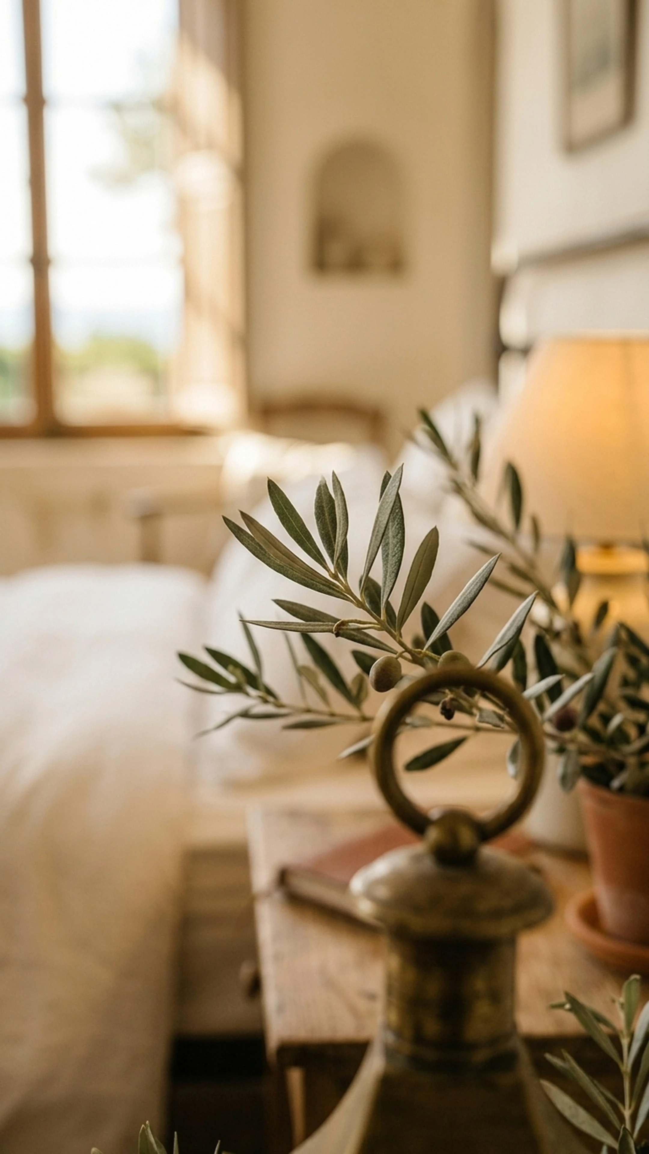
- Arched openings: Doorways, windows, and niches with arched tops soften a space and add architectural interest. Arched mirrors and arched-top bookcases achieve the same effect in a rental without any structural work.
- Exposed natural materials: Stone, terracotta, and raw wood are used as finish materials rather than hidden behind paint or drywall. The material itself becomes the design.
- Indoor-outdoor continuity: Large openings, consistent flooring materials, and landscaping that frames interior views make the inside feel larger and more connected to natural light.
- Warm neutral palette as a base: The foundation colors are earthy and warm, which allows bolder accent choices to read as intentional rather than overwhelming.
Mediterranean and Tuscan Design Elements You Can Adapt
The Mediterranean aesthetic is defined by natural materials, warm color palettes, and architectural details that reference Southern European building traditions. Its core elements, terracotta, warm stone, arched forms, and layered textiles, are widely available at accessible price points, which makes it one of the most practical celebrity aesthetics to adapt.
Terracotta and Warm Stone Tones
The easiest entry point into Mediterranean design is color. Terracotta, warm ochre, dusty rose, and aged white create the palette foundation. These tones work on walls, in tile, in upholstery, and in ceramics.
For walls, a warm terracotta or clay tone in a matte finish reads as architectural rather than trendy. Farrow and Ball's "Red Earth" or Benjamin Moore's "Moroccan Spice" are reliable starting points. The key is to commit to the tone rather than diluting it into a pale blush that loses the warmth entirely.
For flooring, large-format terracotta or stone-look tile is now widely available. In apartments where flooring can't be changed, a large natural fiber or wool rug in warm tones achieves a similar grounding effect.
Arched Details Without Structural Work
Arched forms are one of the most recognizable Mediterranean design elements, and they're achievable without touching a wall. Options include:
- Arched mirrors as a focal point above a console or dresser
- Arched-top bookcases or display cabinets
- Arched window treatments using curved curtain rods
- Arched wall niches created with simple millwork or even a painted trompe l'oeil effect
West Elm and CB2 both carry arched mirror options that bring this architectural reference into a standard apartment without renovation. Anthropologie Home carries arched ceramic and glass accessories that reinforce the language at a smaller scale.
Texture Layering: The Detail That Makes It Feel Real
Mediterranean interiors feel rich because of texture, not because of expensive materials. Linen, jute, rough-hewn wood, hammered metal, and woven textiles layered together create the depth that makes a room feel collected rather than assembled.
The practical version: choose upholstery in a natural linen or bouclé, add a jute or sisal rug underneath, and layer a woven throw and ceramic accessories on top. The individual pieces don't need to be expensive. The combination does the work.
Here's how texture layering maps across material categories:
LayerMaterialWhere It AppearsBaseNatural fiber rug (jute, sisal, wool)Floor, anchoring the seating areaStructuralLinen or bouclé upholsterySofa, accent chairsWarmthWarm wood (walnut, oak, olive)Coffee table, shelving, framesDetailHammered or aged metalHardware, lighting, decorative objectsSoftnessWoven or knit textilesThrows, cushion coversOrganicCeramics, terracotta, stoneVases, bowls, candle holders
Bold Color and Maximalist Design: How to Do It Without Overdoing It
Maximalism is one of the most misunderstood design approaches. It is not about filling every surface. It is about density of intention. Every piece in a maximalist room should be there for a reason, and the cumulative effect should feel rich rather than chaotic.
House Beautiful's coverage of Gaga's properties notes the layered, artistic quality of her design choices. The Malibu property is grounded by its architectural restraint: the bones are calm, the choices are bold. That balance is the key to maximalism that works.
For homeowners who feel paralyzed by too many options before they even get to the bold choices, the decision fatigue problem in furniture shopping is real and worth addressing before adding more pieces to the mix.
The Anchor Piece Strategy
The most reliable way to approach maximalist design without losing control is to identify one anchor piece per room and build outward from it. The anchor should be the most visually dominant element: a large-scale artwork, a statement sofa, a dramatic light fixture, or a bold rug.
Everything else in the room should either complement or contrast the anchor. Pieces that do neither are just noise, and noise is what makes maximalism feel overwhelming rather than intentional.
For a living room inspired by Gaga's aesthetic, a deep jewel-toned velvet sofa (emerald, sapphire, or aubergine) functions as a strong anchor. Pair it with warm wood tones, natural fiber textiles, and one piece of large-scale art. The sofa does the dramatic work. Everything else provides context.
Bold Accent Walls: What Actually Works
An accent wall in a deep, warm tone creates a focal point that makes a room feel designed rather than decorated. The rules for accent walls that actually work:
- Choose the wall the eye naturally travels to when entering the room, usually the wall opposite the door.
- Use a matte or flat finish. Sheen on a bold color reads as cheap rather than dramatic.
- Extend the color to built-ins, trim, or adjacent architectural elements if possible. A painted accent wall that stops at the corner looks applied. One that wraps around a fireplace or bookcase looks intentional.
- Keep adjacent walls in a warm neutral that shares undertones with the accent color.
Maximalist Design Across Budget Tiers
Here's a practical comparison of how to achieve key maximalist elements at different price points:
Design ElementHigh-End OptionMid-Range OptionBudget OptionStatement sofaRH velvet sectional ($4,000+)Article Sven sofa ($1,200-1,800)IKEA Söderhamn with custom cover ($600-900)Large-scale artGallery original ($2,000+)Minted or Society6 large print ($200-500)DIY canvas with bold paint ($50-150)Dramatic lightingVisual Comfort pendant ($800+)CB2 or West Elm statement fixture ($200-400)Rejuvenation-inspired thrift find ($50-200)Bold rugLulu and Georgia wool ($800+)Rugs USA or Joss and Main ($200-400)IKEA flatweave with layering ($80-150)Textured throw pillowsAnthropologie Home ($60-120 each)West Elm or Pottery Barn ($30-60 each)H&M Home ($15-30 each)
Art Deco Influence and Architectural Detail
Art Deco design is characterized by geometric forms, rich materials, high contrast, and a sense of glamour that feels deliberate rather than accidental. It appears throughout high-end celebrity interiors because it communicates sophistication without requiring historical accuracy or period-specific sourcing.
Art Deco works best in contemporary interiors when used as an accent language rather than a full period recreation. Three or four Art Deco-influenced pieces in an otherwise modern room feel sophisticated. A fully committed Art Deco room in a standard apartment feels like a theme park. The distinction matters.
Geometric Hardware and Fluted Surfaces
Hardware is one of the highest-impact, lowest-cost design changes available. Replacing standard brushed nickel cabinet pulls with unlacquered brass or aged bronze geometric hardware immediately shifts a kitchen or bathroom toward a more considered aesthetic. The cost is typically $3-15 per pull, and the visual return is disproportionate to the investment.
Fluted surfaces, whether on cabinet fronts, vases, or furniture legs, add tactile detail that makes a room feel designed. CB2 and Anthropologie Home both carry fluted ceramic and glass accessories that bring this detail into a space without custom millwork.
Mirrored Accents and High Contrast
Art Deco interiors use mirrors strategically: not as functional objects but as design elements that amplify light and create visual depth. A large arched mirror leaning against a wall, a mirrored console, or a collection of smaller geometric mirrors grouped on a wall all achieve this effect without structural changes.
High contrast is equally important. Art Deco pairs dark and light, matte and reflective, rough and smooth. A dark walnut console against a light wall. A matte black fixture against warm white plaster. The contrast creates the visual tension that makes the room feel alive rather than settled.
The Art Deco Accent Approach
The most effective approach for most homes: choose one Art Deco anchor (a geometric light fixture, a fluted sideboard, or a bold geometric rug) and let the rest of the room be clean and modern. The contrast between the Art Deco piece and the contemporary context is what makes both feel more interesting.
Specific pieces worth considering:
- Fluted brass pendant from CB2 or West Elm (geometric form, warm metal finish)
- Arched mirror with a brass or unlacquered frame from Anthropologie Home
- Geometric brass cabinet hardware from Rejuvenation or House of Antique Hardware
- Fluted ceramic vase or lamp base from CB2 or local ceramicists
Lighting Design: Creating Dramatic Ambiance at Home
Layered lighting is the practice of combining ambient, task, and accent light sources to create depth, atmosphere, and visual interest in a room. It is the single most common characteristic of luxury residential interiors and the most overlooked element in standard homes.
Most rooms are lit with a single overhead fixture that creates flat, unflattering light and makes even well-furnished spaces feel unfinished. Understanding how furniture and design decisions interact with lighting is essential before committing to any major purchase, because the same sofa reads completely differently under a single overhead bulb versus a layered lighting scheme.
The Three-Layer Lighting System
Ambient lighting provides the base level of illumination. In a well-designed room, this comes from multiple sources rather than a single overhead fixture: recessed lights on a dimmer, a floor lamp in a corner, or wall sconces flanking a focal point.
Task lighting serves functional purposes: reading lamps, under-cabinet kitchen lighting, desk lamps. These should be positioned to eliminate shadows in work areas without contributing to the overall ambient level.
Accent lighting creates drama and draws attention to specific elements: picture lights above art, LED strips inside shelving, uplights behind plants or in corners. Accent lighting is what makes a room feel designed rather than simply illuminated.
Statement Fixtures as Design Anchors
A statement light fixture functions like a piece of sculpture. It occupies visual space, establishes a design direction, and signals intentionality. In a room that's otherwise simple, one dramatic pendant or chandelier does more design work than a dozen decorative accessories.
For a Gaga-inspired aesthetic, look for fixtures with organic forms, warm metal finishes (aged brass, unlacquered brass, or antique bronze), and materials that reference natural elements: rattan, blown glass, or hammered metal. Visual Comfort, Rejuvenation, and CB2 all carry options in the $200-600 range that achieve this effect.
The Cheapest Luxury Upgrade Available
Installing dimmer switches on existing fixtures costs $15-30 per switch and takes about 20 minutes. The ability to adjust light levels throughout the day is one of the defining characteristics of luxury residential design. It's also one of the most overlooked upgrades in standard apartments and homes. If you do nothing else from this guide, install dimmers.
How to Shop for This Aesthetic Without Starting Over
The most common mistake in trying to recreate a celebrity interior is approaching it as a wholesale replacement rather than a series of intentional additions. You don't need to empty the room and start over. You need to identify the two or three pieces that are actively working against the aesthetic you want, remove them, and then layer in the elements that move the room in the right direction.
Omnihomeideas coverage of the Malibu property notes the layered, collected quality of the interiors. That quality comes from curation over time, not from a single shopping trip to a single retailer.
The Edit-First Approach
Before buying anything, remove everything from the room that doesn't belong to the aesthetic you're building toward. This includes:
- Mismatched throw pillows in colors that don't relate to each other
- Small decorative objects that don't have visual weight
- Furniture pieces that are the wrong scale for the room
- Lighting that's purely functional with no design consideration
What's left after the edit is your starting point. Often, the room is closer than it looked before the edit. The problem was accumulation, not absence.
Building a Cohesive Room from Multiple Retailers
The right room rarely comes from a single catalog. Gaga's Malibu compound draws on custom pieces, vintage finds, and curated accessories from multiple sources. The cohesion comes from a consistent design language, not a matching furniture set.
For homeowners working across retailers like West Elm, CB2, Lulu and Georgia, and Chairish, the key is to establish a material palette before shopping. Decide on your wood tone (warm walnut, light oak, or dark ebony), your metal finish (aged brass, matte black, or unlacquered brass), and your textile palette (warm neutrals, jewel tones, or earthy naturals). Then shop within those constraints across multiple retailers.
This is exactly the kind of multi-retailer curation that First Chair is built for. Rather than limiting recommendations to a single catalog, the platform pulls across West Elm, CB2, Crate and Barrel, Pottery Barn, and Lulu and Georgia to find pieces that work together stylistically. The room cohesion comes from the curation, not from buying everything in the same place.
Sourcing Guide by Category
CategoryPrimary SourceSecondary SourceVintage OptionStatement sofaRH, Interior DefineArticle, West ElmChairish, Facebook MarketplaceRugsLulu and GeorgiaCB2, Pottery BarneBay vintage, Rugs USALightingVisual Comfort, RejuvenationCB2, West ElmChairish, 1stDibsArtLocal galleries, Saatchi ArtMinted, Society6Thrift stores, student showsCeramics and accessoriesAnthropologie HomeCB2, West ElmEtsy, local pottersHardwareRejuvenation, House of Antique HardwareCB2Architectural salvage
Room-by-Room Application Guide
Understanding the design principles is one thing. Applying them to a specific room is another. Here's how the Gaga aesthetic translates into three common residential spaces, with practical sequencing for each.
For homeowners working through the full process of decorating a new apartment, the room-by-room approach is almost always more effective than trying to furnish an entire home at once.
Living Room: Warmth, Drama, and One Strong Anchor
The sequencing for a living room inspired by this aesthetic:
- Start with a warm neutral wall color (warm white, aged linen, or soft terracotta in matte finish).
- Choose a sofa in a rich, saturated tone or warm natural texture (deep green velvet, warm bouclé, or cognac leather). This is the anchor.
- Add a large-scale rug in a warm neutral with texture. Natural fiber or wool works best.
- Introduce a statement light fixture above the seating area.
- Add one piece of large-scale art on the primary wall.
- Layer in ceramic accessories, woven textiles, and plants that add organic softness.
The room should feel warm, considered, and slightly dramatic. Not staged. Not safe.
Bedroom: Layered Texture and Intimate Lighting
The bedroom version of this aesthetic prioritizes texture and warmth over drama. A linen or velvet upholstered headboard in a warm tone anchors the space. Layered bedding in natural linen, cotton, and a woven throw creates the depth that makes a bed feel considered rather than made. Warm wood nightstands with aged brass hardware reinforce the material language.
Lighting in the bedroom should be entirely warm and dimmable. No overhead fluorescents. Wall sconces flanking the headboard, a small table lamp on each nightstand, and blackout curtains in a warm linen or velvet complete the scheme.
Dining Room: Drama Through Scale and Contrast
The dining room is the easiest place to commit to a bold choice because it's used for shorter periods and the drama reads as intentional rather than exhausting. A statement chandelier above the table is the single most impactful investment. Choose something with presence: blown glass, rattan, or hammered metal in a warm finish.
Pair it with a dark wood or stone-top table and upholstered chairs in a warm neutral or jewel tone. A large-scale mirror on one wall amplifies the light and makes the room feel larger. Keep the accessories minimal: a ceramic bowl, a few candles, a small plant. The fixture and the table do the work.
Tools and Platforms for Executing This Aesthetic
Getting the design direction right is one challenge. Finding the actual pieces across multiple retailers without spending 40 hours in browser tabs is another. Here's how the current tool landscape maps to the specific needs of this kind of project.
Inspiration and Visualization
Several platforms help with the inspiration-to-visualization step. Houzz offers a large image library and some basic room planning tools. Pinterest remains useful for collecting references, though it doesn't connect to shoppable products. DecorMatters and Collov AI offer AI-generated room visualizations, though both rely primarily on rendered concepts rather than real, purchasable furniture.
Shoppable Design Platforms
For homeowners who want to move from inspiration to actual purchases without the tab chaos, the options differ significantly in how they handle product sourcing.
First Chair is built specifically for the gap between inspiration and execution. Users can upload photos of spaces they love (including celebrity interiors like Gaga's Malibu compound), describe their aesthetic direction in nuanced terms, and receive curated room concepts built from real, in-stock furniture across multiple retailers including West Elm, CB2, Crate and Barrel, Pottery Barn, and Lulu and Georgia. The platform is designed to narrow the field rather than expand it, which matters when the problem is too many options rather than too few. Member pricing is available on most pieces. Early access is currently open.
Havenly and Decorilla both offer human designer-led services at various price points, which works well for homeowners who want a fully managed process but involves longer timelines and higher minimum spend.
Retailer-Specific Tools
IKEA Kreativ and Wayfair's room visualization tools are useful for budget planning and basic layout testing, but both are limited to their own catalogs, which constrains the kind of multi-retailer curation that makes a room feel collected rather than catalog-stamped.
Vintage and Secondary Market Platforms
Chairish and 1stDibs are essential for the vintage and high-end secondary market pieces that give a room its collected quality. Neither offers design guidance, but both are worth building into a regular sourcing rotation for lighting, rugs, and accent furniture.
Best Practices for Recreating Celebrity Design at Home
- Establish a material palette before shopping. Decide on your wood tone, metal finish, and textile palette first. Every purchase should be checked against those three constraints before buying.
- Edit before you add. Remove pieces that don't belong to the aesthetic before introducing new ones. The room is almost always closer than it looks after an honest edit.
- Invest in the anchor, economize on the supporting cast. Spend the most on the piece that does the most visual work (the sofa, the rug, the light fixture). Save on accessories and textiles.
- Commit to the bold choice. A terracotta wall that's been diluted into a pale blush loses all its power. If you're going bold, go bold. Half-measures read as indecision, not restraint.
- Layer lighting before buying new furniture. Add a floor lamp, install dimmers, and introduce accent lighting before concluding that the room needs new pieces. Lighting changes the perception of everything already in the room.
- Shop across multiple retailers with a consistent material language. The cohesion comes from the palette, not from buying everything in the same place.
- Scale matters more than style. A beautiful piece in the wrong scale for the room will always look wrong. Measure before buying, and err toward pieces that are slightly larger than you think you need.
- Give the room one thing to look at. Every room needs a clear focal point. If the eye doesn't know where to land, the room feels unsettled regardless of how good the individual pieces are.
Common Mistakes to Avoid
Buying the matching set. A five-piece living room set from a single retailer looks staged rather than lived in. The room ends up looking like a showroom floor, not a home. Mix sources, mix periods, mix scales.
Choosing the safe version of the bold choice. If the room calls for a deep terracotta wall and you paint it a pale peach instead, you get neither the warmth of a neutral nor the drama of the bold choice. Commit or go neutral.
Ignoring scale. A sofa that's too small for the room makes the room feel unanchored. A rug that doesn't extend under the front legs of the furniture makes the seating area feel disconnected from the floor. Scale is the most common mistake in residential furnishing and the hardest to fix after the fact.
Treating lighting as an afterthought. Choosing furniture before establishing a lighting plan means the furniture will never look as good as it should. Lighting is the context in which everything else is perceived.
Accumulating instead of curating. Adding pieces without removing others creates visual noise that reads as clutter regardless of the quality of the individual items. The edit is as important as the acquisition.
Buying art last. Art is often treated as the final accessory rather than a design anchor. In a Gaga-inspired room, the art should be one of the first decisions, not the last. It sets the tone for everything else.
Mixing too many metal finishes. Aged brass, matte black, chrome, and brushed nickel in the same room create visual confusion. Choose one primary finish and one secondary finish, and stay within those two throughout the space.
Over-accessorizing to fill space. Empty space is a design choice, not a failure. Rooms that feel calm and considered usually have more negative space than rooms that feel cluttered. Resist the impulse to fill every surface.
Frequently Asked Questions
What is the defining design style of Lady Gaga's Malibu house?
The Malibu compound draws primarily from Mediterranean and Tuscan architectural traditions, featuring warm stone exteriors, terracotta roof tiles, arched doorways, exposed beams, and natural wood and stone interior finishes. The overall aesthetic balances warm, grounded materiality with bold artistic choices in furnishings and art. It reads as Italian countryside meets California coast rather than conventional celebrity maximalism.
How do I get a Mediterranean interior look without renovating?
The most impactful non-renovation moves are: painting walls in warm terracotta or clay tones in a matte finish, adding arched mirrors and arched-top furniture pieces, layering natural fiber rugs and linen upholstery, introducing hammered metal and ceramic accessories, and using warm-toned lighting throughout. These changes work in rental apartments and require no structural modifications.
What is the difference between maximalism and clutter?
Maximalism is density of intention: every piece is present for a reason, and the cumulative effect is richness rather than chaos. Clutter is accumulation without curation: pieces that are present by default rather than by choice. The practical test is whether you can articulate why each piece is in the room. If you can't, it's probably contributing to clutter rather than maximalism.
How much does it cost to recreate a celebrity-inspired interior?
The range is wide. A living room inspired by Gaga's aesthetic can be executed for $3,000-5,000 using mid-range retailers like Article, West Elm, and CB2 for the major pieces, with vintage and budget finds filling in accessories. The same room at a high-end level (RH, Visual Comfort, Lulu and Georgia, original art) would run $15,000-30,000. The design principles are the same at both price points. The materials differ.
What is the most impactful single change I can make to a room?
Layered lighting. Installing dimmers on existing fixtures, adding a floor lamp in a dark corner, and introducing one accent light source (a picture light, a shelf light, or an uplight behind a plant) changes the perception of everything else in the room. It's the highest-return change available in most residential spaces and requires no furniture purchases.
Which retailers are best for a Mediterranean-inspired interior?
For the core pieces, Lulu and Georgia carries the strongest selection of warm-toned rugs and organic-form furniture. CB2 and West Elm are reliable for arched mirrors, fluted accessories, and statement lighting. Anthropologie Home is the best source for ceramic accessories and textured textiles. Chairish and 1stDibs are essential for vintage lighting and accent furniture that adds the collected quality the aesthetic requires.
Conclusion: The Room You've Been Saving Is Closer Than You Think
The design principles that make Lady Gaga's Malibu compound work are not exclusive to an eight-figure renovation budget. They're about commitment to a material palette, willingness to make one bold choice and let it anchor the room, and the discipline to edit rather than accumulate. Warm stone tones, arched forms, layered texture, and dramatic lighting are all achievable in a standard apartment or home. The gap between the saved image and the actual room is narrower than it looks.
Start with the edit. Establish your material palette. Invest in the anchor piece. Layer the lighting. Shop across multiple retailers with a consistent design language rather than buying everything from one catalog.
If you're ready to move from the saved inspiration to an actual room plan built around real, purchasable pieces, First Chair is designed for exactly that moment. Upload the Malibu reference, describe the aesthetic direction, and get a curated room concept built from real furniture across West Elm, CB2, Crate and Barrel, Pottery Barn, and Lulu and Georgia. No more tabs. No more second-guessing. Just the room you've been trying to make.
