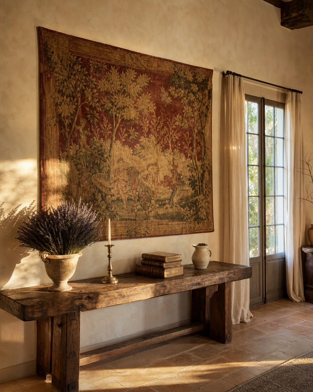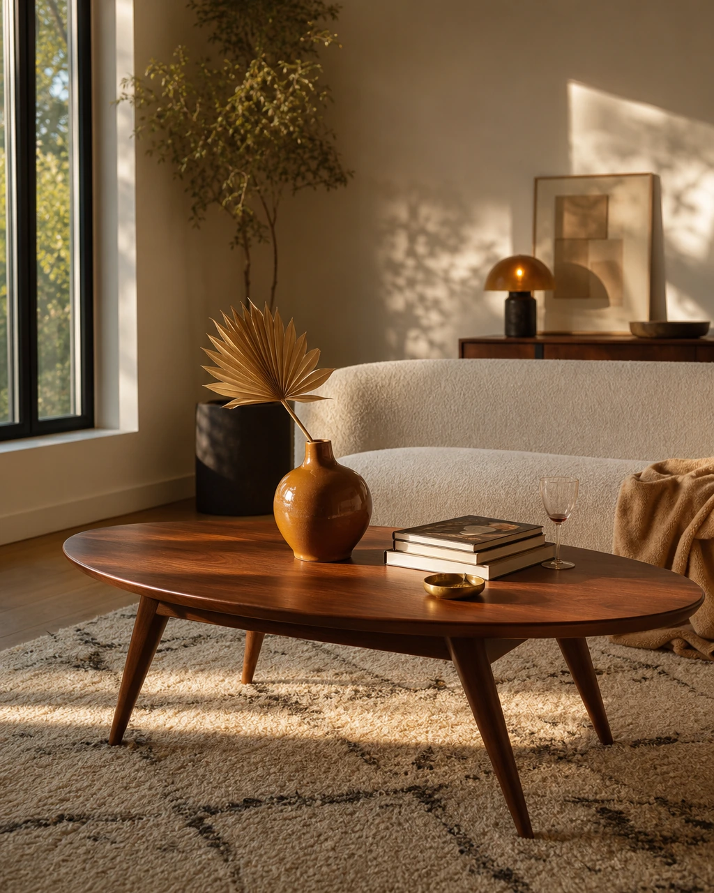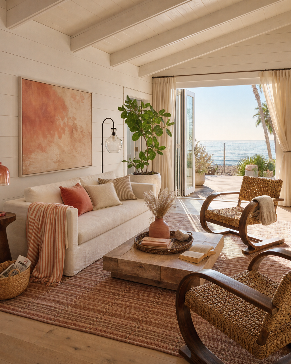
You've been staring at your living room walls for three months. You have a Pinterest board with 200 saves, a browser with eleven furniture tabs, and a vague but persistent feeling that your apartment should look more like that. If "that" keeps resolving to the same warm, book-lined, chandelier-lit Manhattan space from Sex and the City, you're not alone, and you're not chasing something impossible.
Carrie Bradshaw's Upper East Side apartment has become one of the most referenced interiors in residential design, not because it's flashy or expensive-looking, but because it feels genuinely inhabited. It reads like someone with real taste assembled it slowly, from pieces that meant something. That quality is harder to buy than people expect, and easier to recreate than most guides suggest.
The problem with most Carrie-inspired recreations is that they focus on the wrong things: the tutu on the door, the pink accents, the maximalist surface chaos. The actual design logic underneath is far more restrained. It's a warm neutral backdrop, a handful of vintage anchors, one strong light fixture, and accessories that earn their place. Those are learnable, executable principles that work in a Chicago one-bedroom, an Austin rental, or a Brooklyn studio just as well as they work on a television set.
This guide breaks down each element of that logic and translates it into real decisions you can make with real furniture from real retailers.
What you'll learn:
- How to build a warm neutral foundation that makes everything else look better
- Where to source vintage pieces and how to mix them with contemporary retailers
- How to choose and scale a statement lighting fixture correctly
- How to accessorize without cluttering
- How to make a small apartment feel larger using vertical thinking
- Where to spend and where to save when recreating this aesthetic
- How to pull the bedroom together with a small number of well-chosen pieces
Key Takeaways
- Carrie's apartment works because of its warm neutral backdrop, not because of any single statement piece. Start with walls and large furniture before adding character.
- The 60-30-10 color rule allocates 60% to the dominant base color, 30% to a secondary color, and 10% to accents. It's the structural logic behind her palette.
- Mixing vintage and contemporary pieces creates the "collected over time" quality that no single-retailer room can replicate.
- One statement lighting fixture does more for a room than five average ones. Treat it as furniture, not an afterthought.
- Vertical elements including tall bookshelves, paneling, and large-scale art make compact urban apartments feel significantly larger.
- Accessories should be edited and purposeful. The goal is "collected," not "decorated."
- Books, ceramics, and personal art are central to the styling logic of Carrie's apartment. They're not afterthoughts.
- You don't need to copy the set. You need to understand the principles behind it.
What Makes Carrie's Apartment Actually Work
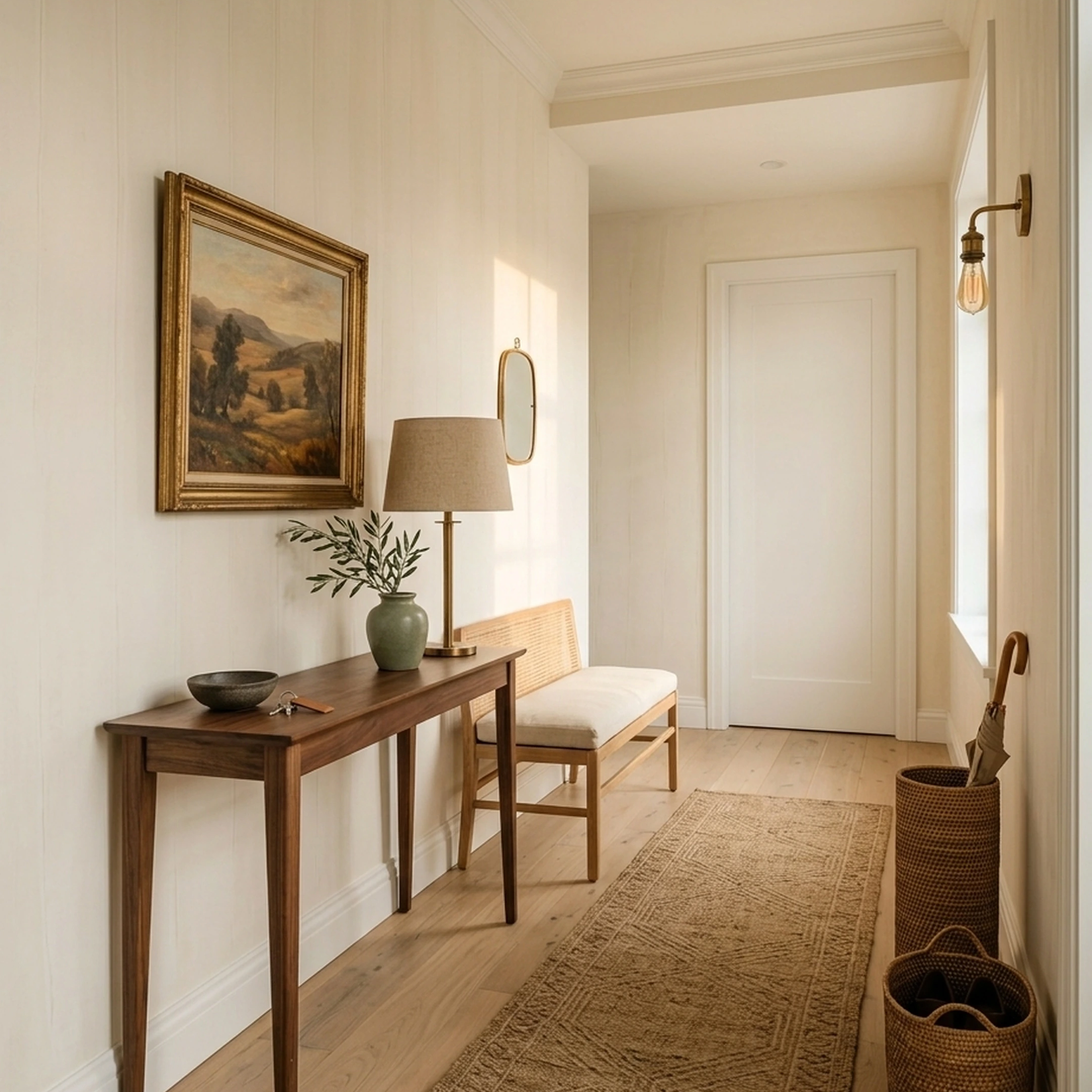
Carrie Bradshaw's apartment is a curated, layered, urban-neutral interior built on warm pale walls, mixed vintage and contemporary furniture, statement lighting, and accessories that feel collected rather than matched. The most recreatable version for real homes uses a warm neutral base, select vintage anchors, one focal light, and edited styling rather than attempting to copy the set literally.
This distinction matters. The set itself is a stylized version of a real design sensibility. Chasing the literal props will produce a costume. Understanding the underlying logic will produce a room.
The sensibility has four structural elements: a calm backdrop that lets objects do the visual work, furniture from different eras that creates depth and contrast, lighting that establishes personality before anything else does, and accessories chosen for presence rather than coverage. Each of those elements is independently achievable. Together, they produce the quality that makes the apartment feel like a real person lives there.
Why This Aesthetic Resonates in 2026
The timing for this kind of interior is genuinely good. Several converging design trends make the Carrie aesthetic easier to execute now than it would have been five years ago.
The strongest shift is the move away from cool stark grays toward warmer, earthier neutrals. Designers in 2026 are actively choosing softer, emotionally warm palettes for permanent surfaces because they create visual warmth without demanding attention. This directly supports the Carrie approach, where the backdrop becomes invisible and the objects take over.
A second shift is the return of paneling, texture, and architectural layering as a way to add richness without heavy color. ELLE Decor's coverage of Carrie's newer townhouse in And Just Like That specifically highlights panel drenching, same-color walls and trim, and vertical-lined panels in smaller rooms. These techniques create the illusion of more space and add architectural interest without renovation.
Third, the mainstreaming of curated interiors has made vintage sourcing more accessible. Curated homes are now understood as intentional and personality-driven, assembled from meaningful pieces rather than fully coordinated furniture packages. The market has responded: Chairish, 1stDibs, and Etsy have all expanded their vintage and antique inventory significantly, making it easier to find the right piece without months of hunting.
Finally, mid-century modern and retro styles dominate consumer vintage preferences, which means the supply of warm, character-rich furniture is high. For a Carrie-inspired room, you're working with the current rather than against it.
The Warm Neutral Foundation: Why Her Walls Work So Hard
A warm neutral is a soft white, cream, taupe, greige, or earthy off-white that creates a calm visual backdrop while reflecting light and making spaces feel larger than they are. In Carrie's apartment, the walls do almost nothing visually, and that's precisely the point. They create silence so that the furniture, books, and art can speak.
This is not an accident of set design. It's a deliberate principle that applies directly to real apartments.
Choosing the Right Warm White
The most common mistake is pulling a white paint chip and choosing the brightest, cleanest option. Cool whites with blue or green undertones will fight with warm wood tones, aged brass, and vintage upholstery. The room will feel slightly off and you won't be able to identify why.
Look for whites and off-whites with yellow, pink, or red undertones. Benjamin Moore's "White Dove," Farrow and Ball's "Pointing," and Sherwin-Williams' "Alabaster" are reliable starting points. Test them in your actual light before committing. Undertones shift dramatically between morning and evening light, and a paint chip in a store will tell you almost nothing useful.
Applying the 60-30-10 Rule to This Palette
The 60-30-10 rule allocates 60% of a room's color to the dominant base, 30% to a secondary color, and 10% to accents. Interior designers recommend using three to five colors as the sweet spot for a cohesive room. In Carrie's apartment, this plays out as follows:
Stick to this ratio and the room will feel balanced even when the individual pieces are eclectic. The ratio does more structural work than any single color choice.
Color Drenching as an Advanced Move
Color drenching means using one color continuously across walls, trim, and sometimes ceiling to create a seamless, cocooning effect. Tonal drenching is a softer version that stays within one color family rather than one exact shade. Both techniques appear in Carrie's newer townhouse and both work well in small apartments because they eliminate the visual interruption of contrasting trim. The room reads as larger and more intentional.
For a first attempt, try painting walls and trim the same warm white. The effect is subtle but immediately noticeable.
Vintage and Antique Furniture: Building the "Collected" Quality
A curated interior is a room assembled intentionally, where every object serves a function, tells a story, or earns its visual space. This quality separates Carrie's apartment from a showroom. Nothing looks like it arrived in the same delivery.
The "collected over time" feeling is the single most important quality to recreate. The mix of eras, textures, and finishes creates depth that a room furnished entirely from one retailer in one season will always lack.
Where to Source Vintage Pieces That Actually Work
You don't need to spend months hunting flea markets. Chairish and 1stDibs both offer curated vintage and antique furniture with reliable photography and condition descriptions. Etsy is useful for smaller decorative objects, vintage frames, and ceramic accessories.
For a Carrie-inspired room, prioritize these categories when sourcing vintage:
- Upholstered chairs with curved or camelback silhouettes
- Side tables with turned legs or brass hardware
- Mirrors with ornate or architectural frames
- Lamps with ceramic or sculptural bases
- Small occasional tables with inlay or carved detail
Lean toward French-influenced or transitional pieces rather than strict mid-century. The goal is warmth and character, not a specific era.
Mixing Vintage with Contemporary Retailers
The practical approach is to anchor the room with one or two vintage statement pieces, then fill in with contemporary retailers. West Elm, CB2, and Crate and Barrel all carry pieces with enough warmth and restraint to sit comfortably next to vintage finds. Lulu and Georgia is particularly strong for rugs and upholstered seating that reads elevated without looking brand-new.
Skip matching furniture sets entirely. A sofa and loveseat from the same collection, in the same fabric, will always look more like a furniture store floor than a real home. The room needs contrast to feel inhabited.
For practical guidance on furniture buying decisions without ending up with a room that looks assembled rather than curated, First Chair's buying guides walk through the real tradeoffs.
The Mixing Ratio That Works
A useful starting ratio: one vintage anchor piece per major room zone, surrounded by two or three contemporary pieces. In a living room, that might mean a vintage armchair paired with a contemporary sofa and a new rug. In a bedroom, a vintage vanity or side table alongside a new upholstered bed. The vintage piece does the character work; the contemporary pieces provide the comfort and scale.
Statement Lighting as a Focal Point
A statement lighting fixture is a fixture designed to act as a visual focal point, not just a light source. In Carrie's apartment, the chandelier above the dining area establishes the room's personality before anything else does. It's the first thing you notice and the thing that makes the room feel intentional.
Visual Comfort's guidance on statement lighting frames the principle clearly: the fixture should be scaled to the room, positioned to draw the eye, and layered with ambient and task lighting so the room remains functional. A beautiful chandelier in a room with no other light sources will look dramatic in photographs and miserable to actually live in.
The Three-Layer Lighting System
Layered lighting combines ambient, task, and accent sources to create a room that works at different times of day and for different activities. PacLights recommends treating the statement fixture as the starting point and building the other layers around it.
Choose the chandelier or pendant first, then identify where task and accent sources need to fill in. Most apartments are underlighted at the task and accent levels, which is why they feel flat even when the overhead fixture is beautiful.
Fixture Styles That Work in This Aesthetic
For a Carrie-inspired room, look for fixtures in aged brass, antique bronze, or unlacquered brass finishes. Avoid chrome and brushed nickel, which read too contemporary and cool for this palette. Rejuvenation and Visual Comfort both carry fixtures in the right finish range.
Scale matters more than most people expect. The standard guidance: add the room's length and width in feet, then convert that number to inches for the fixture's diameter. A 12 by 14 foot room needs a fixture roughly 26 inches wide. A fixture that's too small for the room will look like an afterthought regardless of how beautiful it is.
Curating Art and Accessories Without Cluttering the Room
Every piece in a curated room should serve both function and personal narrative. Accessories that exist purely as filler will make the room feel decorated rather than lived in. That distinction is the difference between a room that looks like a set and a room that looks like someone's home.
Carrie's apartment is full of objects, but they're the right objects. Books stacked on every surface. Art that feels personal rather than purchased for the wall. Ceramics and sculptural pieces that earn their space visually.
Books and Magazines as Actual Decor
Books add color, texture, height variation, and personality simultaneously. Stack them horizontally on coffee tables, arrange them vertically on shelves with objects tucked between, and use them as risers for lamps or small sculptures. Books and magazines are central to Carrie's styling, and this isn't accidental. They signal that someone actually lives in the space.
This is also one of the most cost-effective styling tools available. A shelf of well-chosen books costs almost nothing and does more for a room's personality than most decorative objects.
Purposeful Accessories: What to Keep and What to Skip
The categories that consistently work include sculptural bookends, handmade ceramics, architectural candle holders, and statement textiles. These share a quality: they have visual weight and physical presence without demanding attention.
What to skip: matching decorative sets, anything that looks like it came in a gift box, and objects that exist purely to fill a surface. If you can't explain why a piece is in the room, it probably shouldn't be.
A useful editing test: remove every accessory from a surface, then add pieces back one at a time. Stop when the surface feels complete. Most surfaces need fewer objects than people instinctively place on them.
For help identifying which accessories actually work together before purchasing, First Chair's room design platform lets you visualize how pieces interact in a real space rather than guessing from product photos.
Small Space Optimization: Making a Manhattan Apartment Feel Larger
Carrie's apartment is not large by any objective measure. What makes it feel spacious is a combination of vertical thinking, light management, and furniture that earns its footprint.
New York apartments rely on tall bookshelves, statement lamps, and large-scale art to draw the eye upward. This vertical emphasis is the single most effective tool for making a compact room feel larger, and it costs less than most people expect.
Vertical Elements That Add Perceived Height
- Tall bookshelves that reach toward the ceiling (leave the top shelf slightly underfilled for a relaxed look)
- Paneling with vertical lines, which draws the eye upward and makes smaller rooms feel taller
- Large-format art hung higher than feels instinctive (the center of the piece should sit at roughly 57 to 60 inches from the floor)
- Floor lamps with tall, slender profiles
- Curtains hung close to the ceiling and extending to the floor, even if the window itself is smaller
Furniture Scale and Circulation
In small apartments, oversized furniture is a common and expensive mistake. A sofa that's too deep or a coffee table that's too wide will make the room feel cramped and difficult to move through. Track-arm sofas generally work better in tighter spaces than rolled or English arms because they buy back visual and physical space at the sides.
Hidden storage and multifunctional furniture reduce visual clutter while adding practical function. Ottomans with storage, beds with drawers, and console tables that double as desks all qualify. The goal is a room where everything has a place and nothing is visible that doesn't need to be.
For specific guidance on furniture for small city apartments, First Chair's small-space guide covers scale, circulation, and the pieces that consistently perform well in compact urban layouts.
Mixing High-End and Budget-Friendly Pieces Strategically
The Carrie aesthetic is not about spending a lot of money. It's about spending money in the right places and being strategic everywhere else. A room where every piece is expensive looks like a showroom. A room where every piece is budget-friendly looks like a starter apartment. The goal is a mix that reads elevated without being obvious about where the money went.
Where to Invest
Spend on pieces that anchor the room visually and physically:
- The sofa (the most important investment in a living room)
- The rug (defines the zone and sets the palette)
- The statement light fixture (establishes the room's personality)
- One or two vintage anchor pieces (give the room its character)
A well-made sofa with good bones, quality upholstery, and the right scale will make everything around it look better. Interior Define and Crate and Barrel both offer sofas in the right quality range for this aesthetic.
Where to Save
Side tables, decorative accessories, art prints, and textiles are the categories where Chairish, Etsy, and even IKEA can deliver pieces that look right at a fraction of the cost. A ceramic vase from Etsy can sit next to a quality sofa and look completely intentional.
Pairing warm whites with natural wood tones and one deeper anchor color such as navy, forest green, or terracotta lets you introduce color through lower-cost accessories like throw pillows and small ceramics rather than committing it to expensive upholstery. This is a practical budget strategy as much as a design principle.
For a broader look at apps for designing your apartment that help you plan the mix before spending anything, First Chair's roundup covers the tools that actually help with real purchase decisions rather than generating inspiration you can't act on.
Creating a Functional Bedroom Layout with Carrie's Aesthetic
Carrie's bedroom is the most personal room in the apartment and the most directly tied to her identity. It's also the most achievable to recreate because it relies on a small number of well-chosen pieces rather than a complex layered scheme.
The core elements: a bed with an upholstered headboard in a warm neutral fabric, layered bedding in ivory and cream, a mix of bedside lighting, and at least one piece of furniture that feels personal, whether a vintage vanity, an upholstered bench, or a small armchair in the corner.
Bedding and Textile Layering
The layered bedding look that reads as effortlessly luxurious is actually quite simple in execution. A fitted sheet, a flat sheet, a duvet in a neutral cover, and one or two throw blankets in complementary textures. Linen, cotton, and velvet all work well together in this palette. Avoid matching sets, which flatten the layered quality.
Serena and Lily and Anthropologie Home both carry bedding in the right texture and color range. For a more budget-conscious approach, Pottery Barn's linen bedding performs well and photographs beautifully.
The Bedroom Lighting Rule
Overhead lighting in a bedroom almost always makes the room feel institutional. Replace it or supplement it with bedside lamps, a floor lamp in the corner, and ideally a small accent light near a mirror or vanity. The room should feel warm and dim in the evening, not bright and flat.
This is one of the highest-impact, lowest-cost changes available in a bedroom. Two good bedside lamps and a floor lamp will transform the room's atmosphere more than almost any furniture purchase.
Tools and Resources for Executing This Aesthetic
Getting the right pieces requires the right sourcing strategy. The following categories cover the full range of what you'll need, from paint selection to vintage hunting to room visualization.
Paint and Color Selection
Choosing warm neutrals requires testing undertones in your actual light. Benjamin Moore, Sherwin-Williams, and Farrow and Ball all offer sample pots. Order at least three options and live with them for a week before committing.
Vintage and Resale Marketplaces
- Chairish: Curated vintage and antique furniture with reliable condition descriptions. Strong for upholstered chairs, mirrors, and lighting.
- 1stDibs: Higher-end vintage and antique pieces. Best for statement furniture and art.
- Etsy: Useful for smaller decorative objects, vintage frames, ceramic accessories, and art prints.
Home Furnishing Retailers
- West Elm: Good for sofas, rugs, and lighting in the right warmth range.
- CB2: Strong for contemporary pieces with enough restraint to sit next to vintage finds.
- Crate and Barrel: Reliable for quality sofas and dining furniture.
- Lulu and Georgia: Particularly strong for rugs and upholstered seating.
- Interior Define: Custom sofas with good quality-to-price ratio.
Lighting Brands
- Visual Comfort: Wide range of aged brass and antique bronze fixtures.
- Rejuvenation: Historically influenced fixtures in the right finish range.
- Louis Poulsen: Worth considering for dining pendants at higher budgets.
Art and Accessory Sourcing
- Saatchi Art: Original art at a range of price points.
- Desenio: Quality art prints for walls.
- Society6: Affordable prints and textile accessories.
Room Visualization and Design Planning
- First Chair: An AI-assisted design platform that translates inspiration images into curated room concepts built from real, in-stock furniture across multiple retailers including West Elm, CB2, Crate and Barrel, Pottery Barn, and Lulu and Georgia. Rather than generating fantasy renders, First Chair focuses on rooms you can actually build, with insider pricing on most pieces. Useful for moving from a reference image of Carrie's apartment to a real, purchasable room plan without the cost of a traditional designer.
Best Practices for Recreating This Aesthetic
- Start with the backdrop, not the objects. Walls, large furniture, and major built-ins should be resolved before adding character through accessories and art. The backdrop creates the silence that makes everything else work.
- Use the 60-30-10 rule as a structural check. Before finalizing a room, audit the color distribution. If the dominant color is taking less than 60% of the visual space, the room will feel busy.
- Treat the statement light fixture as furniture. Budget for it accordingly, scale it correctly to the room, and choose it before selecting other decorative elements. It sets the room's personality.
- Mix eras deliberately. One vintage anchor piece per major room zone, surrounded by contemporary pieces. The vintage piece does the character work; the contemporary pieces provide comfort and scale.
- Edit accessories ruthlessly. Remove everything from a surface, then add pieces back one at a time. Stop when the surface feels complete. Most surfaces need fewer objects than people instinctively place on them.
- Think vertically in small apartments. Tall bookshelves, large-scale art, and floor lamps draw the eye upward and make compact rooms feel larger. This costs less than most people expect and has more impact than most furniture purchases.
- Test paint in your actual light. Undertones shift dramatically between morning and evening. A warm white that looks perfect in a store will behave differently in your specific apartment.
- Layer bedding rather than matching it. Linen, cotton, and velvet in the same color family create the effortlessly luxurious quality that matching sets can never replicate.
Common Mistakes and How to Fix Them
Choosing cool stark whites. Cool whites with blue or gray undertones fight with warm wood tones, aged brass, and vintage upholstery. The room feels slightly off and you can't identify why. Fix: test paint with yellow, pink, or red undertones and compare them in your actual light.
Overcrowding with too many bold elements. Multiple competing patterns, colors, or statement pieces weaken the refined, curated effect. Fix: let one or two bold pieces do the heavy lifting and keep everything else restrained.
Treating lighting as purely functional. A room with only overhead lighting will feel flat and institutional regardless of how good the furniture is. Fix: layer ambient, task, and accent sources. Start with the statement fixture and build from there.
Buying furniture in matching sets. A matched living room set will always look more like a furniture store floor than a real home. Fix: anchor the room with one or two vintage pieces, then fill in with contemporary retailers. The contrast creates depth.
Ignoring scale. Oversized furniture in a small apartment makes the room feel cramped. Undersized furniture makes it feel sparse. Fix: measure your room carefully and check furniture dimensions before purchasing. Track-arm sofas work better in tight spaces than rolled or English arms.
Using accessories as filler. Objects that exist purely to cover a surface make the room feel decorated rather than lived in. Fix: apply the edit test. Remove everything, add pieces back one at a time, and stop when the surface feels complete.
Blocking natural light. Compact spaces depend on bright, airy backdrops to feel larger. Heavy curtains or furniture placed in front of windows will undermine the warm neutral palette. Fix: hang curtains close to the ceiling and extend them to the floor, keeping them clear of the window itself.
Skipping the bedroom lighting. Overhead lighting in a bedroom makes the room feel institutional. Fix: replace or supplement it with bedside lamps, a floor lamp, and a small accent light near a mirror or vanity.
Frequently Asked Questions
What color palette does Carrie Bradshaw's apartment use?
Carrie's apartment is built on warm neutrals: soft whites, creams, and taupes that create a calm backdrop for furniture and accessories. The palette follows a roughly 60-30-10 structure, with warm ivory as the dominant color, warm wood tones as the secondary layer, and dusty rose or aged gold as accents. Avoid cool whites with blue or gray undertones, which will fight with the warm materials throughout the room.
How do I get the "collected" look without it feeling cluttered?
The key is editing. Every object in the room should earn its place either visually or functionally. Books, ceramics, sculptural objects, and personal art all work because they have genuine presence. Avoid decorative sets, filler objects, and anything that exists purely to cover a surface. When in doubt, remove rather than add.
What kind of lighting fixtures work best for this aesthetic?
Look for fixtures in aged brass, antique bronze, or unlacquered brass finishes. A chandelier or statement pendant establishes the room's focal point, but it needs to be layered with floor lamps, table lamps, and accent lighting to make the room functional. Avoid chrome and brushed nickel, which read too cool and contemporary for this palette.
Can I recreate this look in a small apartment?
Yes, and in some ways a smaller apartment is easier to work with because the scale is more manageable. Focus on vertical elements including tall bookshelves, large-scale art, and floor lamps to add height, choose furniture with the right scale for your actual room dimensions, and use hidden storage to reduce visual clutter. Track-arm sofas work particularly well in tight spaces.
Where should I spend versus save when recreating this aesthetic?
Invest in the sofa, the rug, the statement light fixture, and one or two vintage anchor pieces. Save on side tables, decorative accessories, art prints, and textiles. The quality of the anchor pieces will elevate everything around them, and the budget pieces will look intentional rather than cheap when they're surrounded by well-chosen investments.
Do I need to hire an interior designer to pull this off?
No. The Carrie aesthetic is fundamentally about taste and restraint, not professional execution. The principles are learnable: warm neutral backdrop, mixed vintage and contemporary furniture, one strong light fixture, edited accessories, and vertical thinking in small spaces. Platforms like First Chair can help you move from inspiration images to real, purchasable pieces without the cost of a traditional designer.
Conclusion: From Pinterest Board to Finished Room
The reason Carrie Bradshaw's apartment is so widely saved and so rarely successfully recreated is that most people focus on the surface details rather than the underlying logic. The tutu on the door is not the point. The warm neutral backdrop, the vintage anchors, the single strong light fixture, and the edited accessories are the point. Those are principles, not props, and they translate directly to real apartments in real cities.
Start with the walls. Get the backdrop right before adding anything else. Then anchor the room with one or two vintage pieces that have genuine character. Choose a statement light fixture and scale it correctly. Layer in contemporary pieces from retailers that understand warmth and restraint. Edit the accessories until every surface feels complete rather than covered.
The room you've been saving for six months is more achievable than it looks. The gap between the Pinterest board and the finished room is mostly a matter of knowing which decisions to make first.
If you're ready to move from inspiration to a room you can actually buy, First Chair translates reference images into curated room concepts built from real, in-stock pieces across multiple retailers. It's the difference between a board that stays a board and a room that finally gets finished.