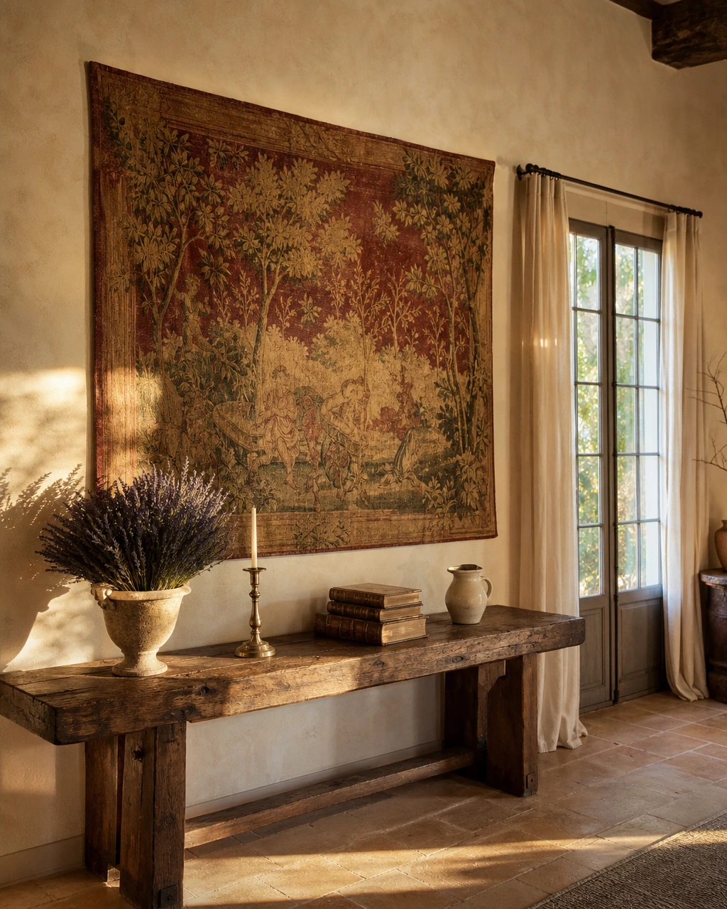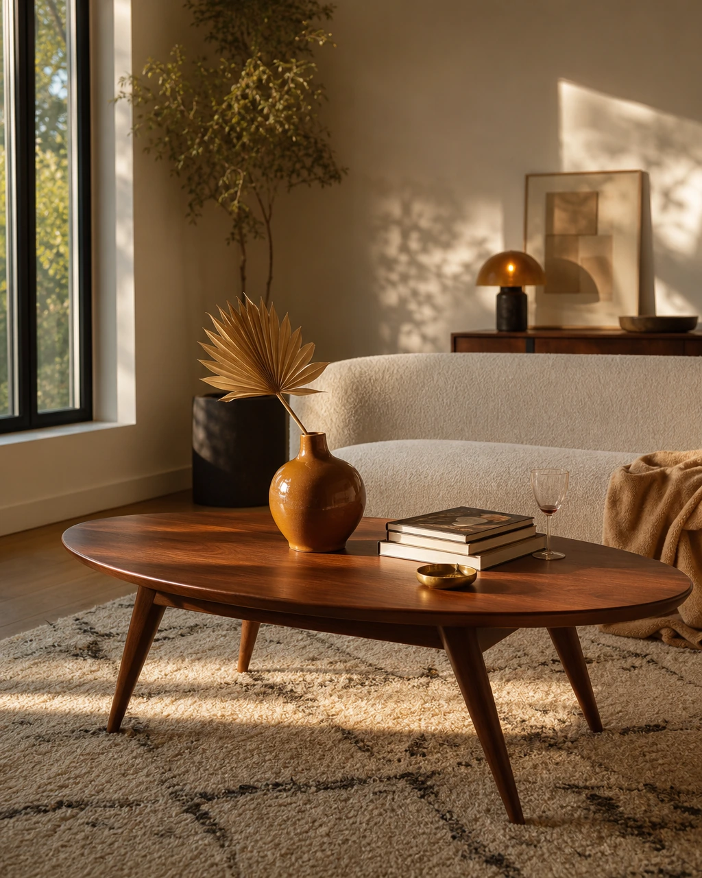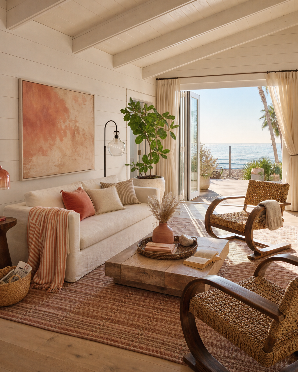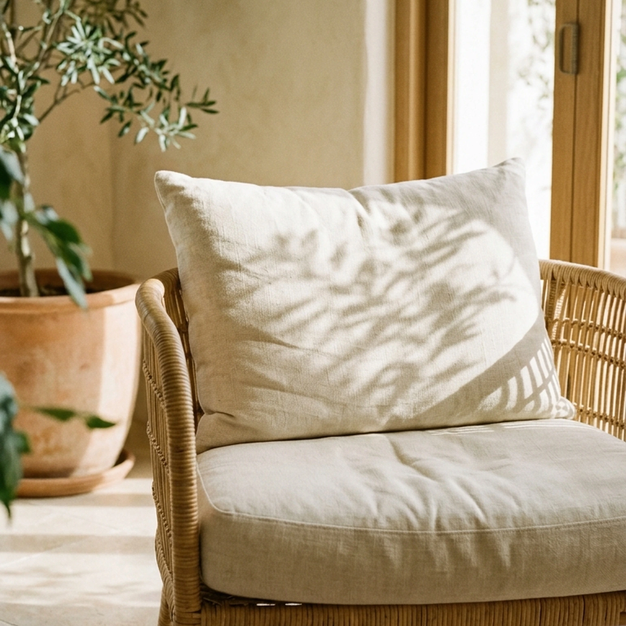

You signed a lease in Austin last spring, spent three weeks pinning interiors on your phone, and then stood in your actual living room holding a throw pillow that cost more than it should have, wondering why nothing felt right. The vision was clear. The room was not. If that moment sounds familiar, you are not alone, and the problem is not your taste.
The notebook house concept offers a way through that specific kind of paralysis. It takes the visual logic of a well-designed notebook, grids, ruled lines, color-coded sections, clean margins, and handwritten touches, and translates those principles into a home that feels organized, personal, and genuinely livable. Not a showroom. Not a render. A real space with structure and warmth that you can build on a reasonable budget without starting over every six months.
This is not a trend piece. It is a practical framework for making design decisions with more confidence and fewer regrets. The notebook house works because it gives you a system, and systems make execution easier than inspiration alone ever does.
In this guide, you will learn:
- What the notebook house aesthetic actually means and why it resonates in 2026
- How to apply page-layout thinking to small spaces
- How to build a restrained, stationery-inspired color palette
- Which wall organization and storage systems deliver the grid aesthetic on a budget
- How to design a functional home office nook within a shared living space
- Which sustainable materials fit the aesthetic and why they matter
- How to blend productivity zones with living areas without the room feeling compromised
Key Takeaways
- More than 65% of North American homeowners aged 25 to 44 identify as active DIY renovators, making low-barrier, system-based design concepts highly relevant to this audience.
- The minimalist interior design market reached $3.80 billion in 2024 and is projected to grow to $6.68 billion by 2033 at 6.3% CAGR, reflecting strong demand for clean, intentional spaces.
- 2026 trend reporting consistently points toward "warm minimalism": simple forms layered with texture, wood tones, and personal accents rather than stark, empty rooms.
- Zoned layouts significantly improve satisfaction and perceived productivity compared with undifferentiated open-plan spaces, which directly supports the notebook concept of dividing a room into purposeful sections.
- Better home office ergonomics correlate with roughly a 0.3 standard-deviation increase in self-reported productivity, making nook design a functional investment, not just an aesthetic one.
- 43% of millennials prefer eco-friendly or sustainable design, making reclaimed wood, bamboo, and recycled textiles natural material fits for the notebook house palette.
- The notebook aesthetic works best when you treat each room like a page: one clear anchor piece, defined margins (negative space), and deliberate color choices rather than accumulated visual noise.
What the Notebook House Aesthetic Actually Means
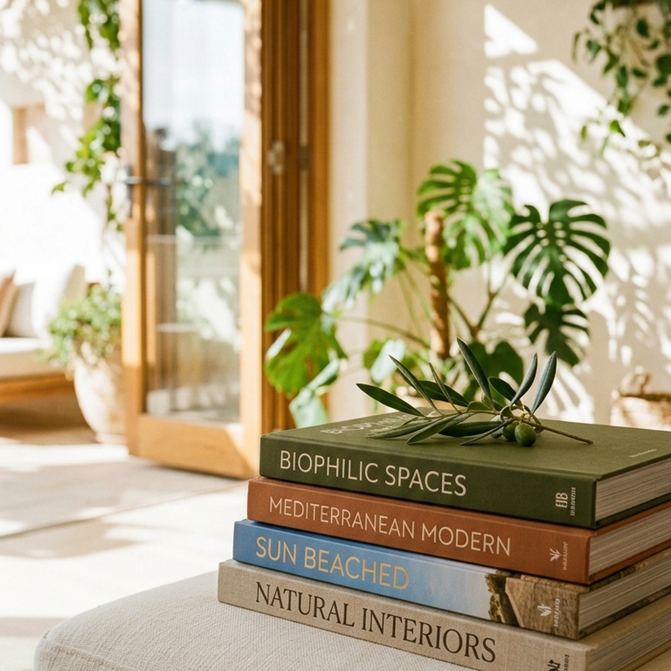
The notebook house is a home décor approach that draws on the visual logic of notebook design, specifically grids, ruled lines, tabbed sections, color coding, clean margins, and handwritten personal touches, and translates those principles into walls, storage systems, and work zones to create spaces that feel organized, warm, and intentional.
This is not a rigid style category with a fixed product list. It sits comfortably within the broader 2026 movement toward warm minimalism: spaces that are structured and intentional but not cold or performative. Think of it as the design equivalent of a Leuchtturm1917 or a Muji notebook. Everything has a place. The palette is restrained but not sterile. There is room for personality within the system.
The concept resonates particularly well with homeowners who already gravitate toward minimalist interior design principles but want their space to feel collected and personal rather than assembled from a single catalog.
Why This Aesthetic Works in 2026
Buyer behavior data tells a clear story. Zillow listing data shows that mentions of vintage accents are up 17% year over year, whimsical details up 15%, and artisan craftsmanship up 21%. Buyers and renters are moving away from generic interiors toward spaces with character and story. The notebook house delivers exactly that: a system with personality built in.
Consumer preference data from 2024 shows that 63% of consumers prefer minimalist designs, but the same research notes that "overdoing it might not be practical." The notebook house threads that needle by using structure as a design tool rather than an end in itself. The grid is not the point. The grid is what makes everything else feel intentional.
Minimalist Principles for Small Spaces: The Page Layout Approach
Minimalist interior design is a style that emphasizes simplicity, clean lines, neutral colors, and functional furniture, with each element serving a clear purpose before being styled. In the notebook house, this translates directly: treat each room like a page layout.
Every page has margins. Every page has a hierarchy. Not everything gets equal visual weight.
Defining Your Room's Margins
Margins in a room are the negative space around furniture groupings. Most small apartments fail not because they lack good pieces but because furniture is pushed against every wall, eliminating the breathing room that makes a space feel considered rather than crammed.
A practical rule: leave at least 18 inches of clear floor space between major furniture pieces. In a living room, this might mean a single sofa, one accent chair, and a coffee table rather than a full sectional plus side chairs. The room reads cleaner and larger.
For furniture in small city apartments, track-arm sofas consistently outperform rolled-arm versions in tighter spaces because they buy back visual and physical space at both ends. Skip the matching set entirely. The room ends up looking staged instead of lived in.
Establishing a Visual Hierarchy
A notebook page has a title, body text, and margin notes. A room needs the same structure. The table below maps notebook design logic onto room elements:
Room ElementNotebook EquivalentDesign RoleAnchor furniture piecePage titleDraws the eye first, sets the toneSecondary seating or storageBody textSupports the anchor without competingDecorative accessoriesMargin notesAdds personality without dominatingNegative spaceWhite spaceLets the composition breathe
Pick one anchor piece per room and let everything else support it. In a living room, that is usually the sofa. In a bedroom, the bed. In a home office, the desk. Everything else is supporting cast. If two pieces are competing for visual dominance, one of them is probably wrong for the room.
Color Palettes and Typography Inspired by Stationery Design
Stationery design uses color with restraint and intention. A classic notebook might have a single accent color, a neutral ground, and one or two typographic weights. That same logic applied to a room produces spaces that feel cohesive without feeling flat.
Building a Notebook-Inspired Color Palette
The 2026 interior color story leans toward warm, grounded tones. Trend reporting for 2026 consistently points to terra cotta, sage, dusty blue, warm beige, and soft brown as the dominant palette directions. Zillow data shows that "color drenching," painting walls, ceilings, and trim in a single saturated hue, increased 149% year over year in listing descriptions. That is the paint equivalent of a monochromatic notebook cover.
A practical three-step palette for the notebook house:
- Ground color: A warm neutral for walls and large surfaces. Warm white, oat, or soft greige rather than stark white. Stark white reads as a blank document. Warm white reads as a page.
- Accent color: One intentional hue used on a single wall, a shelf, or a set of accessories. Sage, dusty blue, and terra cotta all work well. Choose one and commit.
- Material tone: The natural color of your wood, rattan, or linen pieces. This acts as a third "color" without requiring paint.
Avoid introducing a fourth color unless it appears in a piece of art or a plant. The constraint is the point.
Typography as a Design Element
Notebooks use typography to organize information. In a home, this translates to signage, labels, and handwritten elements that add personality and reinforce the organizational logic of the space.
Practical applications include:
- Handwritten labels on open shelving or pantry jars
- A chalkboard or whiteboard panel in the kitchen or home office
- Framed typographic prints in a consistent font family
- Washi tape or colored tape used to "rule" a pegboard or wall grid
These touches are low-cost, reversible (important for renters), and immediately personal. One or two per room is enough. More than that tips from intentional into craft-project territory.
Budget-Friendly Wall Organization and Display Systems
The grid is the defining visual motif of notebook design. Graph paper, dot grids, ruled lines: all of them impose a repeating structure that makes information legible. The same principle applied to a wall creates storage and display systems that feel intentional rather than accumulated.
Grid Wall Systems That Actually Work
IKEA's Skadis pegboard system is the most accessible entry point for the notebook aesthetic. It mounts flat against the wall, accepts a range of hooks and shelves, and can be configured and reconfigured without new hardware. For a home office or kitchen, it is the direct physical equivalent of a dot-grid notebook page.
The Container Store's Elfa system offers a more substantial modular shelving option for larger walls. It is more expensive but significantly more flexible, and it can be expanded over time as needs change. For a purely decorative grid wall, a set of matching frames in a grid arrangement, all the same size, all with the same mat, works well. The uniformity does the work. The content (photos, prints, pressed botanicals) provides the personality.
Modular Storage Using Grid and Cube Concepts
Cube storage, particularly IKEA's Kallax line, maps directly onto the notebook grid concept. Each cube is a cell. Leave some open for display, add fabric bins for concealed storage, and use the top surface as a work or display area.
The key is restraint. A Kallax unit with every cube filled to capacity reads as clutter. A Kallax unit with roughly 60% of cubes styled and 40% left open or lightly filled reads as intentional. For renters who cannot mount heavy shelving, freestanding cube units deliver the same organizational logic without wall damage.
The comparison below shows how different storage approaches map to the notebook aesthetic:
| Storage System | Notebook Aesthetic Fit | Best Use Case | Renter-Friendly |
|---|---|---|---|
| IKEA Skadis pegboard | High (dot-grid logic) | Home office, kitchen | Yes (light mounting) |
| IKEA Kallax cube shelving | High (grid cells) | Living room, bedroom | Yes (freestanding) |
| Container Store Elfa | High (modular sections) | Full wall, closet | Partial (wall-mounted) |
| Matching frame grid | High (ruled-line logic) | Gallery walls | Yes (Command strips) |
| Mismatched open shelving | Low | Not recommended | Varies |
Creating Functional Home Office Nooks with Notebook Aesthetics
A home office nook is the most literal expression of the notebook house concept: a defined zone within a larger room, organized for focus, equipped for productivity, and visually distinct from the surrounding living space.
Research published in Environment and Behavior found that aesthetics, furniture quality, temperature, and noise are primary predictors of perceived work effectiveness in home versus office environments. A well-designed nook addresses all four.
Zoning a Home Office Within a Living Space
Warm minimalism and zoned open-plan design are two of the strongest 2026 interior trends, and they work together directly in the notebook house. A zone is defined not by walls but by visual cues: a rug, a pendant light, a change in wall color, or a shift in furniture orientation.
For a home office nook in a living room or bedroom:
- Use a rug to anchor the desk area and separate it visually from the rest of the room
- Position the desk perpendicular to or facing a wall rather than floating in the center of the room
- Add a pendant or task light directly above or beside the desk to signal "this is a work zone"
- Use a low bookshelf or open shelving unit as a soft room divider if space allows
Zoned designs significantly improve satisfaction, enjoyment, and perceived productivity compared with undifferentiated open-plan spaces. The same principle applies at home. The zone does not need to be enclosed to be effective. It needs to be legible.
Ergonomics and Environmental Quality in the Home Office
The functional case for a well-designed nook is stronger than most people realize. Better ventilation and air quality in the home office correlated with a 0.5-point productivity increase on a 10-point scale, a 0.4-point decrease in burnout, and a 1.2-point increase in willingness to continue working from home. Satisfaction with ergonomics correlated with roughly a 0.3 standard-deviation increase in productivity.
For a home office nook, this means:
- An adjustable chair at the correct desk height (elbows at roughly 90 degrees when seated)
- A monitor or laptop stand that brings the screen to eye level
- A window or supplemental air circulation within the nook
- Adequate task lighting that eliminates screen glare
Herman Miller and Steelcase both produce ergonomic seating that fits within a notebook-inspired aesthetic. If the budget does not stretch that far, a used Herman Miller Aeron from Chairish or a local resale platform is a significantly better investment than a new chair at a lower price point. The ergonomics are the same. The cost is not.
Incorporating Handwritten Elements and Personal Touches in Home Décor
The handwritten element is what separates a notebook from a printed document. It is the mark of a specific person at a specific moment. In a home, handwritten and personally made elements serve the same function: they signal that the space belongs to someone rather than having been assembled from a catalog.
Practical Handwritten and Personal Touches
These ideas are low-cost, renter-friendly, and immediately effective:
- Framed handwritten notes or quotes: A piece of your own handwriting, framed simply, reads as art without requiring artistic skill. The specificity is the point.
- Labeled open shelving: Handwritten labels on jars, bins, or baskets reinforce the organizational logic of the notebook house while adding warmth.
- A dedicated margin wall: A small chalkboard or whiteboard panel in the kitchen or home office functions as a living notebook page: to-do lists, meal plans, notes to yourself or a partner.
- Personal photo grids: A grid of personal photos in matching frames, printed at a consistent size, creates a cohesive display that feels collected rather than random.
- Washi tape accents: Colored washi tape can be used to create ruled lines on a pegboard, frame a mirror, or add a color accent to a plain shelf. It removes cleanly, making it ideal for renters.
One or two handwritten elements in a room are enough. The restraint is what makes each element feel intentional rather than decorative.
Sustainable Materials and Eco-Friendly Design Choices
Sustainable home décor refers to furnishings and accessories designed to minimize environmental impact, typically using renewable resources, recycled materials, and ethically sourced components. The notebook house aligns naturally with sustainability: the aesthetic favors natural materials, restraint over accumulation, and pieces chosen to last rather than trend.
The sustainable home decor market is projected to reach $43.6 billion in 2026 and $70.9 billion by 2033 at 7.2% CAGR, reflecting strong and growing consumer demand. The preference is not niche. 43% of millennials prefer eco-friendly or sustainable design, which maps directly onto the core notebook house audience.
Material Choices That Fit the Notebook Aesthetic
The table below shows how common sustainable materials align with the notebook aesthetic:
| Material | Notebook Aesthetic Fit | Sustainability Notes |
|---|---|---|
| FSC-certified wood | Warm, natural grain; works as shelving, frames, desk surfaces | Certified sustainable forestry |
| Bamboo | Clean lines, light tone; good for shelving and accessories | Rapidly renewable, low-impact |
| Recycled paper goods | Direct notebook reference; use for art, labels, packaging | Closed-loop material |
| Linen and cotton textiles | Soft, natural texture; cushions, throws, curtains | Biodegradable, often organic |
| Reclaimed wood | Adds warmth and character; works as accent shelving | Diverts material from landfill |
West Elm and Pottery Barn both carry FSC-certified wood furniture and recycled-material textiles that fit within the notebook house palette. For vintage and reclaimed pieces, Chairish and 1stDibs offer sourced options that add the "collected over time" quality that distinguishes a notebook house from a showroom.
Buying Less, Buying Better
The most sustainable design decision is also the most notebook-appropriate one: buy fewer pieces that do more work. A well-chosen reclaimed wood shelf does more for a room than three cheaper alternatives stacked together. A single quality linen throw does more than a pile of synthetic cushions.
This is the core principle behind avoiding furniture decision fatigue: the right piece matters more than more pieces. Restraint is not a budget constraint. It is a design choice.
Blending Productivity Zones with Living Spaces
The notebook house is particularly well-suited to homes where work and living share the same square footage. The notebook's organizational logic, sections, tabs, color coding, provides a framework for making that coexistence feel intentional rather than compromised.
Designing for Dual-Use Rooms
The key principle is that zones should be visually distinct but not physically separated. A living room with a defined work nook reads as a thoughtfully designed space. A living room where a laptop lives on the coffee table reads as a space that has not been designed at all.
Practical zone-definition tools:
- Rugs: The single most effective zone-defining tool in an open-plan space. A rug under the desk area and a separate rug under the sofa create two distinct zones without any construction.
- Lighting: A pendant or arc lamp over the work zone and a floor lamp beside the sofa signal different modes of use.
- Shelving as dividers: A low open bookshelf positioned perpendicular to the wall creates a soft boundary between zones while adding storage.
- Color: A single accent wall or a painted shelf behind the desk differentiates the work zone from the living zone using the notebook's color-coding logic.
Transitioning Between Work and Rest
One underrated design challenge in dual-use rooms is the psychological transition between work mode and rest mode. The notebook house addresses this through visual cues that can be activated and deactivated.
A desk with a roll-down cover, a curtain that can be drawn across the work nook, or a simple habit of clearing the desk surface at the end of the workday all reinforce the zone logic. The room does not change. The signal does. That distinction matters more than most people expect.
For more on designing apartment spaces that balance function and aesthetics, the planning tools available in 2026 make it significantly easier to test zone layouts before moving a single piece of furniture.
Tools and Solutions for the Notebook House
The notebook house concept is easy to understand and genuinely difficult to execute without the right resources. Below are the tool categories most relevant to building this aesthetic, organized by function.
DIY Home Improvement and Materials Retail
These platforms enable the affordable, implementable projects that underpin the notebook house approach. The global DIY home improvement market is forecast to reach $1,586 billion by 2034 at 6.9% CAGR, reflecting strong consumer appetite for self-led projects.
- Home Depot: Major DIY home improvement retailer for materials, tools, and organization systems. Useful for paint, pegboard, and basic shelving components.
- Lowe's: Large North American home improvement chain serving the DIY segment. Comparable range to Home Depot with strong paint and lumber sections.
- IKEA: Flat-pack furniture, grid-based shelving (Kallax), and pegboard systems (Skadis) that map directly onto notebook aesthetic modularity.
Minimalist and Stationery-Inspired Furniture Brands
These brands produce pieces with the clean lines and restrained palettes that anchor the notebook house aesthetic.
- Muji: Neutral palettes, understated furniture, and organizational products that align closely with the notebook aesthetic. One of the leading names in the minimalist interior design market.
- CB2: Clean-lined modern furniture with a slightly warmer edge than classic minimalism. Works well as anchor pieces.
- West Elm: FSC-certified wood options and a range of warm-neutral textiles. Strong for shelving, desks, and accent chairs.
Sustainable Home Décor Vendors
Natural materials with minimal environmental impact align with both the notebook aesthetic and the preferences of the core 25 to 45 audience.
- Pottery Barn: Eco-lines including reclaimed wood and organic textiles. Fits the sustainable home décor category and the warm-neutral palette.
- Crate and Barrel: Solid wood and natural-fiber options across furniture and textiles. Reliable for anchor pieces.
- Chairish: Vintage and reclaimed pieces that add the "collected over time" quality that distinguishes a notebook house from a showroom.
Ergonomic and Productivity-Focused Furniture
For home office nooks, ergonomics are a functional investment. Satisfaction with ergonomics correlated with roughly a 0.3 standard-deviation increase in self-reported productivity.
- Herman Miller: Ergonomic chairs and desks. Used Aeron chairs from resale platforms offer the same ergonomic benefit at a significantly lower price point.
- Steelcase: Major ergonomic furniture manufacturer, often cited in workplace design research. Relevant to home-office nook design.
- 1stDibs: Sourced vintage and designer pieces for accent furniture. Useful for finding the specific lamp or chair that completes a nook.
AI-Assisted Design and Room Planning
Planning tools lower the skill barrier for layout decisions and help avoid costly mismatches before purchase.
- First Chair: An AI-assisted interior design and shopping platform that helps homeowners turn inspiration into real, shoppable rooms using actual in-stock pieces sourced across multiple retailers including West Elm, CB2, Crate and Barrel, Pottery Barn, and Lulu and Georgia. For the notebook house specifically, First Chair handles layered aesthetic directions well. You can describe your direction as "minimalist but warm" or "organized but not clinical" and receive recommendations that reflect the actual tension in those descriptions rather than defaulting to a generic style category. The platform curates for cohesion, meaning the shelf, the desk lamp, the rug, and the accent chair are chosen to work as a system. Member pricing on selected pieces is built in without a promo-code hunt. Start with your room at First Chair.
- Houzz: Design platform and marketplace with trend reporting and product discovery. Useful for layout inspiration and finding specific pieces.
- AR-enabled paint visualizers: Paint brand apps that allow you to preview wall colors in your actual space before committing. Particularly useful for the accent color step in the notebook palette.
Modular Organization and Storage Systems
Grid-based storage systems are the most direct physical expression of the notebook aesthetic.
- IKEA (Kallax, Skadis): Grid shelving and pegboard systems that map directly onto notebook-style modularity. The most accessible entry point.
- The Container Store (Elfa): Modular shelving and closet systems. More expensive but significantly more flexible and expandable over time.
- ClosetMaid: Mass-market modular shelving that enables DIY zoned storage at a lower price point than Elfa.
Best Practices for the Notebook House
These practices are grounded in both design research and the specific logic of the notebook aesthetic.
- Design for function first, then aesthetics. Map zones (work, rest, storage) like sections of a notebook before layering visual elements. Every piece should serve a clear purpose before it is styled. This is the core principle of minimalist interior design applied to a real room.
- Use warm minimalism rather than stark minimalism. 2026 trend reporting consistently emphasizes that homeowners want warmth and personality alongside structure. Combine simple lines with textured surfaces, wood tones, and personal artifacts to avoid the sterility that makes minimalist rooms feel uninhabited.
- Create defined but flexible zones in small spaces. Use rugs, lighting, and furniture placement to define reading nooks, workstations, and relaxation areas. The zones should be legible without being rigid. A rug can move. A wall cannot.
- Prioritize ergonomics and indoor environmental quality in home offices. Treat air quality (windows, fans, plants) as part of the design, not an afterthought. An adjustable chair and appropriate desk height are not optional upgrades. They are the functional foundation of a nook that actually gets used.
- Layer color thoughtfully using a three-step palette. Ground color, accent color, material tone. Introduce a fourth color only through art or plants. The constraint produces cohesion faster than any amount of additional sourcing.
- Add handwritten and personal elements deliberately. One or two per room. A framed piece of your own handwriting, a labeled shelf, a chalkboard panel. These are the elements that make the room feel like yours rather than a styled set.
- Choose sustainable materials that align with the aesthetic. FSC-certified wood, bamboo, linen, and reclaimed pieces all fit the notebook palette and reflect the preferences of the core audience. Buying fewer, better pieces is both the most sustainable and the most notebook-appropriate approach.
- Test layouts before purchasing. AR planning tools and room layout apps make it easy to verify that a piece works at your actual scale before it arrives. Scale errors are the most common and most expensive notebook house mistake.
Common Mistakes to Avoid
These are the failure modes that turn a notebook house concept into a room that feels almost right but never quite gets there.
- Buying pieces individually without a cohesion plan. The notebook aesthetic depends on pieces working as a system. A shelf, a lamp, and a rug that each look good in isolation can still produce a room that feels random. Curate for the room, not for individual pieces.
- Overloading the grid. A Kallax unit with every cube filled, a pegboard with every hook used, a gallery wall with no breathing room: all of these defeat the purpose of the grid. The negative space is doing as much work as the objects. Protect it.
- Choosing stark white over warm white. Stark white reads as a blank document. Warm white reads as a page. The difference is small in a paint chip and significant in a room. Test paint colors in your actual light before committing.
- Adding too many handwritten or personal elements. Two framed handwritten pieces, three labeled shelves, a chalkboard, and a photo wall in the same room tips from intentional into overwhelming. One or two personal touches per room. The restraint is what makes each one land.
- Ignoring scale. The most common furniture mistake in small spaces is buying pieces that are proportionally wrong for the room. A sofa that is six inches too long can make an entire layout unworkable. Measure twice, order once.
- Defaulting to black metal lighting in a room that already feels cold. If the room lacks warmth, black metal fixtures make it worse. Warm wood and aged brass soften a space faster than any other single change.
- Treating the home office nook as an afterthought. A laptop on the coffee table is not a home office nook. A defined zone with a proper chair, task lighting, and adequate air circulation is. The ergonomic and productivity benefits are real and measurable. The nook deserves the same design attention as the rest of the room.
- Buying the matching set. Matched living room sets, matched bedroom sets, matched dining sets: all of them produce rooms that look staged rather than lived in. Mix pieces from different sources. The room should look collected, not purchased.
Frequently Asked Questions
What is the notebook house design aesthetic?
The notebook house aesthetic is a home décor approach inspired by the visual logic of notebook design: grids, ruled lines, color-coded sections, clean margins, and handwritten personal touches. It translates these elements into walls, storage systems, and work zones to create spaces that feel organized, warm, and intentional. The style sits within the broader 2026 movement toward warm minimalism and works particularly well in small apartments and dual-use rooms.
How do I start a notebook-inspired room on a limited budget?
Start with the elements that cost the least and have the most visual impact: a restrained three-color palette, a grid wall system using IKEA's Skadis pegboard or a set of matching frames, and one or two handwritten personal touches like labeled shelving or a framed quote. Avoid buying multiple pieces at once. One well-chosen anchor piece does more for a room than several cheaper additions combined.
Can renters implement the notebook house aesthetic without damaging walls?
Yes. Most notebook house elements are renter-friendly by design. Freestanding cube storage, pegboards mounted with damage-free hardware, washi tape accents, rugs for zone definition, and freestanding shelving units all deliver the aesthetic without permanent wall changes. Command strips handle lighter frames and small pegboards in most rental situations.
What materials work best for a notebook-inspired home?
Natural materials with clean lines work best: FSC-certified or reclaimed wood for shelving and desk surfaces, linen and cotton for textiles, bamboo for accessories, and recycled paper goods for art and labels. These materials align with both the notebook aesthetic and the sustainable design preferences of the 25 to 45 demographic. West Elm and Pottery Barn carry accessible options in most of these categories.
How do I define a home office zone without building walls?
Use a combination of a rug to anchor the desk area, a pendant or task light to signal the work zone, and a low bookshelf positioned perpendicular to the wall as a soft divider. These three elements create a visually legible zone without any construction. Research on zoned office layouts confirms that visual definition alone is sufficient to improve focus and perceived productivity.
How many colors should a notebook house room use?
Three: a ground color (warm neutral for walls and large surfaces), an accent color (one intentional hue used sparingly), and a material tone (the natural color of your wood or textile pieces). A fourth color can appear in art or plants. Beyond that, the palette loses the restraint that makes the notebook aesthetic work.
Conclusion: From Concept to Room You Can Actually Live In
The notebook house is not a style you buy. It is a system you apply. Treat each room like a page: one anchor piece, defined margins, a restrained palette, and deliberate personal touches. Zone your spaces like sections of a notebook. Choose materials that age well and align with how you actually live. Buy fewer pieces that do more work.
The research supports what the aesthetic already suggests: zoned layouts improve productivity, ergonomics matter more than most people invest in them, and the move toward warm minimalism in 2026 is not a trend but a correction. People want spaces that feel intentional and personal, not assembled and generic.
The gap between the room you can picture and the room you can actually build is almost always an execution problem, not a taste problem. If you are ready to close that gap, First Chair helps you move from saved inspiration to a finished room built with real, in-stock pieces from multiple retailers, curated to work together rather than just look good individually. Start with your room.