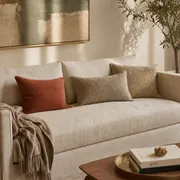
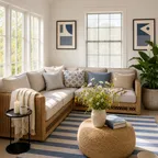
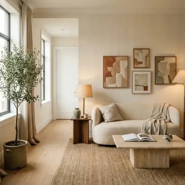
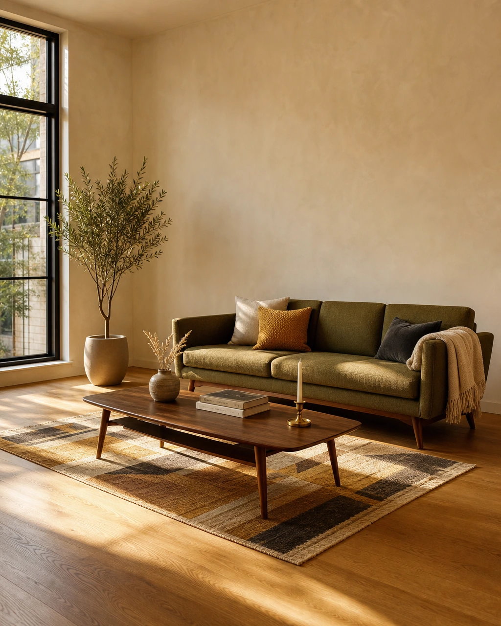
If you've spent any time on Pinterest in the last five years, you've saved at least one screenshot from Something's Gotta Give or It's Complicated without fully knowing why. The rooms feel warm without being fussy. Expensive without being cold. Lived in without being messy. And every time you try to translate that feeling into your actual home, something gets lost between the inspiration and the execution.
The good news is that the Nancy Meyers aesthetic is not a Hollywood illusion built from custom set fabrications and studio budgets. Beth Rubino, the set decorator behind several of Meyers' most iconic films, confirmed in a Country Living interview that the palette comes from Benjamin Moore, Farrow & Ball, and Donald Kaufman Color. These are not custom studio paints. They are the same brands your local designer specifies every week. The look is built from standard residential finishes, classic furniture silhouettes, and layered styling choices that any homeowner can source and install through normal channels.
What makes the rooms feel cinematic is not the budget. It is the discipline: a warm neutral base, layered lighting, natural materials, and the confidence to leave everyday objects visible rather than hiding them behind cabinet doors. That discipline is repeatable. This guide breaks each principle into decisions you can actually make, room by room, at a range of budgets.
What you'll learn in this guide:
- How to choose and test the right warm neutral paint colors
- Why the kitchen is the emotional center of the aesthetic and how to style it
- The four-layer lighting system that separates a Meyers room from a flat, overhead-lit space
- Furniture selection and layout principles, including why you should pull the sofa away from the wall
- How to layer textiles and natural materials for warmth without clutter
- Shelf and accessory styling rules borrowed from set design practice
- Where to spend and where to save when working toward this look on a real budget
Key Takeaways
- The Nancy Meyers aesthetic is built on warm neutral paint, layered lighting, natural materials, and slipcovered or classically tailored seating. These are standard residential choices, not custom set-design tricks.
- Meyers' decorator cites Benjamin Moore, Farrow & Ball, and Donald Kaufman Color as the go-to paint brands for the palette, with eggshell finish recommended for better light response.
- Layered lighting (table lamps, floor lamps, sconces, and candles) is the single biggest technical shift that separates this look from a flat, overhead-lit room.
- The kitchen is the emotional center of the aesthetic. Open shelving, visible cookware, fresh herbs, and fruit bowls are intentional styling choices, not clutter.
- Mixing new classic pieces with vintage or collected objects is what makes a room feel curated over time rather than assembled in a single shopping trip.
- Pushing furniture against the walls weakens the look. Pulled-in groupings create the cozy vignette effect that defines the style.
- The most common mistake is making the room too white or too cold. Warmth comes from texture, wood tones, and soft lighting, not paint color alone.
What the Nancy Meyers Aesthetic Actually Is
The Nancy Meyers interior design aesthetic is a warm, layered, and livable residential style defined by neutral paint palettes, natural materials, slipcovered or classically tailored seating, layered lighting, and the deliberate display of everyday objects. It is the opposite of stark minimalism. The rooms feel like someone actually lives in them.
The style spans more than four decades of Meyers' filmmaking, from the Connecticut farmhouses of The Holiday to the Hamptons kitchen of Something's Gotta Give to the Provence farmhouse of It's Complicated. What connects all of them is a consistent set of principles: warmth over drama, comfort over formality, and the sense that the room supports the life being lived in it rather than asking the inhabitants to be careful. Design writer Linda Merrill, who has analyzed the style across four decades of Meyers films, notes that the aesthetic has always prioritized timeless choices over trend-forward ones. That consistency is part of why it translates so well to real residential spaces.
Why This Aesthetic Resonates Now
The timing of the Meyers aesthetic's resurgence is not accidental. It maps directly to a broader shift in how homeowners think about their spaces.
The post-pandemic period accelerated a preference for homes that feel warm, personal, and functional rather than starkly minimal. Rooms designed for entertaining, work-from-home life, and everyday comfort have replaced purely showpiece interiors as the dominant aspiration for design-minded homeowners. The Meyers look delivers exactly that: spaces that support gathering, reading, cooking, and conversation rather than spaces designed to look impressive in photographs.
The slipcovered sofa, one of the most recognizable furniture elements of the aesthetic, is having a significant moment in 2026, with homeowners specifically seeking the relaxed, approachable quality that slipcovers provide. That quality is central to the Meyers philosophy: the room should feel like it welcomes you.
Social media and design publishing have also played a role. Film stills from Meyers movies have been circulating as interior design references for years, and the conversation has matured from "I love that kitchen" to room-by-room implementation guides with specific sourcing recommendations. The aesthetic has moved from aspirational reference to actionable design direction, which is where most homeowners actually need it.
Finally, the style's emphasis on natural materials, classic silhouettes, and timeless choices aligns with a broader consumer preference for pieces that hold their value and their relevance rather than dating quickly. In a market where furniture is expensive and mistakes are costly, the Meyers approach to buying fewer, better, more enduring pieces is genuinely practical advice.
Nancy Meyers Color Palettes and Neutral Tones
The Nancy Meyers color palette is a family of creamy whites, warm taupes, sandy beiges, soft blues, and pale sage tones that read calm and layered rather than stark or clinical. The defining characteristic is warmth. These are not the cool, blue-toned whites that dominated minimalist interiors for the past decade. They are colors that shift with the light throughout the day and feel different at noon than they do at dusk.
Rubino described the colors as "film-friendly" in her Country Living interview, meaning they perform well under changing light conditions rather than looking flat on camera. That same quality translates directly to residential spaces. A color that reads beautifully under morning light and holds its warmth under evening lamps is a better choice than one that only works in a single lighting condition.
The Three Go-To Paint Brands
The brands named directly by Rubino are:
- Benjamin Moore: Wide range of warm whites and taupes with strong light performance across different room orientations
- Farrow & Ball: Known for complex, pigment-rich neutrals that shift noticeably with light throughout the day
- Donald Kaufman Color: A smaller specialist brand favored by designers for nuanced warm tones that resist looking flat
Finish and Application
Rubino specifically recommends eggshell finish for walls. The reasoning is practical: eggshell has a slight sheen that reflects light softly without the clinical glare of satin or semi-gloss. In a room with layered lighting, that soft reflectivity adds to the warmth rather than competing with it.
Testing Before Committing
One of the most practical pieces of guidance from the source material is to test paint samples in multiple lighting conditions before committing. A color that looks perfect in afternoon sun can read entirely differently under evening lamps or on a cloudy morning. Paint a large swatch (at least 12 by 12 inches) directly on the wall and observe it across a full day before ordering. This is especially important for warm neutrals, which are the most sensitive to light direction and intensity.
The five palette families that appear most consistently across the source material are:
| Palette Family | Character | Best Used |
|---|---|---|
| Creamy whites | Warm, soft, never stark | Walls, trim, cabinetry |
| Sandy taupes and beiges | Grounded, earthy | Living rooms, bedrooms |
| Warm grays | Calm, versatile | Transitional spaces |
| Soft blues | Quiet, coastal | Kitchens, bathrooms |
| Pale sage | Organic, fresh | Kitchens, sunrooms |
Kitchen Design Inspiration from Nancy Meyers Films
The Nancy Meyers kitchen is the most studied room in her entire body of work, and for good reason. It is where the aesthetic is most fully expressed: warm wood tones, stone counters, open shelving, visible cookware, fresh flowers, and the sense that someone actually cooks and lives there.
The kitchen functions as the emotional center of the Meyers home. It is not a showroom. It is a room that supports cooking, conversation, and gathering, and the styling reflects that. Copper pots hang from a rack. A bowl of lemons sits on the counter. Herbs grow in small pots near the window. None of this is accidental.
Open Shelving and Visible Storage
Open shelving is one of the three most repeated kitchen elements across practitioner guidance on this aesthetic, alongside copper cookware and fresh flowers or fruit. The principle behind it is that the everyday objects of a well-lived life are worth displaying, not hiding.
If a full open-shelf kitchen feels like too much commitment, start with one section of open shelving above a counter you use regularly. Style it with a mix of practical items (stacked bowls, a few good glasses) and decorative ones (a small plant, a ceramic pitcher, a cookbook). The goal is to make it look like it evolved naturally, not like it was arranged for a photo shoot.
Materials That Define the Look
The most consistent material choices across the source material are:
| Material | Where It Appears | Why It Works |
|---|---|---|
| Warm wood | Cabinets, open shelving, cutting boards | Adds organic warmth against stone or plaster |
| Stone or marble | Countertops, backsplash | Provides natural variation and depth |
| Copper | Cookware, hardware accents | Warm metallic that ages beautifully |
| Linen or cotton | Window treatments, dish towels | Softens the architecture |
| Terracotta | Pots, small accessories | Earthy warmth without heaviness |
The Everyday-Objects Principle
The styling rule that most distinguishes a Meyers kitchen from a generic neutral kitchen is the deliberate visibility of everyday objects. Books, bowls of fruit, cookware, and personal objects are intentionally left out rather than hidden in cabinets. The room looks like someone actually lives there. This is a styling choice, not a lack of organization. The difference between a cluttered counter and a styled one is curation: every visible object should be either beautiful, useful, or both.
Lighting Techniques for Warm and Inviting Interiors
Layered lighting is the single most impactful technical change you can make to move a room toward the Nancy Meyers aesthetic. It is also the most commonly skipped step.
Most homes rely on a single overhead fixture as the primary light source. That approach creates flat, even illumination that reads as functional rather than warm. The interior trend analysis identifies layered illumination as a defining characteristic: table lamps, floor lamps, sconces, and candles working together to create soft pools of light rather than uniform brightness.
The Four-Layer Lighting System
These four lighting types appear consistently across practitioner guidance on this aesthetic:
- Table lamps: Placed on side tables, consoles, and nightstands to create warm pools of light at eye level
- Floor lamps: Used to fill corners and add height variation to the lighting plan
- Sconces: Wall-mounted fixtures that add architectural interest and soft ambient light without taking up floor or surface space
- Candles: Used in the evening to add flicker and warmth that no electric source fully replicates
Dimmers are essential. Every lamp and overhead fixture should be on a dimmer switch so the room can shift from bright and functional during the day to warm and atmospheric in the evening.
Bulb Temperature and Fixture Style
Warm white bulbs in the 2700K to 3000K color temperature range are the correct choice for this aesthetic. Cool white or daylight bulbs (4000K and above) will undermine the warmth of even the best neutral palette. This is one of the most common and most fixable mistakes in recreating the look.
For fixture style, classic silhouettes in aged brass, warm bronze, or natural materials (linen shades, rattan, ceramic bases) align with the look. Brands like Visual Comfort, Rejuvenation, and Hudson Valley Lighting carry ranges that fit this direction without requiring custom sourcing.
Furniture Selection and Layout Principles
The furniture in a Nancy Meyers interior is comfortable first and beautiful second. That is not a compromise. It is the point. The rooms are designed to be used, and the furniture reflects that priority through soft upholstery, classic silhouettes, and arrangements that invite people to sit close together rather than perching at the edges of a formal room.
Slipcovered and Soft-Tailored Seating
Slipcovered seating is upholstered furniture with removable fabric covers, typically in linen, cotton, or a linen-cotton blend. The look is relaxed and slightly rumpled in the best possible way. It reads as lived in rather than showroom-fresh. The slipcovered sofa trend is particularly prominent in 2026, with homeowners specifically seeking the approachable quality that slipcovers provide.
For homeowners who prefer a more tailored approach, the same quality can be achieved with sofas and chairs in natural fabric upholstery (linen, cotton, or a textured weave) in warm neutral tones. The key is avoiding anything that looks too tight, too shiny, or too perfect. Brands like Serena & Lily, RH, and Lee Industries carry classic silhouettes in natural upholstery fabrics that align with this direction.
Layout Principles That Create the Vignette Effect
One of the most consistent mistakes in recreating this aesthetic is pushing furniture against the walls. The Meyers look depends on pulled-in groupings that create intimate conversation zones. A sofa and two chairs arranged around a coffee table, with space between the furniture and the walls, feels like a room designed for people rather than a room designed to look large.
Practical layout rules:
- Pull the sofa at least 18 inches from the wall behind it
- Create a central gathering zone anchored by a rug that fits under the front legs of all seating
- Add a reading chair with a floor lamp and small side table in a corner to create a secondary vignette
- Leave some negative space. The room should not feel crowded.
For guidance on furniture in smaller floor plans, the pulled-in grouping principle applies even in tighter apartments. A smaller rug and a loveseat instead of a full sofa can deliver the same vignette quality at reduced scale.
Classic Silhouettes Over Trend Pieces
The furniture shapes that appear consistently across Meyers interiors are familiar and enduring rather than sculptural or trend-forward. Track-arm sofas, roll-arm chairs, turned-leg tables, and simple case goods in warm wood tones are the building blocks. These shapes age well precisely because they are not trying to be of the moment.
Textiles, Patterns, and Layering Strategies
Layering is the design principle that separates a Nancy Meyers room from a room that simply uses the same colors. Layering means combining multiple textures, finishes, and materials so the room feels rich and dimensional rather than flat, even when the palette is restrained.
The warmth of these rooms comes from texture rather than color contrast. A room in creamy whites and warm taupes can feel either cold and empty or warm and inviting depending entirely on how many different textures are present. This is the principle that most homeowners underestimate.
The Core Textile Families
The two fabric families that appear most consistently across the source material are linen and cotton. Both are natural, breathable, and have a slightly imperfect texture that reads as warm and authentic rather than synthetic or overly polished.
Practical applications:
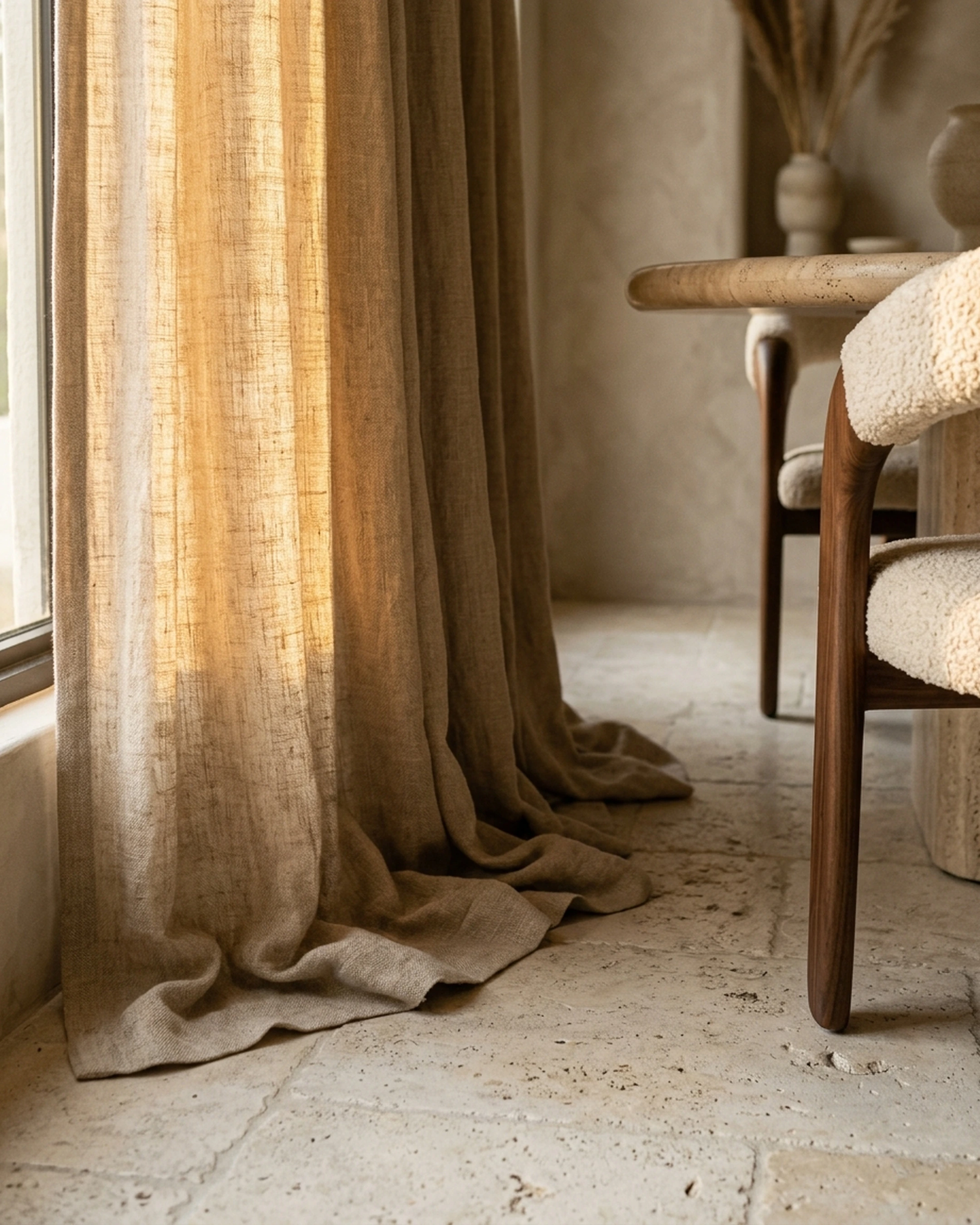
- Linen curtains: Floor-length, slightly loose, in a warm white or natural linen tone. These soften the architecture and filter light beautifully.
- Cotton or linen throw pillows: Mix two or three different textures (a smooth linen, a textured weave, a subtle pattern) rather than matching sets.
- Wool or cotton throws: Draped over the arm of a sofa or the back of a chair, not folded neatly.
- Natural fiber rugs: Sisal and seagrass are the two most commonly recommended options. They add texture underfoot without competing with the rest of the room.
Patterns and How to Use Them
The Meyers aesthetic is not pattern-free, but patterns are used with restraint. Stripes, subtle checks, small-scale botanicals, and classic geometric weaves appear in textiles without dominating the room. The rule of thumb is that patterns should feel like they belong to the same calm, warm family as the rest of the palette.
Avoid high-contrast patterns, bold graphic prints, or anything that reads as trend-forward. The goal is pieces that look like they have been in the room for years.
Layering in Practice: A Room Checklist
A well-layered room in this aesthetic typically includes:
| Layer | Example |
|---|---|
| Base texture | Sisal or seagrass rug |
| Soft seating texture | Linen or cotton upholstery |
| Window softness | Floor-length linen curtains |
| Throw texture | Chunky knit or waffle-weave cotton |
| Pillow variety | Two to three different weaves in the same palette |
| Hard surface warmth | Wood tones in furniture and accessories |
| Natural material accent | Wicker, rattan, or terracotta object |
Accessorizing and Styling Shelves Like a Set Designer
The accessorizing in a Nancy Meyers interior is one of the most studied and most misunderstood elements of the aesthetic. The rooms look effortlessly styled, but that effortlessness is the result of deliberate choices about what to display, how to group objects, and how to make the everyday feel intentional.
The core principle, consistent across the source material, is that everyday objects are worth displaying. Books, bowls of fruit, cookware, ceramics, and personal objects are intentionally visible rather than hidden in cabinets. The room looks like someone actually lives there.
The Collected Feeling
Collected decor is a mix of vintage, antique, heirloom, and personal objects that makes a room feel curated over time rather than assembled in a single shopping trip. This is one of the most important qualities of the Meyers aesthetic and one of the hardest to fake by buying everything new at once.
The practical approach is to mix new classic pieces with vintage or secondhand finds. Chairish and 1stDibs are useful sources for vintage ceramics, antique books, and collected objects that add the patina of time. McGee & Co. and Terrain carry new pieces that have the right organic, handmade quality without requiring a vintage hunt.
Shelf Styling Rules
A few principles that appear consistently across the source material:
- Group objects in odd numbers (three or five reads more naturally than two or four)
- Vary height within each grouping (a tall vase, a medium stack of books, a small ceramic)
- Mix materials within each grouping (something ceramic, something wood, something with texture)
- Leave some empty space. Overcrowded shelves lose the calm quality that defines the look.
- Include at least one living element: a small plant, fresh flowers, or a bowl of fruit
For more on decorating a new apartment from scratch, these shelf-styling principles apply at every scale and budget level.
Budget-Friendly Ways to Achieve the Nancy Meyers Look
The Nancy Meyers aesthetic is often associated with large, beautifully appointed homes, but the underlying principles are accessible at a range of budgets. The look is built on restraint, natural materials, and layered styling choices. None of those require a renovation budget.
Timeless choices over trend-forward ones are actually a budget advantage. Pieces chosen for classic silhouettes and natural materials hold their value and their relevance longer than trend pieces, which means fewer replacements and fewer costly mistakes. This is the design philosophy that Linda Merrill identifies as consistent across four decades of Meyers' work.
Where to Spend and Where to Save
| Category | Worth Spending More | Where to Save |
|---|---|---|
| Sofa | Yes. A classic silhouette in natural fabric will last. | Skip the matching set. Buy the sofa alone. |
| Rug | Yes. Natural fiber or quality wool anchors the room. | Sisal or seagrass costs less than wool and works just as well. |
| Lighting | Yes. One good lamp makes a bigger difference than many cheap ones. | Sconces can be inexpensive if the style is simple and classic. |
| Curtains | Yes. Floor-length linen curtains change the room significantly. | IKEA linen curtains are a widely used budget option that performs well. |
| Accessories | No. This is where vintage and secondhand shine. | Thrift stores, estate sales, and Chairish are the right sources here. |
| Paint | Yes. The brands Rubino recommends are worth the price. | You only need one or two colors. The cost is in the application, not the volume. |
The Three Highest-Impact Low-Cost Changes
If budget is a real constraint, these three changes deliver the most visible shift toward the aesthetic:
- Replace overhead lighting with two or three table lamps and add dimmers to existing fixtures
- Add floor-length linen curtains to any window in the main living space
- Pull the sofa away from the wall and add a natural fiber rug that fits under the front legs of all seating
These three changes address lighting, softness, and layout simultaneously, which are the three areas where most rooms fall furthest from the Meyers look. For more on stopping furniture overwhelm before it starts, the same principle applies: a few considered choices outperform a room full of compromises.
Tools and Resources for Executing the Look
Translating the Meyers aesthetic from inspiration to an actual, buyable room requires sourcing across several categories. The right pieces rarely come from a single retailer.
Paint and Color Specification
- Benjamin Moore: Broad range of warm whites and neutrals with strong residential availability
- Farrow & Ball: Complex, pigment-rich neutrals; best for homeowners who want the most nuanced palette shifts
- Donald Kaufman Color: Specialist brand for designers seeking the most refined warm tones
Lighting and Fixtures
- Visual Comfort: Wide range of classic lamp and sconce silhouettes in aged brass and warm finishes
- Rejuvenation: Strong selection of historically inspired fixtures that align with the classic Meyers look
- Hudson Valley Lighting: Accessible price point with classic residential silhouettes
Upholstery and Soft Furnishings
- Serena & Lily: Consistent with the slipcovered, tailored, and neutral-upholstery direction
- RH: Classic silhouettes in natural fabrics at a range of price points
- Lee Industries: Known for quality construction and natural fabric options in classic forms
Rugs and Floor Coverings
- Dash & Albert: Strong selection of natural fiber and traditional rugs at accessible price points
- Stark Carpet: Higher-end option for custom sizing and premium natural fiber rugs
- Fibreworks: Specialist in sisal, seagrass, and jute rugs
Kitchen Accessories and Open Storage
- deVOL Kitchens: Aligns closely with the open kitchen, visible cookware, and warm wood direction
- Williams Sonoma: Copper cookware, wood boards, and kitchen accessories that fit the everyday-display principle
- Ironware International: Hand-forged iron hardware and cookware with the right aged quality
Decorative Objects and Styling
- Terrain: Ceramics, planters, and organic objects that fit the collected, natural quality of the aesthetic
- McGee & Co.: New pieces with handmade, organic character; good for layering with vintage finds
- Chairish / 1stDibs: The right sources for vintage ceramics, antique books, and collected objects
Design Planning and Sourcing
Pulling all of these categories together into a cohesive room is where most homeowners get stuck. The references are clear. The feeling is clear. But moving from a saved screenshot to a specific sofa, a specific rug, and a specific lamp that work together in the actual proportions of your room is a different challenge.
First Chair is built specifically for that gap. You can upload a photo of a Meyers film still, a magazine page, or a room you photographed in a hotel, describe the direction you want (warmer, softer, more collected), and receive curated recommendations built from real pieces across retailers like Serena & Lily, RH, Crate & Barrel, and CB2. Every piece shown actually exists and can be purchased. The platform pulls across multiple retailers rather than pushing inventory from a single catalog, which matters when the right room rarely comes from one source. For homeowners who already know the feeling they want but struggle to find the specific pieces that deliver it, First Chair offers the guidance of a tastemaker without the cost of a full design engagement.
Best Practices for Recreating the Nancy Meyers Aesthetic
These are the principles that appear most consistently across practitioner guidance on the look:
- Use a warm neutral base and let texture do the work. The palette is restrained by design. Warmth comes from layering different textures and materials, not from adding color.
- Layer multiple light sources instead of relying on overhead lighting alone. Table lamps, floor lamps, sconces, and candles working together create the soft, atmospheric quality that defines the look.
- Choose classic silhouettes for sofas, chairs, and tables. Especially if you want the room to age well. Trend-forward shapes date quickly; roll-arm sofas and turned-leg tables do not.
- Mix new and vintage so the room feels collected rather than staged. A room assembled entirely from new purchases in a single weekend will never have the patina that makes Meyers interiors feel real.
- Make the kitchen feel lived in by displaying everyday objects. Cookware, bowls, herbs, books, and fruit are styling choices, not clutter. The room should look like someone actually cooks there.
- Use natural materials liberally. Wood, linen, stone, jute, wicker, and sisal are the most recurring recommendations across every source. Synthetic substitutes undermine the warmth that natural materials provide.
- Add soft window treatments. Floor-length linen curtains keep the architecture airy and bright while softening the room significantly. This is one of the highest-impact changes per dollar spent.
- Design for how you actually live, not for how the room will look in photographs. Seating should be comfortable. The room should support gathering, reading, cooking, and conversation. Beauty follows from use.
Common Mistakes to Avoid
These are the pitfalls that appear most consistently in practitioner guidance on the aesthetic, along with their consequences and fixes:
Making the room too white or too cold. The consequence is a room that looks clinical rather than warm. The fix is to test paint colors in multiple lighting conditions and choose colors with warm undertones rather than cool or neutral ones.
Relying on one harsh overhead light. A single overhead fixture creates flat, even illumination that reads as functional rather than atmospheric. Replace or supplement it with table lamps, floor lamps, and sconces on dimmers.
Overusing trend pieces instead of timeless shapes and materials. Trend pieces date quickly and break the calm, enduring quality of the aesthetic. Stick to classic silhouettes and natural materials that will look right in five years.
Making the space feel overly polished or untouchable. A room that looks beautiful but feels like a showroom has missed the point entirely. The Meyers aesthetic is about rooms that welcome you, not rooms that ask you to be careful.
Filling the room with synthetic materials when natural textures are central to the look. Faux linen, plastic wicker, and synthetic rugs undermine the warmth that natural materials provide. The tactile quality of real linen, wood, and jute is part of what makes the look work.
Pushing furniture all the way against the walls. This weakens the vignette effect and makes the room feel like a waiting room. Pull seating in and create a central gathering zone.
Treating the kitchen like a showroom and hiding everything. The Meyers kitchen depends on visible life and utility. Open shelving, displayed cookware, and everyday objects on the counter are not optional styling choices. They are the point.
Using clashing colors or overly saturated accents. These break the calm, layered neutrality that defines the palette. Accents should feel like they belong to the same warm family as the rest of the room.
Frequently Asked Questions
What are the key elements of the Nancy Meyers interior design aesthetic?
The Nancy Meyers interior design aesthetic is defined by warm neutral paint palettes, natural materials (wood, linen, stone, jute, and sisal), slipcovered or classically tailored seating, layered lighting from multiple sources, and the deliberate display of everyday objects. The style prioritizes comfort and livability over formality, and rooms are designed to feel collected over time rather than assembled at once.
What paint colors does Nancy Meyers use in her film sets?
Meyers' set decorator Beth Rubino has named Benjamin Moore, Farrow & Ball, and Donald Kaufman Color as the go-to brands for the palette. The colors fall into families of creamy whites, warm taupes, sandy beiges, soft blues, and pale sage tones. Rubino recommends eggshell finish for better light response and advises testing samples in multiple lighting conditions before committing.
How do I recreate the Nancy Meyers kitchen look?
The key elements are warm wood tones (in cabinets, open shelving, and cutting boards), stone or marble countertops, open shelving styled with a mix of practical and decorative objects, copper cookware displayed rather than hidden, fresh herbs or flowers near the window, and a bowl of fruit or lemons on the counter. The goal is a kitchen that looks like someone actually cooks there.
What is the most important lighting change for the Nancy Meyers look?
Replacing or supplementing a single overhead fixture with layered lighting is the single biggest technical shift. Table lamps, floor lamps, sconces, and candles working together create soft pools of light rather than flat, even illumination. All fixtures should be on dimmers, and bulbs should be warm white (2700K to 3000K).
Can I achieve the Nancy Meyers aesthetic on a limited budget?
Yes. The three highest-impact low-cost changes are: replacing overhead lighting with two or three table lamps and adding dimmers, adding floor-length linen curtains to the main living space, and pulling the sofa away from the wall with a natural fiber rug underneath. These address lighting, softness, and layout simultaneously. For accessories, vintage and secondhand sources like Chairish and estate sales deliver the collected quality that new purchases alone cannot replicate.
What furniture silhouettes work best for this aesthetic?
Classic, enduring shapes work best: roll-arm or track-arm sofas, turned-leg chairs and tables, and simple case goods in warm wood tones. Slipcovered upholstery in linen or cotton is the most recognizable furniture element of the look. Avoid sculptural or trend-forward shapes, which date quickly and break the timeless quality of the aesthetic.
Conclusion: From Inspiration to a Room You Can Actually Live In
The Nancy Meyers aesthetic is not a fantasy. It is a set of repeatable design principles built from standard residential finishes, classic furniture silhouettes, and layered styling choices that any homeowner can execute. Warm neutral paint from Benjamin Moore or Farrow & Ball. Layered lighting from table lamps, floor lamps, and sconces on dimmers. Natural materials in linen, wood, stone, and jute. Classic seating pulled away from the walls. Everyday objects displayed rather than hidden. These are not secrets. They are decisions.
The gap between knowing what you want and actually pulling it together is where most homeowners get stuck. The references are clear. The feeling is clear. But translating that feeling into a specific sofa, a specific rug, and a specific lamp that work together in the actual proportions of your room is a different challenge entirely.
First Chair is built for exactly that gap. Upload a photo of a Meyers film still or a room you love, describe the direction you want, and receive curated recommendations built from real pieces across multiple retailers. Every piece shown actually exists and can be purchased. The platform acts like a tastemaker, not a search engine, narrowing the field to pieces that work together rather than overwhelming you with options. If you've been saving screenshots for years and still haven't pulled the room together, that is the move.